From home interiors to fashion runways, a certain kind of quiet luxury has come to define the last decade – understated palettes, soft materials and statement pieces that do little more than whisper. What happens when tranquility is no longer found in the absence of color, but in its abundance? This cheerful Long Island home offers a different answer: joy as a design principle, color as a reset.


Perched atop a hill and surrounded by mature trees, this 12,000-square-foot contemporary home was originally designed as a study in minimalism—clean lines, sharp angles, and an all-white interior that reflected the prevailing aesthetic of restraint. But to its owners, a dynamic family deeply rooted in New York culture, this neutrality felt less like a sanctuary and more like silence. Instead, what they wanted was something much more radical: a home that radiated happiness.

Working with a blank canvas and complete creative freedom, Shanna Gatanis Design Studio he leaned into a subversive approach, transforming the stark shell into a saturated, high-energy environment that still manages to feel deeply restorative. The result is not chaos, but calibration, and a statement that joy can be just as fundamental as stillness.


Bright hues invigorate with the power to positively affect mood swings. Color, in this sense, becomes less about decoration and more about emotional infrastructure and a tool for resilience. Here, this philosophy is integrated into every space.


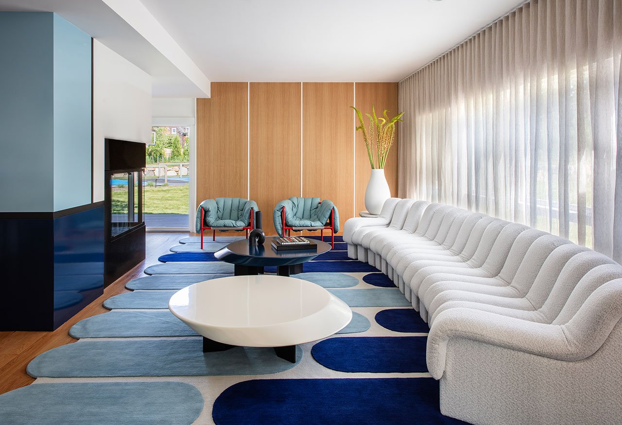
The palette draws from 1990s hip-hop ephemera, retro sports graphics and the color noise of a recycled Nike sneaker floor – the project’s unlikely starting point. Blues anchor the home, providing a sense of depth and continuity, while saturated reds, yellows and greens move through the interiors in rhythm to create visual rhythms that stimulate without overwhelming.


It’s a deliberate rejection of ‘chromophobia’ – that quiet cultural fear of color that has long dictated what is considered ‘tasteful’. Instead, this house leans toward the color that works best: reflecting mood, enhancing joy, and even inviting participation.


The house’s delicate balance between vibrancy and extravagance lies in its material intelligence. Warm woods, terrazzo, colored glass and lacquered surfaces create layers of tactile sensation, while sheer fabrics and 1970s-inspired rounded forms soften the tension. The result is immersive yet palatable for everyday life.


Programmatically, the house unfolds as both a playground and a shelter. Open entertaining zones flow into more intimate family spaces, while amenities—basketball court, music lounge, pools and a convertible outdoor room—expand the concept of home into something experiential.


Moments of delight are everywhere, often literally. A Lego-inspired fireplace rises as a sculptural focal point. A graffiti mural combines Brooklyn, Biggie and basketball in a visual love letter to the family’s roots. While these gestures could be read as whimsical, they become markers of identity, memory and belonging.


It is this sense of personal narrative that ultimately elevates the work beyond spectacle to autobiography. Perhaps peace is not always found in silencing the world, but in knowing it in full technique. And to do that is to invite saturation.


To see this and other works by the spontaneous design studio, visit shannagatanis.com.
Photo courtesy of nickjohnsoninteriors.com.