

The balcony is, by definition, the threshold between domestic intimacy and the outside world, yet too often this outdoor room is treated as a simple container of objects. Many outdoor spaces remain suspended in a visual vacuum: they are neat, functional, but without that gravitational force that really invites you to stop. Elevating a balcony is not a filling exercise, but work volume architecture.
The sense of a “bare” space is not resolved by multiplying elements, but by defining a hierarchy. Often the best intentions are created in errors of scale or an overly horizontal distribution that flattens the perspective. To turn the balcony into an authentic environment, you need to stop looking at individual pieces of furniture and start noticing the structure of the gap. A few targeted interventions in verticality and material coherence are enough to go from a simple exterior view to a scenographic extension of your home.
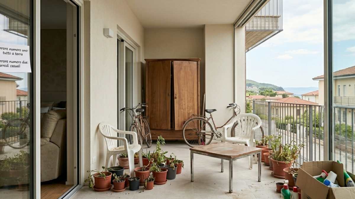
Mistake number one: anything placed on the ground without structure
One of the main reasons why a balcony looks empty is that everything is on the same level. Vases, chairs, coffee tables: everything remains on the floor, creating a flat composition that does not attract attention.
When verticality is missing, space loses depth. Even with many elements, the result remains poor. It doesn’t take much to change that perception. A well-used wall, a shelf, a light structure or even a tall plant they immediately create movement.
Imagine the difference between a row of vases lined up on the floor and a composition that rises up. In the second case, the space looks fuller, more planned, more interesting. Not because there are more objects, but because there are better distributed.
Mistake two: furniture without identity or too random
Another widespread problem is lack of consistency. Often the balcony becomes a container with elements taken individually which together do not build anything. This creates a sense of temporalityas if the space hadn’t really been thought of.
Even a few elements, if consistent with each other, can completely change the outcome. You don’t need a rigid style, but you do need direction. It can be material, natural, minimal. The important thing is that i materials communicate with each other: wood, fabrics, ceramics and metals chosen with logic give character to even the simplest balcony.
Mistake number three: losing a focal point
A bare balcony is often a balcony without a center. There is no point that catches the eye, that defines the space and makes it recognizable. This point need not be expensive: it can be a important planta well-placed seat or a neat table.
But it must be something like that Organize visually everything else. When there is a focal point, the elements around it also find a logic. Without it, all seems lost. This is why some balconies, even though they have many objects, seem empty: an element that holds the whole is missing.
How to really change your balcony without cluttering it up
The solution is not to add, but to correct. Move Items, create different heightsselect few objects but with clean function. Even a small change can completely transform the perception of space.
A balcony works when it invites you to experience it. When there is somewhere to actually sit, a light that makes it welcoming in the evening, a composition that looks thought out and not accidental. You don’t need much more.
At that point, it will no longer be a space you glance at as you pass. It will become a place where you stop. And that’s it real difference.


