
At Salone del Mobile, and within the dense program of EuroCucina 2026, the kitchen returns to the center of the design debate – not as a purely functional system, but as a multi-layered environment where technology, identity and domestic rituals intersect. This is where brands are forced to clarify their position, either to follow the neutralization of devices in architecture or to push them back into visibility as authorial objects.
SMEG has historically chosen the second path. Founded in Emilia-Romagna in 1948, the company has created a precise and recognizable visual language: saturated colors, soft geometries, reflective surfaces and constant attention to detail. These elements have made its products legible for decades, resisting the tendency to flatten minimalism without losing coherence. At Milan Design Week 2026, this identity is not revised, but expanded through a set of collections that sharpen the relationship between device and space, developed and perfected through collaborations with design studios such as Borromeo de Silva and Stefano Boeri Interiorsas well as with brands such as Porsche.

Musa by Borromeo de Silva © SMEG
Isola by Stefano Boeri interiors studio © SMEG

Hero Collection, Musa by BorromeodeSilva © SMEG
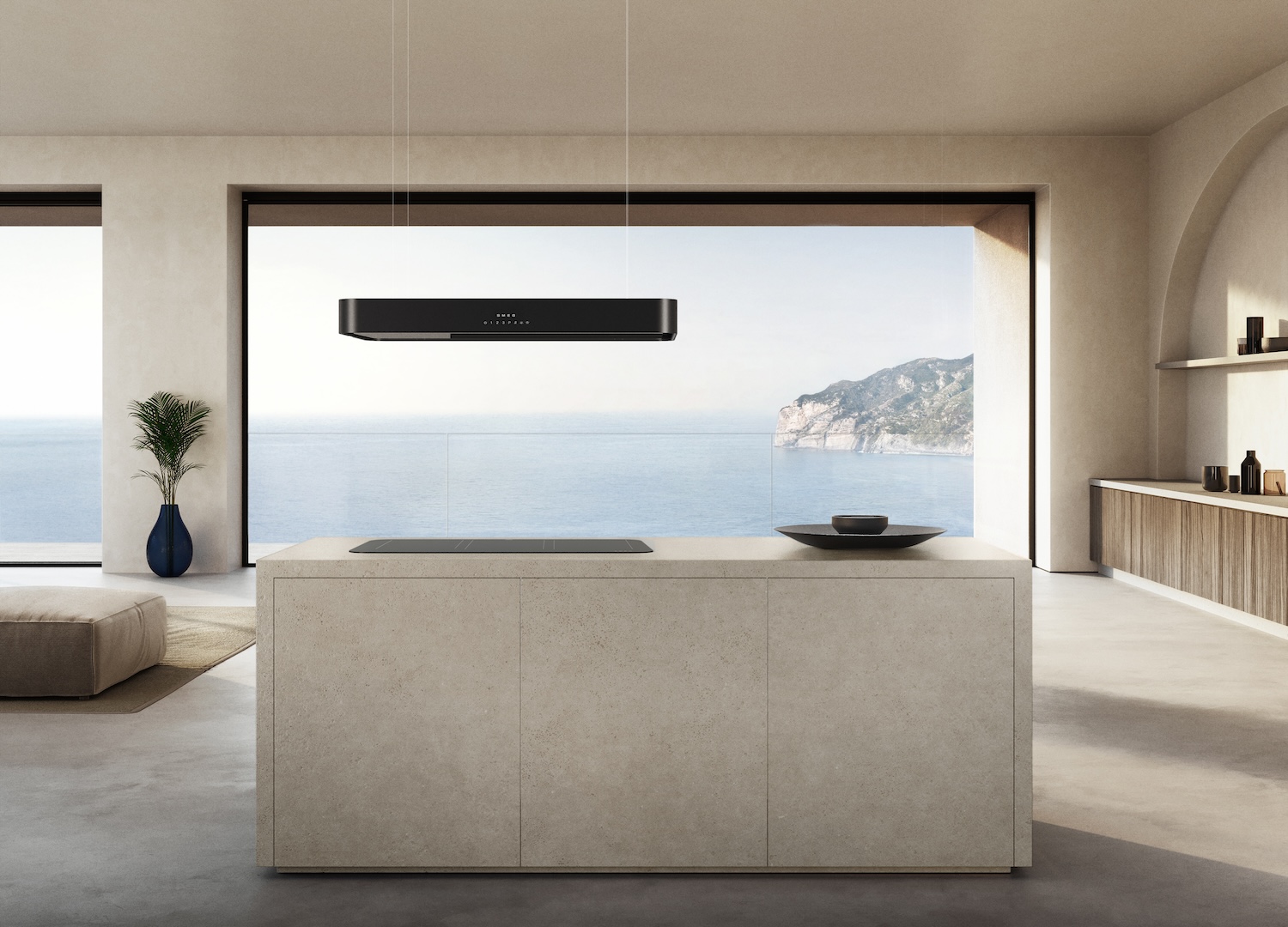
Isola by Stefano Boeri interiors studio © SMEG
Moonlight finish © SMEG
Isola by Stefano Boeri interiors studio © SMEG

Moonlight finish © SMEG

Musa by Borromeo de Silva © SMEG

Musa by Borromeo de Silva © SMEG
Porsche x ©SMEG
The direction is clear: devices are not background infrastructure. They act as design devices, capable of structuring the kitchen both visually and functionally. The brand’s new releases align with this attitude, reinforcing a narrative that combines technological performance with a controlled aesthetic vocabulary, calibrated to contemporary domestic scenarios.
Presented during EuroCucina, the two main collections – Musa and Isola – are developed in collaboration with external studios, a recurring strategy for SMEG. The aim is not to dilute the brand’s DNA, but to test it through different design approaches. Both projects remain anchored in the company’s core language while introducing variations in tone, scale and spatial role.
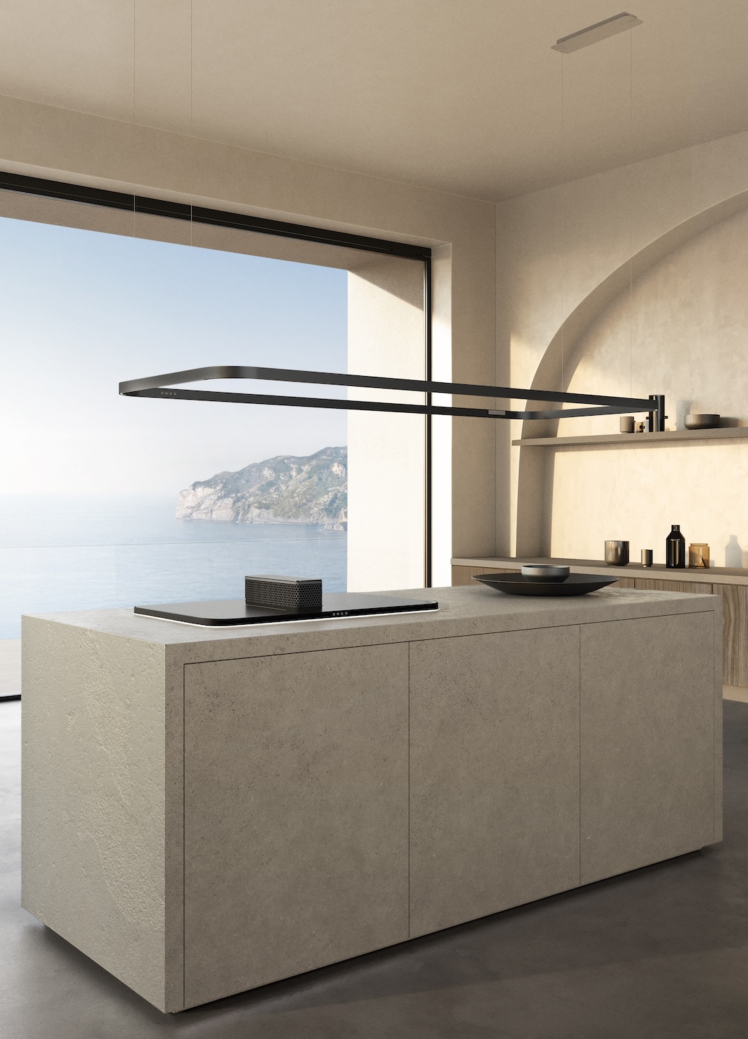
Musedesigned with BorromeodeSilva, it works through reduction. The collection is defined by a minimal and strict formal system, where elements are stripped to their essential geometry, surfaces alternate between matte and glossy, but within a restrained palette – black and silver dominate, avoiding color distraction. The result is a controlled field of view, where contrast is measured and never decorative.

The collection includes induction hobs, hoods, built-in coffee machines and wall-mounted storage units. Each element is designed to sit within the architecture rather than compete with it, but without completely disappearing. The balance is delicate: Musa does not aim for invisibility, but for precision. His presence is quiet, almost technical, but still purposeful and expressive. This approach aligns with Borromeo de Silvaof the wider practice, which often navigates between narrative and industrial design. The studio’s experience with technology-driven companies is evident here, particularly in the way complexity is resolved into easy-to-read forms.
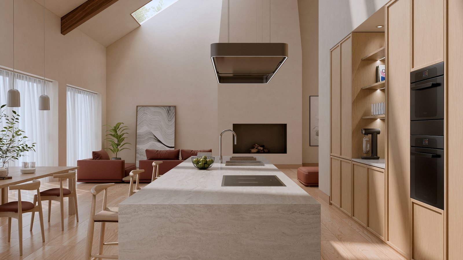
If Musa works by subtraction, Isola takes the opposite route. Developed with Stefano Boeri Interiors and already awarded the Design Intelligence Award in 2025, the collection positions appliances as central agents in the kitchen space. Rather than being integrated into the cabinetry, these elements appear as focal points.

Isola revolves around induction hobs with integrated exhaust systems, combined with hanging hoods and a modular light rail system. The configuration is open, flexible and explicitly visible, defining spatial markers that rethink the way the kitchen is used and perceived. The project reflects a wider change, where the kitchen island is a performative stage and cooking is both action and display.
Also, materials, proportions and lighting are calibrated to give weight to the objects in the room. Cooperation with Stefano Boeri Interiors is consistent in this sense. The studio’s work often treats design as a transformative agent, capable of redefining the way spaces are organized and experienced. Applied to SMEG’s technical expertise, this results in a hybrid language – part infrastructure, part expressive.
In this sense, Musa and Isola do not compete, but outline two possible trajectories for the contemporary kitchen – one, the transition towards reduction and integration, the other towards exposure and articulation.

The exhibition design – both in the exhibition and in the SMEG flagship store – supports this double reading. The installation emphasizes material presence – in a context increasingly dominated by digital representation, the installation insists on physical interaction and wants to be surfaces to be touched, finishes to be read in changing light, volumes to be navigated. This focus on materiality responds to a growing divide between the virtual and the embodied, particularly in design communication. Bringing tactility to the fore, SMEG repositions its products in a sensory context.
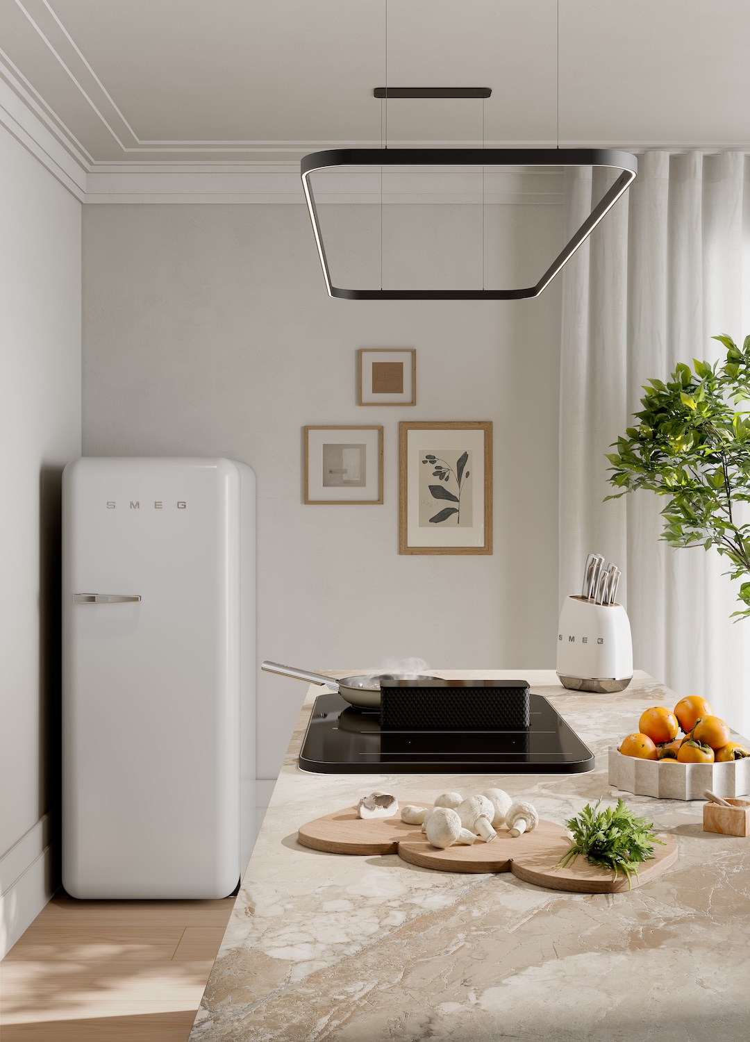
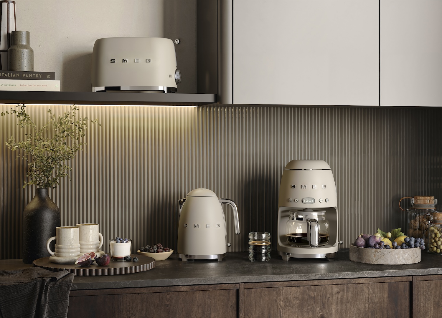
And in that trajectory, the company is honing its position on the surface as a primary design tool. Through the introduction of TOTAL MATTNESS frames the matte finish is understood as a defining aesthetic of modern life. Here, the opacity is treated as an active state and absorbs light instead of reflecting it, stabilizing the color and giving the volume a more grounded presence, to a quite atmospheric effect.
The work is structured around three coordinates – nature, material and color – used to construct a real domestic landscape where each finish is considered as a color field rather than a single tone, calibrated to interact with light and adjacent materials. In writing shift towards density and softness. Blue storm and Emerald Greenn introduce depth without becoming decorative. Amber Clay carries a more explicit hardware register. Moonlightpositioned as a contemporary neutral, it works in between – warm, diffuse and deliberately low-contrast. What results is not a palette in the traditional sense, but a system that can be extended across product categories – from FAB refrigerators to Portofino stand-alone kitchens, hoods, taps and small appliances. The absence of gloss reduces visual noise, making material transitions easier to read and the overall environment more cohesive.
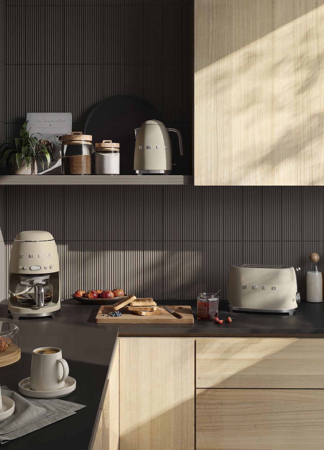
Alongside new collections, the brand introduces updates to existing ranges. THE Dolce Style New The series is undergoing a targeted redesign, focusing on customization. The intervention enhances rather than redefines, allowing greater adaptability to different interior environments while maintaining the established identity of the collection. THE Portofino The range also expands, with new matte finishes that change its visual balance. Originally inspired by the Ligurian coast – its colors and light – the collection now incorporates more restrained surfaces, designed to interact with the stainless steel in a less reflective and more contemporary way.
This development is on a longer trajectory. Since the mid-1950s, SMEG treated kitchens as a core product category, combining Italian design with a solid investment in cooking technology, transforming this heritage into a high-performance system, with large-capacity ovens, triple fan technology for even heat distribution on multiple levels, and advanced insulation that improves performance by reducing warm-up time. The range is designed for flexibility, positioning it between home use and a more professional approach.
Color remains central to his development FAB refrigeratorsof the most recognizable products in the catalog. For 2026, the palette expands to softer, more atmospheric tones. His introduction Moonlight finish – muted, bright and deliberately understated – marks a transition from highly saturated retro hues to a more controlled color language.
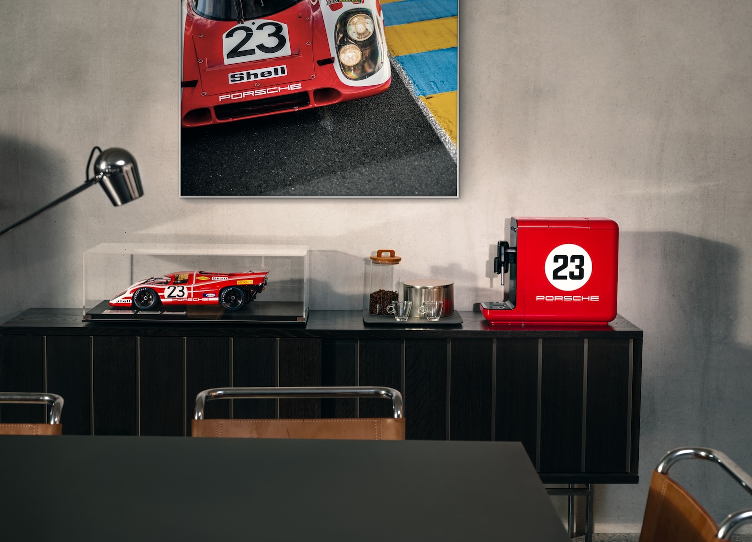
The week also includes the Porsche x SMEG collection, a recent collaboration that merges the automotive industry of precision Porsche with SMEG’s domestic know-how. The partnership brings together two brands aligned on precision, performance and recognition, translating Porsche’s motorsport heritage on a domestic scale without diluting any identity. The result is a controlled overlap between automotive engineering and appliance design, where form is closely related to function and aesthetics remain on target.
At the core of the release is the 917 Salzburg Collection, a limited run of 1,970 individually numbered pieces – including refrigerators and coffee machines – that refers to Porsche’s first overall victory at the 24 Hours of Le Mans. Its use Salzburg Reda special color developed for the collaboration, acts less as a direct reference, anchoring the items to a specific moment in gaming history while enhancing their collectible dimension. Alongside this, the Carrara White and Green shade The variants extend the signature Porsche finishes to a wider range of SMEG products.
Taken together, these elements outline a consistent strategy. SMEG, at Design Weeks 2026, shows how its approach is still contemporary even for a well-known and iconic brandoperating through continuity – and, at the same time, evolving its language in response to evolving domestic landscapes while maintaining a strong formal identity.


