

The problem is that black is unforgiving. Unlike other more neutral, warm or bright colors, this shade acts as a ruthless amplifier of every detail: the quality of the light, the nature of the materials, the actual dimensions of the room and even the strictness of the daily order. It is precisely for this reason that in some homes the end result looks sophisticated and timeless, while in others it quickly becomes heavy, impractical and undeniably difficult to manage in the long term.
Choosing black for the bathroom means accepting a design challenge where balance is everything. There are situations in which this choice, seemingly sophisticated and modern, ends up creating more problems than advantages. It happens especially in small bathrooms, perhaps blind or with poor natural lighting, where volumes are reduced to a minimum.
In these cases Black absorbs light instead of reflecting itacting as a kind of optical “black hole” that makes the environment appear much more closed, compressed and less airy than it actually is. Dark surfaces drastically reduce the perception of available space and can create a sense of limited, almost suffocating depth, turning a moment of relaxation into a perception of constriction.
The choice of finishes also plays a decisive role: the presence of a matte finish or low-reflective materials such as slate or highly textured porcelain further emphasizes this light-absorbing effect. The result is a bathroom that looks elegant on paper or in performance, but which is not very pleasant to experience every daygiving the impression of an environment permanently in shadow and visually tiring.
The practical detail that many underestimate: day-to-day management
Apart from the purely aesthetic and perceptual aspect, there is a very real problem connected with the actual use of the room. Black, especially if applied to smooth surfaces or branded faucets, show all with surgical precision.
Salt, fingerprints, dust and soap or water residue: every little mark stands out immediately, acquiring a white in dark contrast that is much more visible than on light or chrome surfaces. This inevitably translates into a need for much more frequent maintenance and, unfortunately, a constant feeling of ‘not perfect’, even minutes after a thorough cleaning has been carried out. It is one of the most frustrating aspects that is often only discovered “in the field” after you have completed the work and started using the bathroom fixtures on a daily basis.
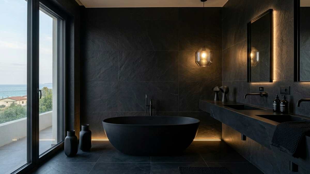
When black really works: ideal conditions
Despite the pitfalls, there are contexts in which black offers excellent results and an elegance that is difficult to combine with other colors. Well-lit bathrooms, equipped with large windows or a multi-layered artificial lighting project (including mood lights, functional mirror lights and accent light cuts), manage to enhance dark shades without overwhelming the structure of the room.
The secret to making it work is the tactile combination: black is at its best when combined with “living” materials that soften its rigidity. Natural wood (such as oak or teak), veined stone or botanical elements are ideal companions. Contrast creates depth and makes the environment more invitingturning the bathroom into a private spa and avoiding the cold, hospital or overly industrial effect.
For most people, partial use remains the smartest and safest option. You don’t need a total black to be fashionable; Targeted details are often enough to change the look of the space: a single dark wall behind the bathroom fixtures, an embossed vanity unit or simple black taps to give a clean, graphic touch.
A real-life example that clears everything up: black faucets
A very popular case study in recent years is the use of matte black faucets, such as those recommended in Leroy Merlin catalogs or other large bathroom furniture retailers. On a purely aesthetic level, it is a strong choice, extremely up-to-date and able to immediately give an architectural character even to an anonymous bathroom.
In a light environment, characterized by neutral tiles and good brightness, the contrast is elegant and well balanced: the black faucet becomes a graphic sign that draws attention like a jewel on a sober dress. However, if this same faucet is placed in an already dark bathroom, with charcoal gray covers or poorly lit, it inevitably contributes to a darker and heavier visual effect.
And above all, the variable of water comes into play: if you live in an area with very hard water, traces of scale will become visible after each usewhich requires the use of specific products that do not damage the delicate finish riot police. It is the exact same design element, but with a completely different functional and visual effect depending on the context in which it is immersed.
The most common mistake when choosing black
The main problem arises from the fact that many are guided solely by the glossy images of social media or magazines. We see perfect bathrooms, photographed with professional lights, in spaces of often unrealistic dimensions for standard apartments and with top-of-the-range materials.
But in everyday reality the conditions change drastically. Light is almost never the zenith of the showroom, space is often limited by system limitations, and everyday use doesn’t allow you to have a 24/7 “display” bathroom. Choosing black color while ignoring the availability of time for cleaning or the actual size of the room is the most common mistake, the one that makes you regret your choice after a few months.
Practical guide: how to use it without making mistakes
In conclusion, black is not a color to avoid, but a visual construction material to be managed with extreme awareness. Here are some golden rules to avoid mistakes:
- Use black to create tones: instead of covering entire walls, use it to emphasize the lines of the shower cubicle or the profile of the mirror.
- Scale with hot ingredients: always include a wooden element or a green plant to contrast the coldness of black.
- Work on lighting: if you choose black, double the bright points. Use warm lights to soften surfaces and direct light to bring out textures.
- Choose from a variety of textures: Avoid flat, uniform black. prefer stones with veins or ceramics with small reliefs that move the light.
It is these small details that make the difference between a bathroom that looks like a dark room and a design that is harmonious. Black instantly conveys elegance, boldness and modernity, but precisely because it is such a charismatic choice, It requires more thought and design care than you might imagine. Sometimes a small adjustment is really enough to achieve a balanced result, but to ignore it is to turn a great aesthetic intuition into an environment that, in the end, does not work.


