
Login takes three seconds. It’s the time it takes to open the door, walk in and get a sense of a home. Three seconds in which the eye registers everything before the brain even intervenes. And that’s exactly where many modern apartments lose out.
Not because of the size. Because of a piece of furniture.
It’s strange, because the entryway is the space you think about least when decorating. You choose the sofa carefully, we think in the dining room, we spend hours on kitchen materials. But the entrance is solved quickly, with what seems obvious. And often what seems obvious is a dark console, a metal hanger, a mirror with a black frame. Things that work, at least until you wonder why the house always seems a little smaller than it is.
The vision block near the door
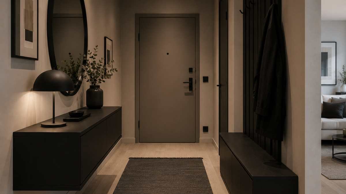
Black consoles, charcoal shoe racks, dark wood effect panels, metal hangers with bold profiles. In recent years these elements have colonized Italian entrances with an almost suspicious consistency. In the photos they worked: sharp contrast, clean lines, that showroom feel that easily wins likes on social media.
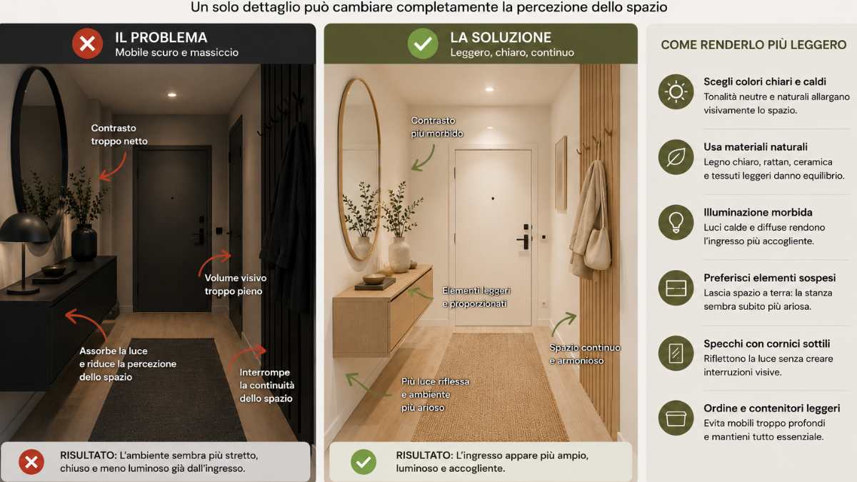
In everyday life a The dark block near the door creates an immediate barrier. Even when the furniture is thin, the visual weight remains. In smaller apartments or in corridors where the entrance flows directly into the living room, this dark element becomes the first and only protagonist of the room. Everything else is lost behind him.
Hay understood this before many: in his arrangements the inputs never have a dominant point. There’s always something suspended, light, allowing the floor to breathe and does not compete with light. The same goes for Muuto, who often uses natural, almost sculptural, curved wooden hangers in his entrances, able to add character without taking up visual space.
When the problem multiplies
There’s an oft-repeated dynamic: you buy a dark console, then a charcoal-framed mirror to match, then a black lamp to finish off. Every choice seems consistent. The overall result is one wall that absorbs light and compresses the space.
Mirrors deserve a separate discussion. A very thick black frame in a small entry works just like furniture: It creates a strong second breaking point. However, few would suffice: one brass frame, natural oak or even framelessleaning against the wall as many Scandinavian works do, and the mirror itself stops weighing down and starts working for the room, multiplying light instead of contrasting it.
How to lighten up without losing personality
The most common mistake is to think that removing contrast means removing character. It doesn’t work that way.
I Natural materials replace many solid surfaces: light or medium woods, matte finishes, frosted glass, warmer metals such as bronze or brushed brass. They are elements that have personality, but carry it in a different way. They do not interrupt the space, they accompany it.
A specific example: one console in natural ash with thin legs it occupies the same physical space as a solid black console, but allows light to pass beneath it. The floor remains visible, the environment breathes. It’s the same logic with hanging furniture: when the floor is not interrupted, the room seems larger of what it is.
Fabric details also matter more than you might think. A carpet made of natural fibers, jute or raw cottonunder the console or in front of the door completely changes the visual temperature of the entrance. It doesn’t fix a wrong piece of furniture, but softens an entrance that’s already in the right direction.
The entryway is small, but it’s the only room in the house that everyone always sees. It’s worth breathing.


