There are houses that you visit for the first time and immediately give you a precise feeling: you would like to stay. They don’t have to be big, they don’t have to be expensive, they don’t follow a recognizable style. They just have something that makes them happy in life, if only for an hour. Then there are equally neat houses, with considered palettes, carefully chosen furniture, all in the right place, which instead leave a feeling of limitless cold. You sit, look around, wait for something to hit. It doesn’t click.
The difference is almost never in the colors. It’s on texture.
It’s not a new observation in the design world, but it’s one of those things that is rarely explained to those outside the industry. The most attentive interior designers they work on texture variation as others work on color variation: with the same care, with the same awareness that each choice affects the overall perception of the space. The principle is simple. A room with many colors but all smooth and uniform surfaces is tired in a different way than a monochromatic room with different materials. The second, almost always, is what feels best.
A rough linen sofa against a lime plaster wall
Imagine an almost completely beige living room. Lime plaster wall with slightly irregular, not smooth surface. Sofa upholstered in raw linen, with this visible texture that changes hue depending on how the light falls. Solid wood coffee table with natural grain, no mirror treatment. Thick knot wool rug with small imperfections in the weave.
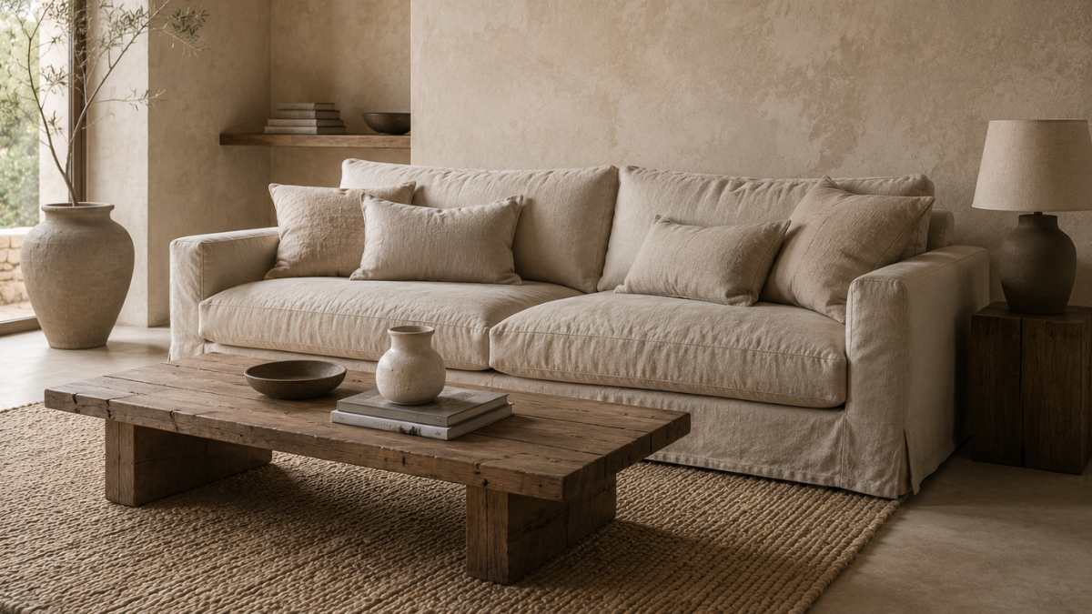
All are almost the same color. However the room has depth, warmth, visual complexity. The eye has places to go without finding aggressive contrasts. He moves from one surface to another, each time finding something slightly different: a roughness, a grain, an opaque reflection. This is exactly what produces the feeling of relaxation. Not the palette, but the variety of how surfaces respond to light.
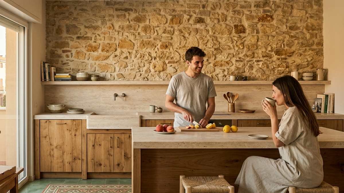
A kitchen where wood talks to stone
In a kitchen where the worktop is unpolished natural stone, the wall units are brushed oak and the floor is terracotta, not much else is needed. The three materials are all in the same color family, warm hues ranging from honey to warm gray, but have completely different textures. The stone is cool to the touch and has a surface that absorbs light. Brushed oak has a visible, almost velvety texture. Terracotta has irregularities that change with the angle of natural light.
The result is a kitchen that it looks like it’s always been inhabited, not built yesterday. Designers who work this way, from Patricia Urquiola to Piero Lissoni, rarely use more than two or three colors in an environment. They work on multiplying textures, not tones.
A bedroom where everything is gray but nothing is the same
Headboard in gray bouclé fabric. Cotton percale sheets, slightly lighter gray. Polished concrete bedside table. Raw linen curtain, yet another different gray. Lamp with matte ceramic base. It’s all gray, but it’s not monochromatic in the flat sense of the term: each surface has a different voice, a different response to light, a tactile temperature that can also be perceived visually.
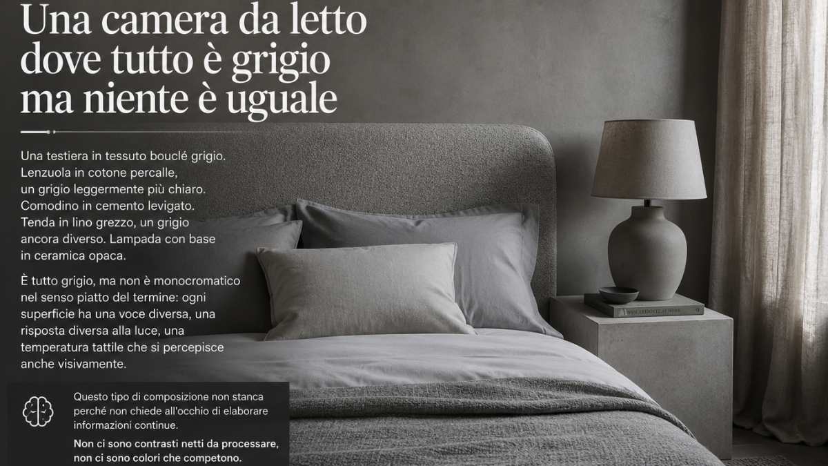
This type of composition is not tiring because it does not ask the eye to process continuous information. There are no clear contrasts in the process, no competing colors. It’s just there subtle variation, the kind of variation the brain reads as harmony.
Everything else that contributes, but in a different way
Texture is the main variable, but it is not the only one. Really relaxing homes tend to have almost always very few shiny surfaces: gloss repels the eye rather than absorbing it, and in a domestic environment this translates into a feeling of restlessness that is hard to name. They tend to have at least one completely clean wall or area, a point of visual silence where the gaze stops without finding anything. And they tend to have diffused light sources instead of exposed bulbs, because the Indirect light creates atmosphere where the immediate builds only illumination.