

The mirrors were used up. White curtains, light walls, five hundred watt chandeliers: all already seen, already recommended, already forgotten. However, there are north-facing apartments with small windows and low ceilings that seem airy. It’s not magical and it’s not exposure dependent. It depends on precise design choices, some of which are so counterintuitive that most people would instinctively avoid them. A professional interior designer does not work directly on light, as if it were a problem to be solved with more watts.
He works on surfaces, on contrasts, on the perceived depth of environments. The difference between a room that looks dark and a room that looks bright can depend on a cover, where a piece of furniture is placed and which wall is left free. Understanding this logic changes the way you see your home.
The dark wall that opens the room
The first conditioned reflex of those who want more light is to paint everything white. It works, partially. But a completely white room tends to flatten and lose depth. What the eye perceives as brightness is not only the amount of light present, but also the contrast between lighter and darker areas. A single back wall painted in deep forest green, midnight blue or charcoal creates a paradoxical effect: the other walls appear whiter, the space seems larger, the room more airy.
This principle is regularly applied in studio works such as Ilse Crawford’s or Neri&Hu’s works. It is not about aesthetic audacity as an end in itself. It is a visual perception technique: the brain interprets contrast as depth and depth as open space. An accent wall in shades of sage green like o Mizzle by Farrow & Ball266, selectively reflects natural light and at the same time creates the sense of volume that a uniform white cannot give.
Surfaces that multiply light
Glass and mirrors are familiar tools. Less discussed is the role of semi-glossy surfaces, satin finishes and materials that reflect without dazzling. A white marble top with gray veins on a low sideboard bounces the side light continuously throughout the day. Different from the flat effect of a matte surface, different from the mirror effect of a glossy lacquer.
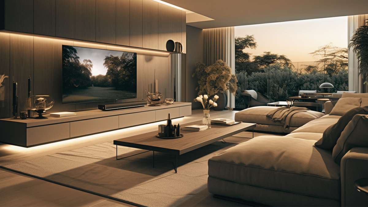
Hay, the Danish brand known for its modern interpretation of Scandinavian design, offers storage furniture with glass doors with silk: they allow a glimpse of the interior without showing it completely, and the treated surface captures the light in a diffused way. The effect in a living room with minimal natural lighting is measurable. Fabrics also contribute: a velvet in light tones, such as pearl gray or champagne, absorbs light differently than raw cotton. The quality of the surface is just as important as the color.
The same goes for the floors. A parquet with a natural oiled finish reflects the light more organic than a satin lacquer and tends not to reveal scratches. But in a dark room, a light porcelain floor with stone, such as Pietra di Noto by Ceramica Sant’Agostino in 120×120 format, completely changes the visual effect of the room without touching the walls.
Where you put your furniture is more important than what you put
A sofa placed by the window blocks 30-40% of useful light from entering a room. It’s a rough but realistic estimate and you only need to stand near a window with a tall piece of furniture in front of you to understand it naturally. Its management bright perimeter that is, the space around natural light sources is one of the most effective interventions a designer can make.
The rule of thumb is simple: no tall furniture in the first 60-80 cm to the side of a window. Bookcases, wardrobes and retaining columns should be moved to the solid walls. Low furniture, on the other hand, can be brought closer to the light source because they do not obstruct the flow of light in the upper part of the room. This is why in the works of Jean-Louis Deniot, a Parisian designer known for his luxury apartments, the main seats are often oriented perpendicular to the window, never parallel to the wall.
Another element that is often overlooked: interior doors. A full door blocks the passage of light between adjacent rooms. A door with clear or etched glass mirrors allows light to travel from one room to another. Ikea has been offering the Grimo door solution for Billy bookcases for yearsin transparent glass, but the same principle applied to a custom interior door turns a blind corridor into a bright distribution element.
The temperature of the artificial light is not a detail
When natural light is not enough, artificial light comes into play. But not all artificial light works the same. A 2700K bulb creates a warm, cozy environment with an orange hue. A 4000K is neutral, almost clinical. For environments that need to appear brighter without heat loss, the ideal range is between 3000K and 3500K: cold enough to appear bright, warm enough not to be hostile.
Light distribution matters as much as temperature. A single central point of light casts shadows downward and tends to darken the corners of the room. Three or four bright spots distributed along the perimeter, even on the ceiling, create a washing effect on the walls that makes them seem lighter and taller. Wall lights are oriented upwards Like those of the Flos Bellhop Wall series in the version with an opaque diffuser, they project a cone of light on the ceiling that visually extends the height of the room by a few tens of perceptive centimeters, even when they are not there.
One last item rarely mentioned: the location of electrical outlets. When renovating, adding floor outlets in the center of the room allows you to use floor lamps in a central position without visible cables, multiplying the possibilities for indirect lighting without being tied to the perimeter.


