

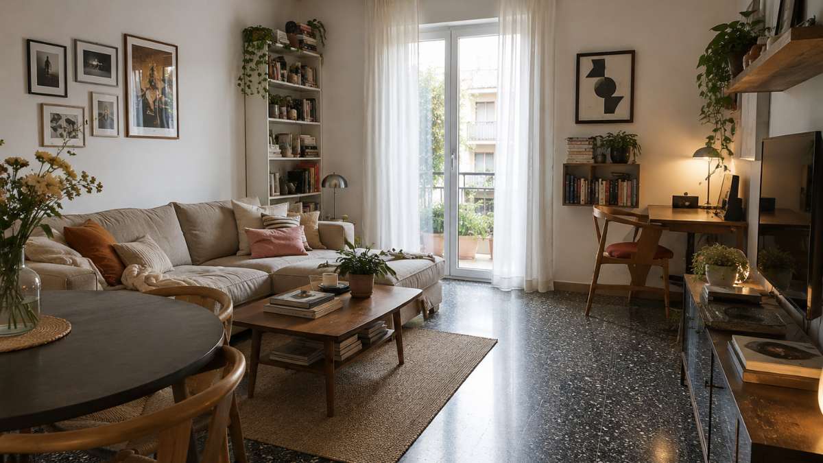
Dark terrazzo is one of those divisive floors. Those who find it at home often inherit with it a baggage of prejudices: old, heavy, difficult to manage. The instinctive reaction is to cover it up, hide it under layers of floating parquet or neutral tiles. A mistake, almost always. Because dark grit, with its mineral fragments that catch light in unpredictable ways, is already a material in itself with a visual complexity that no large-scale laminate will ever be able to match. It’s not about fighting it. The point is to understand what kind of language she speaks and respond to her in the same language, just with an updated vocabulary.
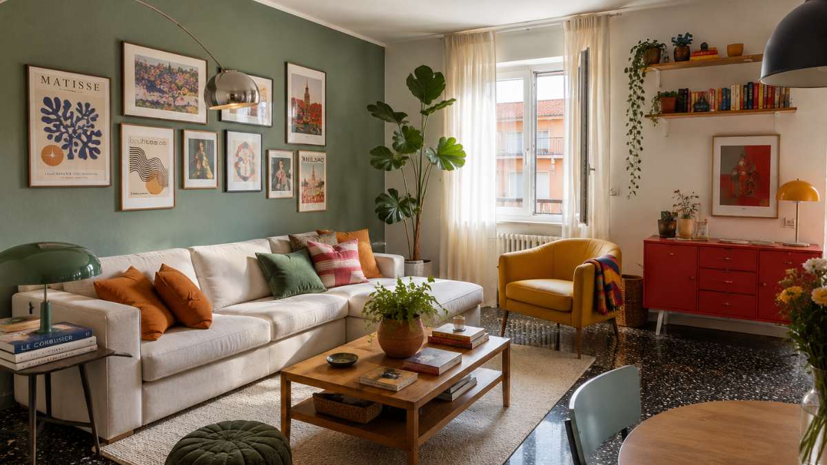
The environments that work with this floor all have something in common: a certain boldness in the choices, a complete absence of color restraint. Not all white to “open up the space”, no light wood to “warm up”. The opposite: depth against depth, color against color, material against material. The result, when the proportions are right, it’s something close to Zara Home catalogs at their best, or in the mise en scène of some Flos exhibition spaces: dense, habitable environments, with precise personality.
The box effect that transforms everything
The most effective strategy to enhance a dark floor is not to light it from above with white walls. This solution creates a clear break, a disturbing contrast that emphasizes the weight of the floor rather than solving it. The alternative that European interior designers are adopting with increasing conviction is the opposite: wrap the entire room in a pallet of similar depthcreating what in terminology is called a “vertical tone to tone” effect.
Walls painted in midnight blue, forest green or smoky gray with an almost velvety matte finish eliminate the visual separation between floor and wall. The eye stops reading the floor as a separate and heavy element and begins to perceive the space as a single, coherent volume. In this context, the bright fragments of sand, those quartz or calcite dots that glow under any light sourcethey stand out like stars against a dark background. The room becomes intimate, luxurious, with a depth that without an all-white environment can ever have.
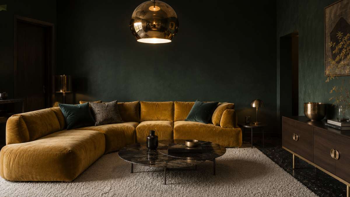
A specific reference: Farrow & Ball painting in color Railings (No. 31)a deep charcoal blue with a Dead Flat finish, it’s just the kind of product designed for this effect. Applied to walls with an almost black grit, the result is a calibrated elegance, without exaggeration.
The heat that breaks the intensity
An all-dark environment risks being oppressive if it doesn’t get injections of color warmth in the right places. This is where the choice of basic furniture comes into play, which should be bold where the walls keep calm. Mustard yellow, terracotta, antique pink, ripe peach: warm and saturated shades in heavy pieceslike a plush sofa or the doors of a boiserie kitchen, they perform two functions at once.
The first is obvious: they break the monotony of darkness, they bring life. The second is less obvious but just as important: they remind of the nuances hidden in the grit itself. Almost all dark colored floors contain sul original mixture of fragments of hot, red or yellowish oxides, which usually pass unnoticed. A mustard velvet sofa highlights them, creating an underground color resonance that makes the environment more cohesive than it appears at first glance.
The Marimekko brand has been working with these combinations for decades in its fabric collections. And Poliform, in the Varenna kitchen range, offers doors in matt lacquer terracotta that develop exactly this kind of dialogue with the dark floor.
Minerals that illuminate without overloading
Where the crack is dark and the walls are equally dark, the light must come from elsewhere. Not necessarily from the bulbs, at least not only from them. THE satin brass and gold details they play a specific role in this type of environment: they reflect the available light with a warm tone, without the coldness of brushed steel and without the kitsch excess of shiny gold.
Bronze handles on dark doors, thin frame profiles, faucets with a shiny gold PVD finish: small elements that mark the space with controlled reflections. Tom Dixon has built much of its range of interior accessories on this principle, and you only need to look at the Beat range of brass pendant lights to see how a single metal fixture can become the focal point of a dark room without overwhelming it.
The technical detail that makes the difference: satin brass reflects diffusely, not specularly. This means it captures and distributes light over a larger area, lighting the room evenly rather than creating blind spots.
Carpets as horizontal architecture
The dark grit covers the entire floor with a dense and uniform texture. Without breaks, this continuity becomes oppressive, undifferentiated. The carpet is not a decorative element in this context: it is a structural intervention. Large plain bouclé wool rugs or natural linenplaced under the main furniture, they create visual islands that assign functions to the spaces of the room and offer a direct tactile contrast to the rigidity of the stone.
The colors that work: pearl gray, warm beige, sand. Light tones that visually lighten the center of the room without betraying the dark palette of the environment. A 250×350 ivory wool bouclé carpet under a dining table creates an almost scenographic effect, as if this area is floating on a slightly different level from the rest.
Hay and Ferm Living produce linen and wool rugs with that rough, irregular surface quality that works perfectly in this type of combination. Prices between 400 and 800 euros for large formats, an investment justified by the visual impact they create.
Dark grit, after all, need not be forgiven. He needs interlocutors who are on an equal footing.


