
You furnished your home with IKEA because it works, is accessible and allows you to build a cohesive space without complications. After a while, though, what initially seemed clean and minimal starts to look too uniform. Everything communicates, but in the same way. There is nothing that really stands out, nothing that creates a point of attention.
The feeling is not disorder, but optical flatness. And that is exactly where the need to intervene arises, not by changing the furniture, but by introducing something that has a different language. A more defining, more recognizable element, not limited to being in the space but modifying it. Kartell works in this sense because it uses materials and finishes that IKEA does not: transparencies, glossy surfaces, solid colors, iconic shapes. Introduced into a neutral environment, these objects are not lost, but emerge immediately. And it is precisely this contrast that makes the difference.
The living room: when a lamp really changes everything
Get an IKEA TV stand like BESTÅ, in light matt or wood effect. It’s perfect, analog, but visually flat. If you place any lamp on it, it stays that way. However, when you enter a Kartell lamp, like a Bourgie or a Mini Geen-A, something very specific happens: the light does not simply illuminate, but creates reflections on the surface, breaks the opaque surface of the furniture and introduces an immediate point of attention. You are no longer looking at a TV cabinet, but a composition.
The same goes for an IKEA LACK coffee table, which often disappears into space. Putting a transparent or glossy Kartell element on it completely changes the perception, because it introduces depth where before there was only a flat surface.
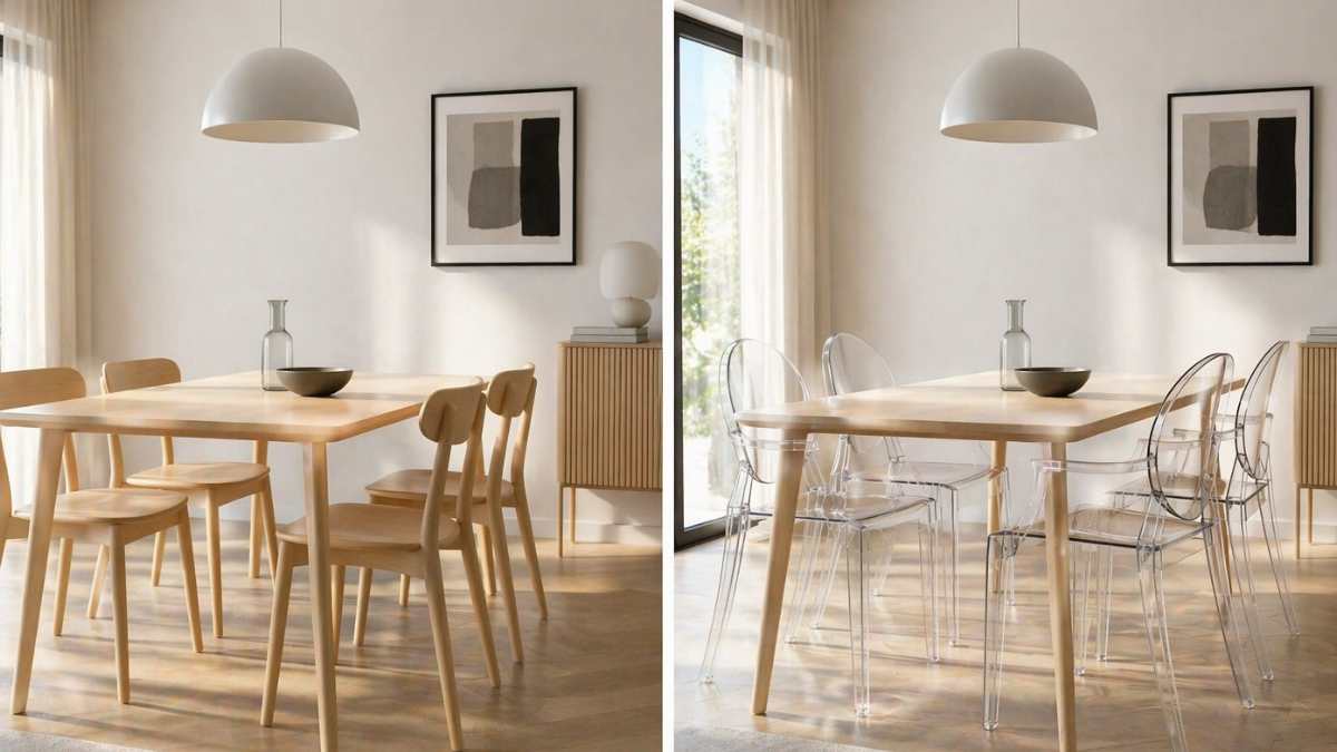
The table: the most obvious combination (and the one everyone gets wrong)
An IKEA table like LISABO or MELLTORP is a perfect base, but tends to look “catalog” when combined with chairs of the same type. The result is correct, but without character. When instead of the classic coordinated chairs you place, for example, Kartell Masters or Louis Ghosts, the scene changes immediately. It is not only an aesthetic issue: transparent or glossy chairs reflect light, lighten the visual volume and create a clear contrast with the opaque table. The point is not to “prettify”, but break the monotony. A simple table remains simple, but is perceived differently because it has elements around it that work with light and shape.
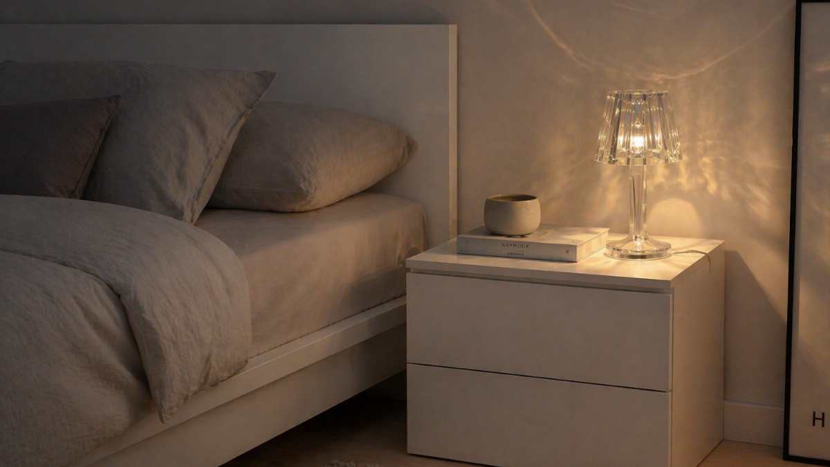
The room: the bedside table is the real weak point
IKEA rooms are always open, but often they are all the same. MALM bed, coordinated nightstands, neutral lighting. All right, but no point of interest. Replacing a standard lamp with a Kartell, such as a socket or battery, really changes the scene. It’s not a “tasteful” detail, it’s a accurate visual interference: transparent or colored plastic reacts to light, creates reflections on the wall and on the bedside table, breaking the static. If the bedside table is very simple, like the LACK model or a basic MALM, this type of insertion avoids the “single block” effect and introduces an extra layer without changing furniture.
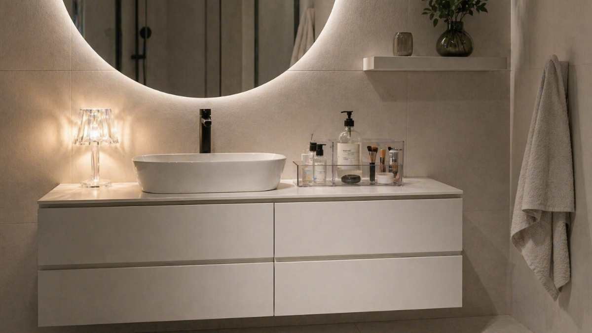
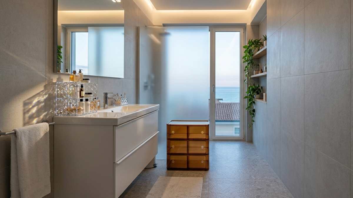
The bathroom: where very little is enough
Un mobile bagno IKEA, come GODMORGON, it’s clean, functional, yet extremely neutral. The danger is that it looks like an “exhibition” environment, without an identity. Here the Kartell details work precisely because they are small but visually powerful. A container, item holder, or even just a transparent element placed on the surface instantly creates a contrast with opaque surfaces of the furniture. The point is not to fill the bathroom, but insert an element that captures light. In an already small and tidy space, it takes very little to change the perception.
The Most Common Mistakes (And Why They Ruin Everything)
The most common mistake is to think that adding “something designer” is enough to improve the space. In fact, if Kartell’s piece is introduced without logic, it becomes an out-of-context item. A very common example is placing a dummy lamp on a piece of furniture that is already full of objects. In this case it does not create opposition, but confusion. The object completely loses its role and becomes one among many.
Another mistake is choosing colors that do not communicate with the rest. If you place a very strong Kartell chair, perhaps transparent in color, in an environment already rich in different materials and shades, the result is not interesting but chaotic. The piece doesn’t stand out, but clashes with everything else. Often the opposite is also the case: overly neutral environments where more Kartell elements are inserted in order to “give character”. In fact the original effect is completely lost. If everything is virtual, nothing is real. Contrast works when dosed.
An underrated mistake is about proportions. A Kartell object that is too small in a large piece of furniture does not change anything, while one that is too large in a small space becomes invasive. The result is that instead of improving perception, an imbalance is created. Finally, there is a more subtle mistake: using these items as mere decoration. Kartell pieces work when they have a role, when interact with light or space. If they are treated as objects “to be placed”, they completely lose their meaning.


