
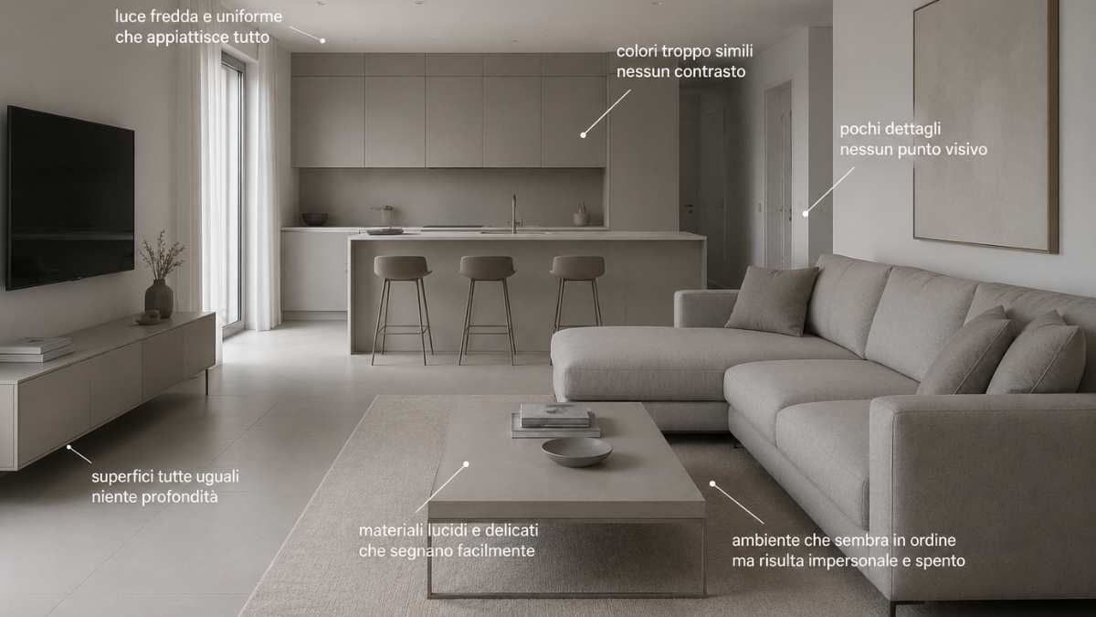
There are newly renovated apartments that after a very short time already start to convey a strange feeling. They are not old, they are not neglected, yet they seem to have lost energy. It often happens when we enter completely beige living rooms, bright kitchens without a visual point that breaks the continuity, or rooms where every surface reflects the same cold light. It is this feeling that is difficult to explain, but immediately perceived: a house that already looks “looks”, almost worn, even if the furniture is recent.
The problem rarely arises from the quality of the furniture. Many of these houses have expensive materials, refined finishes, thoughtful lighting. What is missing is often a component that is more difficult to procure: visual depth. When every choice follows the same aesthetic code, the environment loses intensity, contrast and movement. Everything looks right, but nothing really sticks.
In recent years, many homes have gone for very clean, almost photographic images: light-colored tables, opaque surfaces, neutral palettes, decorations reduced to a minimum. The result, however, in everyday life may become different from what is seen online. Shoes, bags, wires, shadows, natural light that changes during the day enter a real house. And when the decoration is very uniformit doesn’t take much to make it all look wrong.
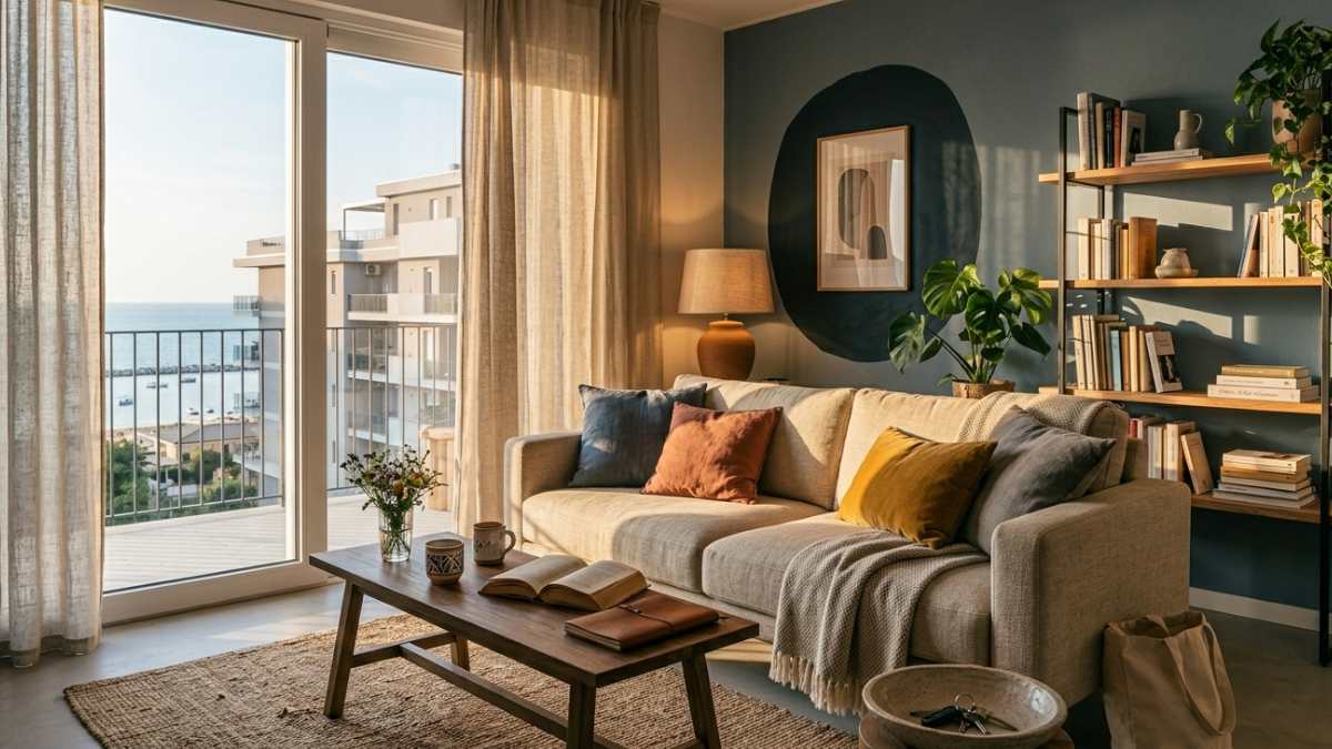
The point is not to fill in the blanks. On the contrary. The houses that stand up best over time are often the ones that are successful in creating perceptual variationseven minimal: a material that absorbs light instead of reflecting it, an irregular surface, a less predictable color, a calibrated contrast between cold elements and more vivid details.
The problem is not minimalism, but the flat effect it creates on the environment
Many modern homes are visually “tired” when every element speaks the same language. Light floors, light furniture, very light colored walls, white lights, neutral fabrics. Separately they work, but together they risk creating one environment without depth. The effect is particularly noticeable at night, when the artificial light flattens the surfaces even more and the room loses its atmosphere.
In a small living room this effect becomes even more obvious. If everything reflects light in the same way, the eye finds no stopping points. The room looks neat but also impersonal, almost temporary. It’s one of the reasons why some newly finished houses already look old after three or four years: not because they’re out of date, but because they don’t have time-adaptive optical layering.
Just enter two apartments furnished with the same pallet pto notice the difference. In the first there are only smooth, symmetrical, perfect surfaces. In the second, perhaps a warmer wooden bookcase appears, a lamp with soft light, a less rigid curtain, an opaque table that does not reflect everything. The perception changes immediately. The house seems more alive, more stable, less “catalog”.
The relationship between the materials is also of great importance. THE Highly polished surfaces tend to visually age faster because they show every halo, reflection or daily sign. In contrast, light materials or opaque materials can better absorb the passage of time. It is not only an aesthetic issue: it changes the way the environment is experienced every day.
Previously, many houses focused everything on the flawless result once it was finished. Every element seemed chosen to be photographed. After a few years, however, small changes in real life were enough to break this balance: objects left on the table, new chairs different from the originals, children’s toys, a visible cable, an overgrown plant. The environment began to feel cluttered more quickly.
In homes that work best today, almost the opposite happens over time. The interior looks designed for they accommodate movement, changing light, small daily changes. And that makes everything less fragile from a visual point of view.
Mistakes to avoid if you want to get a more natural and less “already old” result
One of the most common mistakes is to choose everything in exactly the same tone. Not only the color, but also the visual temperature. A completely cold environment, with identical gray and very white lights, risks appearing sterile after a while. Enter warmer materials, even in small detailsit immediately changes the perception of the space.
For example, the contrast between modern surfaces and more material elements works very well. A linear kitchen can be made more balanced with natural wooden chairs, less perfect fabrics or lamps that diffuse less aggressive light. The problem is particularly noticeable in very bright modern houses: if every material reflects too much, the environment loses its tranquility.
Lighting also plays a huge role. Many newer homes use cool spotlights and even light throughout. In everyday reality, this type of lighting tends to make everything look flatter. A warmer light distributed on multiple levels Instead, it creates bright shadows, depth and a much more believable domestic feel.
In small homes it is best to avoid very thin or completely hanging furniture if everything else is already minimal. Introducing at least one visually more “solid” element helps the environment appear less fragile. It is a detail that is often observed even in the accessible solutions of brands such as IKEA or Maisons du Monde: the most successful environments are not the perfectly coordinated ones, but those where there is balance between order and variation.
How the house changes during the day also matters. A living room that is beautiful only with light in the morning but extinguished at night risks tiring you much faster. For this reason, materials, curtains, lamps and colors should be chosen taking into account real life and not just the initial effect.
Ultimately, homes that last visually are not ones that chase absolute perfection. They are the ones who make it maintain a certain naturalness even when they are truly experienced. And this difference is noticeable as soon as you enter the room.


