
The kitchen is selected at least twice. The first time in front of the samples in the store, when everything looks nice and cohesive and the salesperson shows how the fronts match the worktop and how the sample floor complements everything. The second time is a few months after the installation, when you actually live in it, when you understand how the light changes during the day, how the colors behave with steam and with the artificial light of the evening, how the space feels when it is full of people instead of empty and photographed. They are often two very different cuisines.
THE The monochrome kitchen is the choice that almost always wins in the first round. One color, one finish, all cohesive, all coordinated. It’s perfect in the photo. The catalogs of Varenna, Boffi and Dada show the perfect synthesis of modern rigor. And indeed it is, under conditions. The problem is that these conditions rarely coincide with the average size of an Italian kitchen.
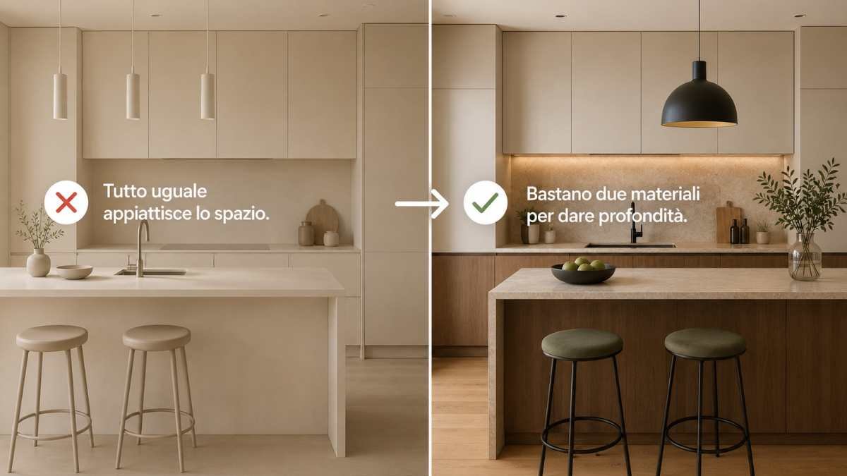
When everything is the same, space loses its boundaries
The paradox of the monochrome kitchen is that it works best in large spaces and worse in small ones, but it is most often chosen in apartments where the kitchen has twelve, fourteen, sixteen square meters. In a compact space, using the same color for the cabinets, base units, worktop and often even the walls creates a visual fusion effect that doesn’t expand the room: it flattens it.
To perceive the depth of a space, the eye is needed visual reference pointsdifferences that allow him to calculate where one level ends and another begins. When everything is the same color and finish, these references disappear. There The kitchen doesn’t look bigger anymore, it looks like a box. And this is precisely the flaw that professional kitchen designers know very well and which, apparently, never appears in catalogs.
The total white that crushes
A kitchen total white with glossy white facadeswhite quartz countertop and white walls is probably the most common and most problematic case. THE glossy enhances the effect: the surfaces reflect light on each other, creating a species diffuse glow that does not illuminate the space but makes it flat. In a long, narrow kitchen, bright white accentuates the feel of the hallway rather than softening it.
In addition, the monochrome glossy white And merciless with the signs of everyday life. Every imprint, every sketch, every vapor halo is immediately visible on all surfaces at once. It’s not just an aesthetic question: it’s a kitchen that requires constant attention to look like the one in the catalogs.
The charcoal gray that closes
The opposite of white is charcoal, which has dominated modern kitchens with equal force for the last ten years. Charcoal facade, concrete or dark stone top, often combined with dark gray stone floor. In kitchens with good natural light and high ceilings it works. In small kitchens or with small windows a environment that absorbs light instead of distributing itwhich seems smaller every hour of the day and which at night, with artificial lights, takes on a larger dimension weight that is difficult to correct.
How to escape monochromatic without giving up coherence
The solution is not the colorful kitchen in the most obvious sense of the term. AND enter the variant where it makes the most sensekeeping the palette limited but working in different materials and heights.
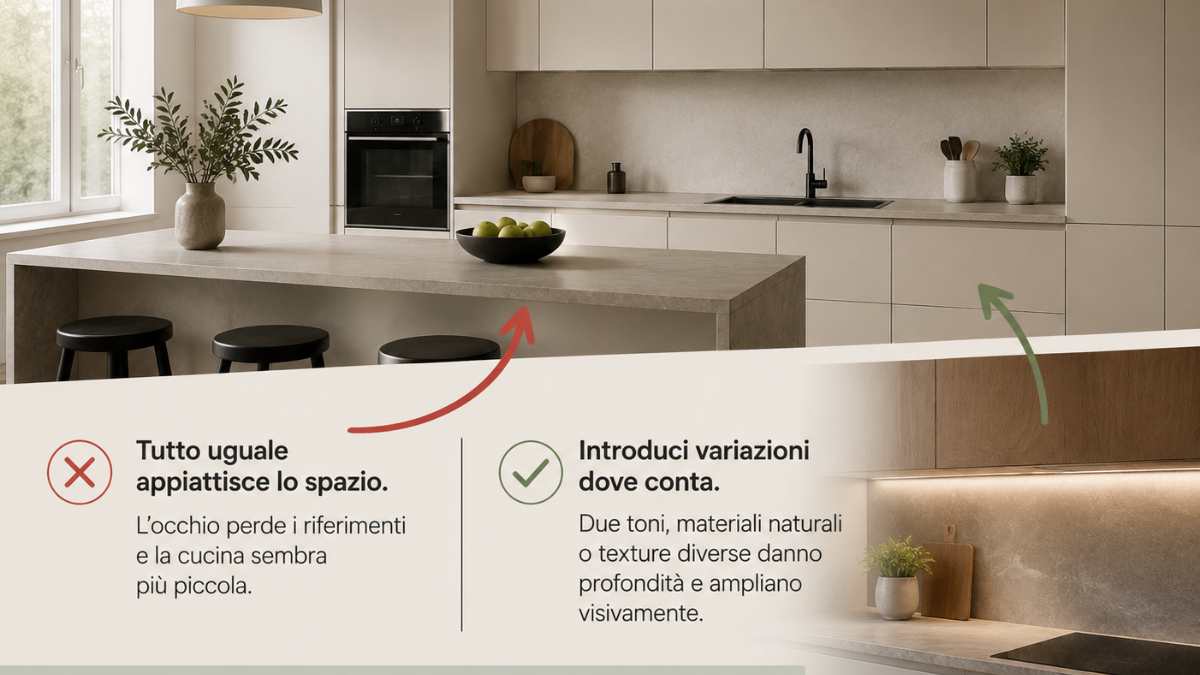
Il dual color, base units in one tone and wall units in anotheris probably the most effective intervention. Wall units have a lighter tone than base units they visually light up the upper part of the kitchen and restoration of separation between floors. You don’t need a stark color difference: two tones from the same family are enough, one warmer and one cooler, or one lighter and one darker, to give the kitchen the depth that monochrome takes away.
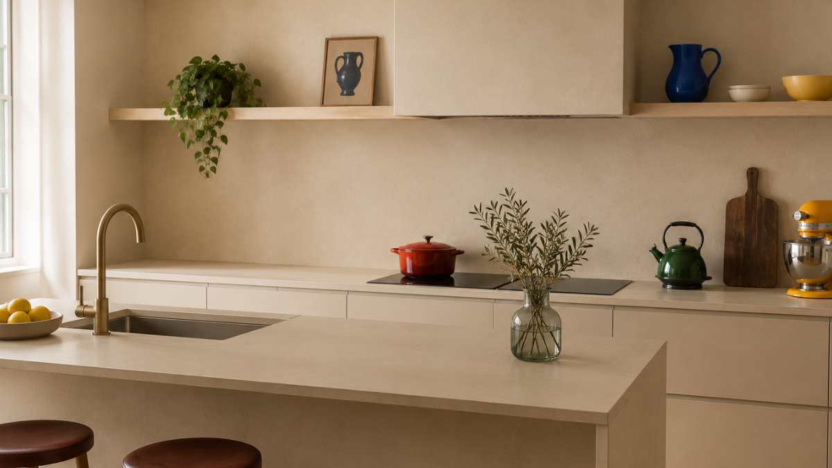
Il natural wood inserted into a specific elementthe bench, the peninsula, a side panel, completely change the perception of the space. Not because wood is the most beautiful ever, but because breaks the color continuum at the right placegiving the eye a tactile reference that monochrome never offers. Brands like Cesar Cucine and Snaidero work a lot on this combination in their latest projects, using wood as a calibrated breaking element in kitchens that remain essentially minimalist.
Il bench made of visible textured materialnatural stone, stone with variations in tone, marble with veins, perform the same function. It is not a different color, but one surface that responds differently to light from everything else. This is enough to make the kitchen look bigger than it is.
The perfect monochromatic kitchen exists, but it almost always lives in spaces we don’t have. What works in real life is almost always what you had the courage to do enter only one exception.


