
The entryway is the first area that someone passes through when entering your home. However, in most Italian apartments, it is treated as a non-place: white walls, a few hooks hung temporarily, a carpet that moves by itself. The reasoning behind this option is always the same: it’s small, not worth investing in. This is exactly the wrong starting point.
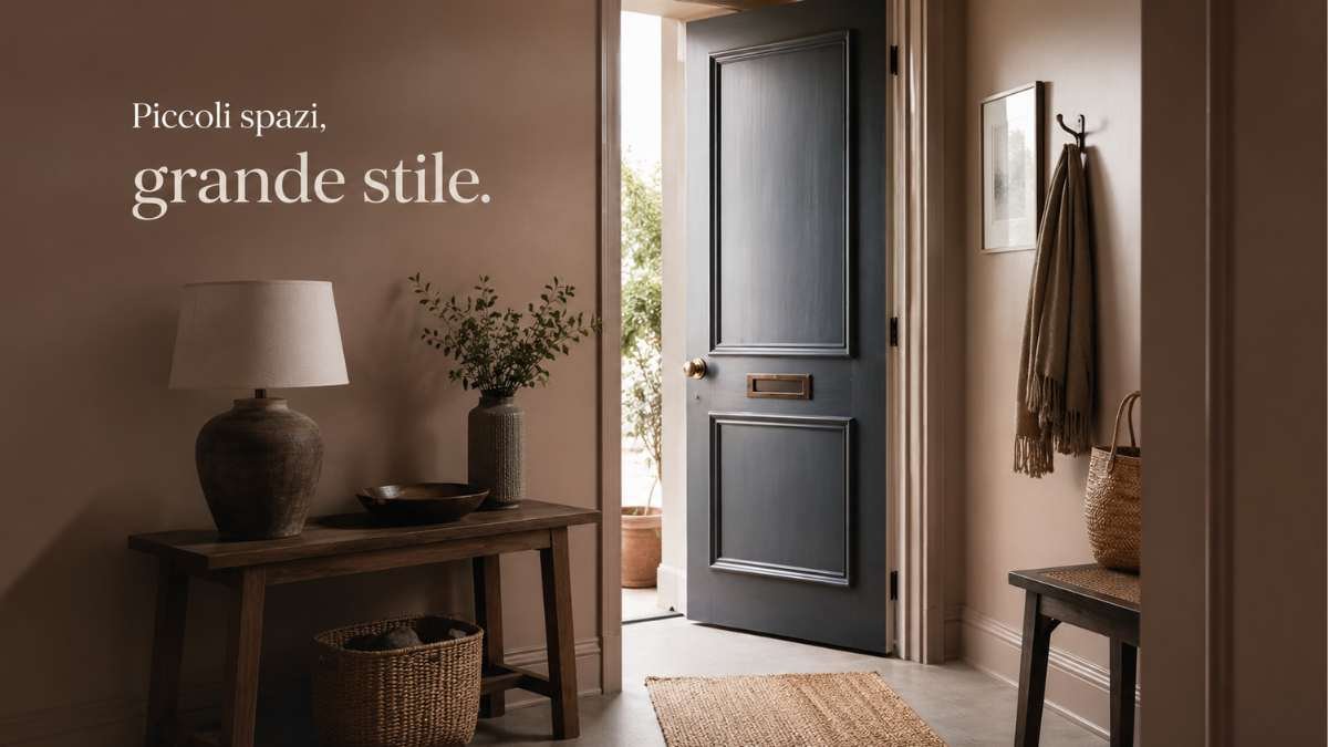
A small space does not require neutral colors to appear larger. It demands a precise direction, a visible intention. A three square meter entrance painted in bottle green or intense terracotta does not shrink: it transforms into a room with its own identity, separate from the rest of the house. Surprisingly, it’s the neutral white that makes the entrance look like a service corridor. A saturated color, on the other hand, makes this space pop wanted.
It’s not about being bold on principle. It is to understand that the entrance, precisely because it is small, is the space in which a bright color costs less effort and more performance: a few square meters to treat, an immediate impact on whoever enters.
The green that does not relax
Green has become the default furniture color modern, often expressed in dusty and soft tones that do not bother anyone. But in the entrance a completely different register works: a deep green, almost forest-like, with a strong blue component. Think about it Earth Green by Farrow & Ball, which is not exactly a relaxing spa green, but a color with depth and presence, able to absorb light without making it flat.
On one of his walls under a narrow entrancethis type of green creates a depth of perspective. When paired with a satin brass coat rack and a small walnut console, the result is a space that looks like it came straight out of a high-end interior design project, even on a shoestring budget. Farrow & Ball sells its paints for around €60 a litre, but two liters is often enough for an entry. The overall cost of color processing remains low compared to the result it produces.
Different but equally effective is the moss green in a matte version, the one used by studios like Studio McGee in mid-range American projects: applied to all four walls of a low, square entrance, with a full-length mirror with a light wooden frame, it makes the space three-dimensional and not suffocating.
Navy blue is not boring if you know where to put it
The navy blue in the entryway makes an effect that the living room can’t replicate. In the living room it is elegant but predictable. At the entrance it becomes almost theatrical, in the best sense of the term: it creates a vestibule with a purposeful character, as if that house had decided to present itself in a certain way.
The most immediate example: a long, narrow entryway, midnight blue walls (Hague Blue by Farrow & Ball or Midnight by Little Greene), existing terrazzo flooring that you don’t want to change, a black iron wall hanger with three hooks, and a vintage botanical print with a gold frame. The contrast between the dark wall and the golden metal detail creates a balance that would be impossible to achieve in a white entrance, because white does not contain the contrasts, it disperses them.
On a low ceiling, navy can be intimidating. The solution is simple: paint only up to a height of 220 cm and leave the rest neutral, creating a glossy painterly effect without the complexity of wood paneling. Ikea sells the Koppang profile that acts as a false dice to separate the two color areas for less than 15 euros per linear meter.
Terracotta is not 90s
There is a version of terracotta that belongs to the terracotta floors and rustic kitchens of the last decade and a modern version that has nothing to do with it. The difference lies in saturation and temperature: today’s terracottas are more orange, less hot, with a warm component that interacts with light woods and gray fabrics in a completely different way.
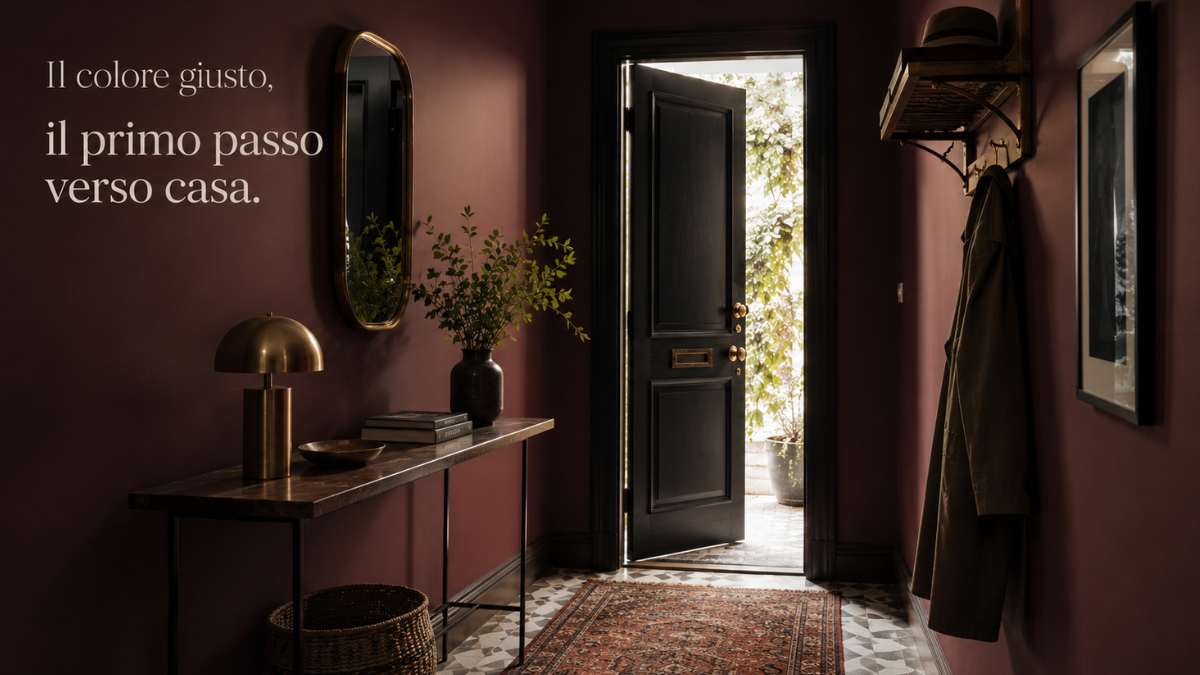
Applied to a small entrance with an irregular shape, saturated terracotta solves the problem of crooked walls or unexpected corners: it visually swallows them. An entrance with three matte terracotta walls, a bleached oak shelf with some raw ceramic objects and a 60×90 Berber carpet becomes a space with its own precise aesthetic logic. Spanish brand Kave Home has a range of ceramic accessories with this palette, with affordable prices and online distribution.
The most interesting variant is the burnt terracottaalmost rust, which works in apartments with exposed beams or dark parquet floors. In this context, it is not a reference to the Mediterranean style, but almost industrial, especially if combined with a hanging chandelier with an amber bulb.
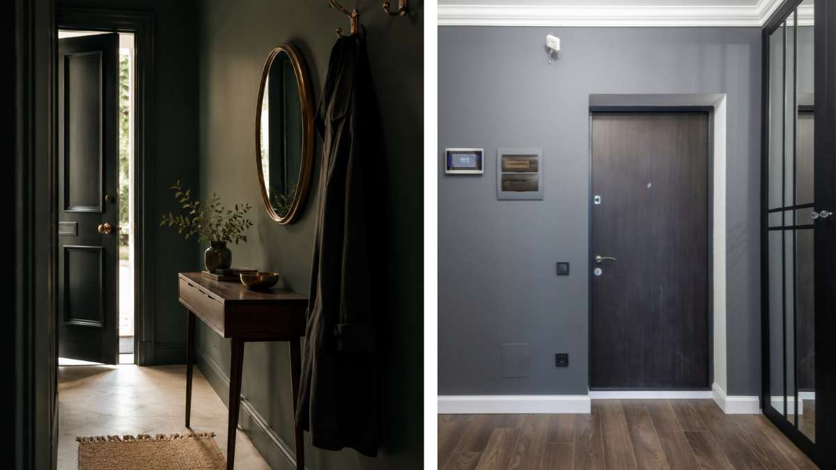
Black: when the small space stops apologizing
Painting an entryway black is the scariest option and the one that produces the cleanest results. Not because it’s the most extreme choice ever, but because it eliminates any ambiguity: this space isn’t trying to be like anything else.
Studio Peregalli, the Milanese studio known for historically researched interiors, often uses dark, almost black, backgrounds in transition spaces. The principle is the same as some theaters: darkness before you enter the main hall. In a private apartment it works in a more everyday way: a matte black entrance, with an existing gray stone floor, a round brass mirror and two smoked glass sconces creates a visual sequence that prepares the eye for the rest of the house rather than being an anonymous prelude.
Black absorbs artificial light and returns it in a different way than light colors: light sources become protagonists, even if they are cheap. Ikea Nymo applique dove with an incandescent lamp on a black wall have more effect than an 80 euro ceiling lamp on a white wall. The relationship between investment and perceived return changes completely.
How to choose without making the wrong color
The most underrated variable in choosing an entryway color is the available natural light, or rather the lack of it. Most entrances have no windows. In this case, light colors don’t really benefit because there’s no natural light to enhance: a white without natural light is as flat as a blue without natural light, but the blue at least has character.
The practical advice is to always sample at least 30×30 cm of wall and observe it three times: morning with lights on, afternoon with any filtered natural light, evening with prevailing artificial light. Jotun Lady paints, available in more than 2000 shades, offer 0.45 liter samples for less than 10 euros, a minimal cost compared to the risk of getting the entire paint job wrong.
A technical detail that makes the difference: the matte finish absorbs wall imperfections and gives depth to the color satin finish resists wear better in a transitional space where the walls are constantly touching. For dark colors in a high-traffic entryway, a satin finish is almost always the most sensible choice.
The entry you’ve been ignoring for years is just waiting for a decision. Not a renovation, not a big budget. A precise color, applied well, changes the perception of the whole house from the moment you open the door. The rest of the partition doesn’t matter in that first second.


