

Grandma’s cupboard stayed in the cellar for three years. Too big, too dark, too much cumbersome for this bright open plan space with porcelain floor and white lacquered kitchen. Then one day, almost out of logistical necessity, it ended up on the living room wall. And from that moment, the room began to make sense.
This pattern repeats itself with a frequency that interior designers know well: antique furniture inherited or found by chance at the flea market becomes the starting point for a project that no catalog could suggest. Not because vintage is a magic formula, but because it introduces something that modern environments struggle to create on their own: a visual layer, a detail that the eye can explore many times without exhausting. A wood grain, a carved door, a patina that tells of decades of real use. Everything that, in an era of smooth surfaces and neutral colors, automatically becomes the protagonist.
The problem is never the cell phone itself. The problem is not knowing where to put it, what to put next to it and why it works when it works.
Focus is not bought, it is inherited
In modern open spaces, the main stylistic danger is not disorder but la visual monotony. Continuous surfaces, squared geometries, neutral tones that add up without ever creating friction. The eye rolls without finding a place to stop. It is precisely here that an antique piece of furniture performs its most precise function: not decorative, but insightful.
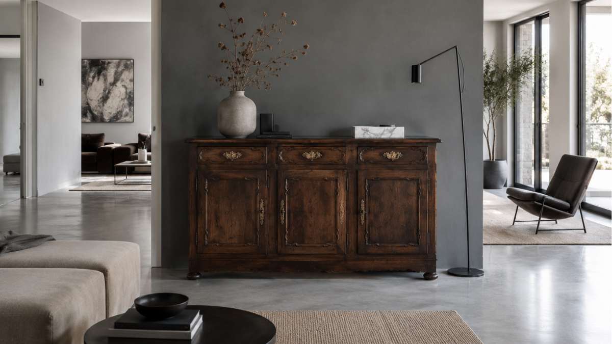
In technical terms we are talking about a focal point, the point of arrival of the gaze that orients the entire reading of the space. A rounded walnut chest of drawers from the early twentieth century, set against a wall painted in smoke gray, absorbs all available attention. The deep textures of the wood create a three-dimensionality that no painting, no geometric wallpaper can copy with the same material reliability. Boffi and Poliform know how to design perfect kitchens, but none of their catalogs sell the effect produced by a sideboard with the original blackened brass knobs.
The choice of position is decisive. Furniture should stand on a clean surface, with no visual competitors in the immediate vicinity. A neutral wall acts as a theatrical backdrop. A wall with too many hanging objects turns the focal point into noise.
Let it breathe: the rule that no one applies immediately
The most common mistake when introducing an antique piece into a contemporary setting is not choosing the wrong piece of furniture. She surrounds him with other old objects, almost to reassure him. The result is an angle that looks like something out of a Provençal brocante, where each element cancels out the others.
Designers working in his field mix and match apply a precise rule: the strong point must be isolated and framed by elements of the opposite sign. Floor lamp in black matte metal Flos, disc in white marble, mirror with geometric frame in polished brass. Modern, austere objects that do not compete with antique furniture but make it stand out in contrast.
Patricia Urquiola has proven this in numerous residential projects: placing an industrial iron table in dialogue with an original Thonet chair from the 30s produces a visual tension that no coordinated set can create. Not because they are opposites, but because they both have their own coherent formal grammar, and the comparison between the two grammars is what makes the space readable and interesting.
Leaving empty space around antique furniture is not synthetic laziness. It is the choice that gives it back the special weight it deserves.
The color of the wall is not a detail
Behind every well-integrated piece of antique furniture is almost always a careful color decision. Dark wood needs a base that neither swallows nor crushes it. Pure white tends to isolate furniture in an overly museum-like way. Beige makes it disappear.
The tones that work best with vintage solid wood pieces are those with a precise thermal component: the sage green, baby blue, gray with warm undertones. Farrow & Ball, which produces mineral paints with a color depth that is difficult to duplicate with industrial products, has created entire chapters of its catalog based on this principle. The color Mole’s Breatha medium gray with warm undertones, it has become a benchmark for those looking to enhance chestnut or walnut furniture without burdening the environment.
For those working with smaller budgets, Behr and Dulux offer reliable alternatives in the same color range. The important thing is to test the color with physical swatches applied to the actual wall, don’t trust the monitor screen.
When the furniture says more than the space in which it is located
There is one dimension of furniture that design catalogs cannot sell: the narrative value of an object with a history. A Minotti sofa is flawless, but nothing to write home about. A cherry desk bought at auction with the notary’s stamp still on the back has a biography.
This difference is not emotional. It affects the perception of the space by those who live there and those who visit it. The houses that are remembered, the ones that make a big impression, almost always have an anomalous element, a piece that doesn’t belong in the vocabulary of the rest but that communicates with everything else. Antique furniture performs exactly this function: it introduces a temporal discontinuity that makes the space more complex, less predictable, more human.
The most popular interior design studios of the moment, from Ilse Crawford to Studio Mumbai, systematically work with this principle: the temporal layering of objects is the most effective method of giving character to a space. Not because it’s a trend, but because it responds to something very simple about the way people read environments.
Grandma’s chest of drawers is still there, against the smoky gray wall. Next to it is an Artek lamp and two stacked books. Nothing else. And the room, finally, has something to look at.


