


An attic has an unrelenting geometry. The walls tilt, the ceiling drops at unexpected angles, and every color choice is enhanced in a way that simply doesn’t happen in regular apartments. Painting an attic is an operation where the margin for error is narrow: one wrong tone and the space closes in on itself, turning into a honey-colored box that weighs like lead. The right tone, however, and the same low scales become something to be desired.
The starting point is not to choose a color you like. It’s about understanding how light moves through that space during the day, how many windows there are and where they’re placed, whether skylights bring in zenith light, or whether the only openings are small side dormers. Correct color response depends on all of these, not a generic Pinterest palette. And then there is the issue of surfaces: in a loft, sloping walls are often painted to blend with the ceiling, and this completely changes the rules of color.
White, gray and beige – not everything saves the day
White is not the automatic response to a low, uneven space. There are at least four categories of whiteness, and some can be spectacularly deceiving. Whites with a yellow or pink base, on sloping surfaces exposed to natural light, turn almost orange in the afternoon. Farrow & Ball has codified this issue well: theirs All White (n.2005) is one of the few truly neutral whites that resist light variations without changing. It costs around 65-70 euros per litre, but is designed to maintain a consistent shade in difficult lighting conditions.
Light grays work well, but with one condition: they must have a cool, bluish or greenish base. Warm grays, those with beige or beige undertones, on the attic ceiling tend to create a sense of compressed space more than any dark color. A gray like Pebble Shore by Dulux The grays of Farrow & Ball’s Architects series (Mole’s Breath, Cornforth White) remain stable and airy even on surfaces that do not receive direct light. Beige, except in very specific cases with plenty of light, should be treated with suspicion: in its most saturated version it can refer to the inside of a pack of cigarettes.
The colors no one expects to use in the attic
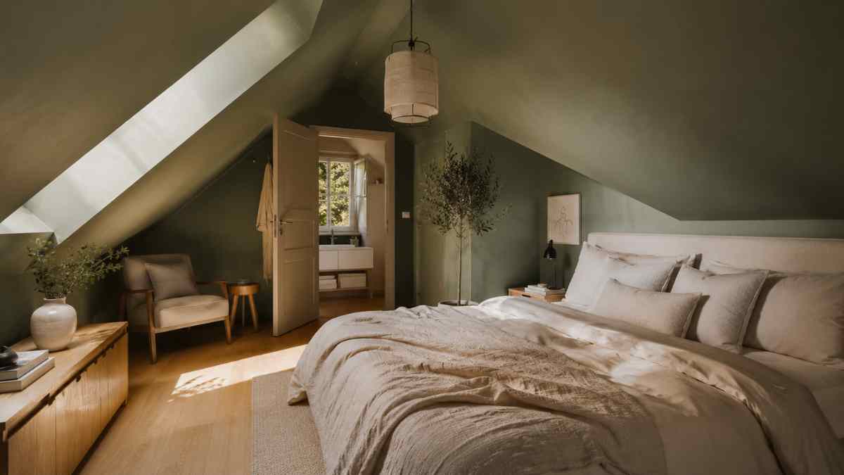
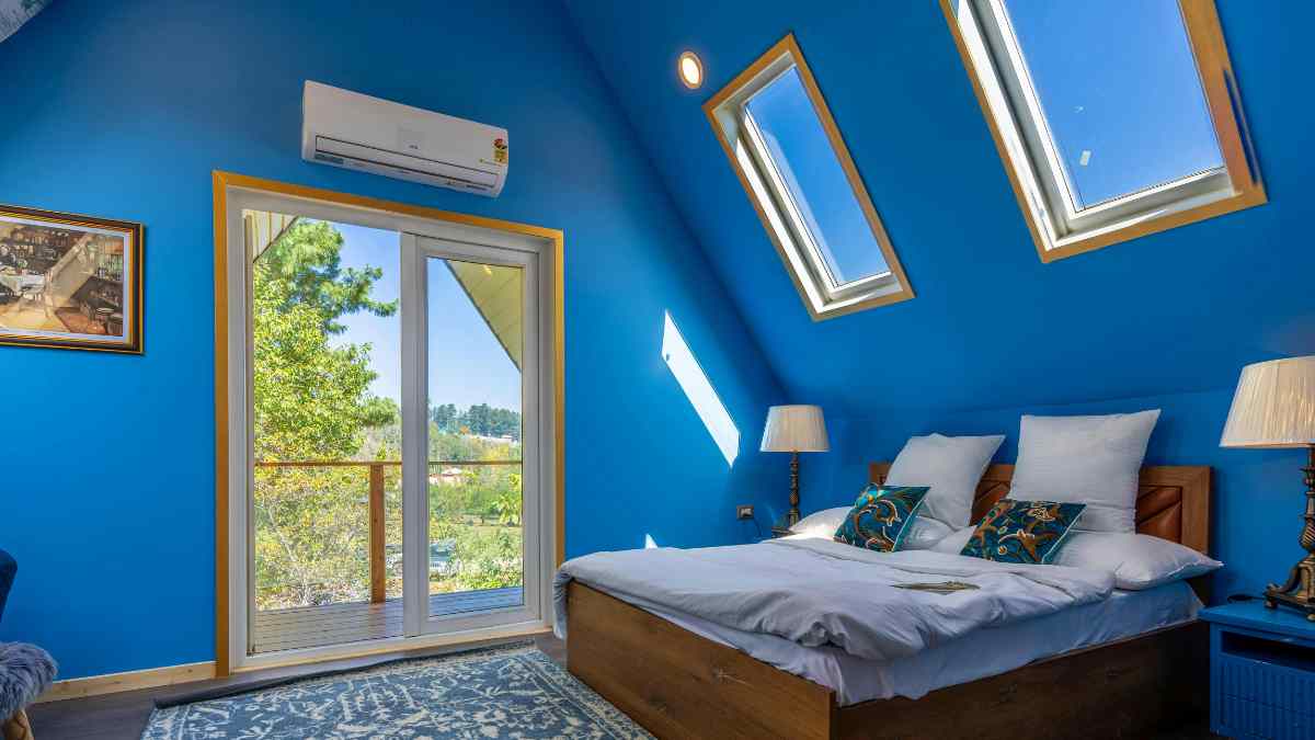
Sage green, dark green, cobalt blue, even black: In many attics they work better than white. The reason is counterintuitive but solid. When a sloped surface is already perceived as a dominant architectural element, painting it a bold color turns it into a conscious choice rather than leaving it as an unsolved problem. Dark color causes the eye to stop measuring distance between himself and the ceiling.
London-based interior design firm Studio McGee has documented several interventions in low-ceilinged spaces where the uniform dark color on the walls and ceiling produced the opposite effect of dread: the space became enveloping, not claustrophobic. It’s a distinction worth remembering. Little Green’s military green, theirs Sage Derby or the darkest Green Bronzecontinuously applied to walls and pitched ceilings, it can transform a loft into a space that has its own precise identity. The prices of Little Greene are around 55-60 euros for 2.5 liters.
Black, then, is a radical choice that works well in lofts with zenithal skylights. The light falling from above on black surfaces creates a contrast that makes the space theatrical. IKEA, with its Rörstrand linehas proposed light furnishing solutions on a dark background in recent years for informal environments: this is the color principle.
Where color really does the heavy lifting
In an attic, managing the junction areas, i.e. the points where the vertical wall meets the inclined wall, is the most overlooked aspect. Many paint everything the same color without thinking, others create clear dividing lines. The most effective solution is often a third way: using the same color but with different finishes. The vertical wall in matte finish, the inclined wall in satin finish reflects the light differently and creates a subtle but legible distinction.
If you choose to use two colors, the rule of thumb is this the lighter color always goes on the sloped part of the roofnot on vertical walls. The opposite effect, light walls and a dark ceiling, only works in attics over 2.70 meters high, otherwise the result is a hat that looks difficult to get out.
Another technical aspect: mediocre water-based paints cover wooden attic surfaces better than solvent-based paints, which tend to highlight knots and irregularities in the support. Marchi come Zoffany o Mylands, Both British and distributed in Italy through specialist retailers, they have specific lines for difficult surfaces with accurate color performance even in thin layers.
The color that looks safe but isn’t
Straw yellow, peach, salmon: the whole family of warm and desaturated tones is perceived as a soft, almost neutral option. In a loft, however, these shades can produce an effect that could be described as a permanent sunset, where the late afternoon light seems permanently installed on the walls. You might as well like it, for goodness sake. But it should be chosen with awareness, not as an alternative to white.
Pink, in the most modern and cold versions, like Farrow & Ball’s Sulking Room Pink, it behaves in a surprisingly neutral way on sloping surfaces. It has a grayish-lilac base that keeps it stable in different light conditions and keeps it away from blush tones that age badly.
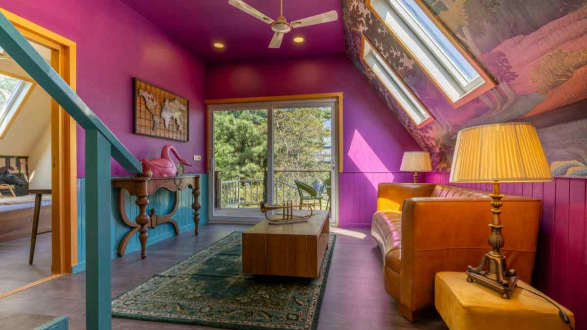
The colors you really need to avoid are those with high saturation in the warm half of the spectrum: orange, brick red, rich ocher. Not because it’s bad, but because in a space where the colored surface is tilted and close, the saturation is perceived more intense than normal. An orange that would give character to an open spacein an attic it becomes an element that cannot be ignored for more than twenty minutes.
The right attic, after all, is the one where color is not perceived as such, but is perceived as something that already belonged to that space. A color that seems almost inevitable, as if there was never another possibility. Getting with us requires tests, samples of at least 30×30 cm size observed at different times of the day and a willingness to revise the first option.