

Architects have always known this: houses are not read by rooms, but by fragments. A narrow hallway can have more personality than a huge living room. A forgotten corner, the exact spot where two bare walls meet, can become the detail that distinguishes a sophisticated interior from a simply furnished one. Yet hardly anyone thinks of it in these terms. Almost everyone, faced with an empty corner, looks for a quick solution: an umbrella stand, a houseplant bought on the go, a chair that is never used. The result is a space that is neither furnished nor free and ends up collecting bags, chargers and boxes waiting to be tidied up.
The problem is not the space. It’s the approach. Improve an unused corner does not mean that you fill, but to design it as a microzone with its own functional identity. A point at home that answers a specific question: what am I doing here? Do I read, sit, exhibit, work? Only by starting from this question can you get something that really works and that people who enter your home will notice before anything else.
Why corners trouble us (and it’s not our fault)
Home environments are designed with central surfaces in mind: the sofa, the table, the bed. Corners are architectural remnants, spaces that no standard piece of furniture is designed to precisely occupy. Furniture manufacturers make items with measurements that assume free and linear walls. A 90 degree angle between two walls often leaves a gap of 40 or 50 centimeters that no standard piece can fill well.
Added to this is a question of perspicacity. Corners are border areas between two visual planes: they attract the eye only if there is something worth seeing, otherwise they disappear from the mental map we build of our home. They become, in the literal sense of the term, blind spots. And that’s why they get messy: we don’t see enough of them to keep them in order.
The modern trend of micro living turns this logic upside down. Instead of considering the corner as a space that is difficult to integrate, he treats it as an autonomous cell, a sub-environment with its own rules, almost a room within a room. It’s a principle that stems directly from Japanese design and the culture of compact spaces, where every centimeter has a stated function.
The method: first the function, then the container
Before choosing any furniture or accessories, it is worth stopping at a trivial but rare question: what activity is missing in this room? Not what to put in, but what to do with it. A corner in the living room near the window could become a reading corner with swivel armchair and arc reading lamp. A narrow space in the hallway could be turned into a place for keys, mail and home messages. A corner in the bedroom could accommodate a small work desk or sink area.
The difference between a corner that works and one that doesn’t almost always comes down to the consistency between the function chosen and the objects chosen to support it. HAY, the Danish brand known for its ability to make the principles of good Scandinavian design accessible, has built part of its catalog on this premise: pieces like About a chair or the Matin lamp They are designed to fit into residual spaces without weighing them down, precisely because of their definitive shape and calibrated visual weight. They don’t occupy space, they inhabit it.
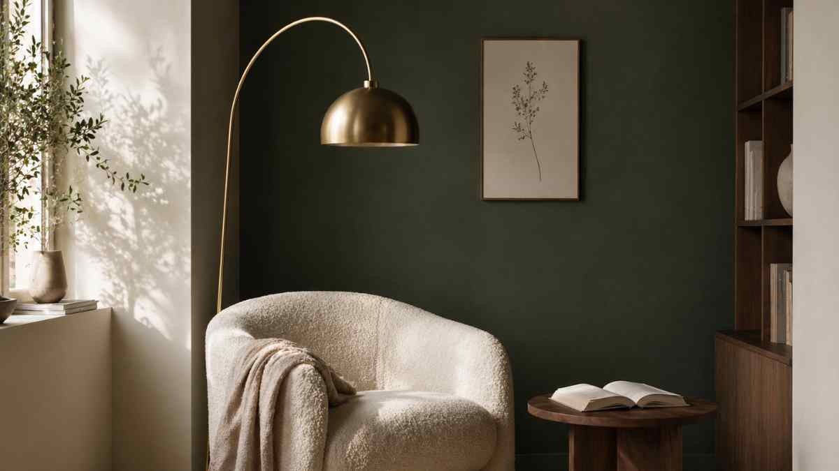
A tangible visual example: a corner between the bookcase and the window, with a low pouf in creamy white boucle, a mini version of a Flos Arco reading lamp and a small brass tripod table. Three elements, one exact function, zero redundancy. The corner ceases to be empty and becomes the place where everyone wants to sit.
Niches, bays and joints: each geometry requires its own answer
Not all angles are the same and the same approach is one of the mistakes that produces disappointing results. A wall niche, for example, can become a full-height bookcase without adding depth to the room: simply place shelves flush with the opening, choose a color palette that matches the surrounding wall, and use the bottom of the niche as a display surface. IKEA popularized this approach with the system Kallax used in the inlay version, but customized solutions in lacquered MDF give much cleaner results, with an investment starting at around 300 euros for simple woodwork.
The subwindow is a different case. The presence of natural light makes it an already privileged space and the temptation to leave it free is understandable. A personalized storage bench, 45cm high and 40cm deepit solves three problems at once: it adds seating, creates storage, and reinforces the window as an architectural element. Solid natural oak wood tops, even in locally made models, cost from 150 to 300 euros and last for decades.
Joints between two walls at a narrow angle, those that are less than 60 cm, are best treated with vertical elements. A column of scalar shelves or a modular system such as String furniture by Swedish designer Nils Strinning, allows you to take advantage of height rather than width, turning geometric constraint into a compositional element.
The detail that makes the difference: defining the visual perimeter
A corner well furnished but not visually defined continues to look relaxed. Defining the perimeter of the microzone is the step that turns a selection of objects into a drawn corner. It can be done with a small carpet delineating the floor, with a wall of different color behind it, with a frame of light created by an arc or an adjustable ceiling light.
Color is perhaps the most effective and least used tool in this context. By painting only one wall, the one that forms the background of the corner, with a different shade from the rest of the space, it creates an immediate scenography. Deep colors, such as bottle green, midnight blue or terracotta, tend to visually reduce the size of the surface and push objects placed or hung in front. Farrow & Ball, with shades like Hague Blue or Studio Green, has essentially redefined the use of color in modern European homes, proving that a dark wall in a small corner does not take away space, it structures it.
After all, the most successful angle imaginable is not necessarily the most expensive nor the most complicated. It is an element in which every element responds to a logic, where one immediately understands what is being done there, and where the geometry of the wall has become part of the project instead of being the problem.


