

Each shelf says something about whoever lives there. Not because of the items it houses, but because of how it arranges them. And while one accumulates with the collecting instinct, residential designers think the opposite: they start from the void and decide what is worth filling. THE shelfieuniting term shelf and selfies, has become one of the most common visual forms on social media, but its successful version has little that is spontaneous. Behind these seemingly random compositions, there is almost always a precise, geometric, reproducible logic. You don’t have to be an interior designer to apply it. However, it is important to understand that the shelf is not a shelf where you put things that cannot find a place elsewhere.
The geometry that the eye does not see but feels
His rule odd numbers is one of the basic principles of visual merchandising, adopted for decades in the composition of window displays and exhibitions. Three objects, or five, naturally create a hierarchy. The brain groups, creates a center and two satellites, perceives movement. With four or six elements, however, the eye tends to split into equal pairs and the result is static, sometimes even anonymous.
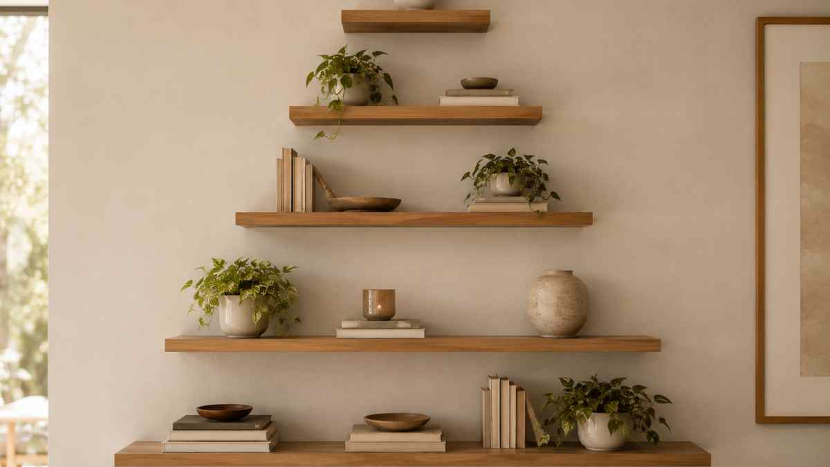
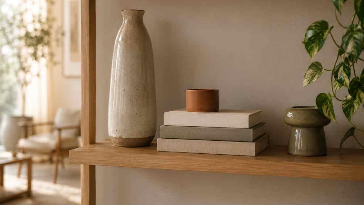
His technique optical triangle exploits precisely this mechanism. You take the group of three objects, such as a tall vase, a book placed horizontally, and a short candle, and place them so that their vertices form an imaginary triangle. The tallest element acts as a vertex. The other two descend to different, non-symmetrical heights. The result is a path for the eye: from one point to another without blocks, without accumulations, without that sense of overcrowding that makes the average shelf chaotic. Hay, the Danish brand known for its approachable design, builds its composition catalogs with exactly this logic: every image is verifiable, every group of objects follows the rule of three.
The void as a design element
One of the most common mistakes in the composition of shelves is the fear of free space. The desire to fill every available inch is understandable, but that’s exactly what turns a shelf into storage. Interior designers define the strategic void with the Anglo-Saxon term negative space: it is not the absence of objects, it is the space that works for nearby objects, giving them breath and relief.
The same reasoning applies to books. An uninterrupted series of vertical volumes has significant visual weight and blocks light. Breaking this continuity by placing some groups horizontally, perhaps with an object on top, completely changes the rhythm of the composition. The brand In the army, another Scandinavian brand with a strong design identityhe often uses this vertical-horizontal switch in combination with monochrome or kraft paper-wrapped covers in his looks, to reduce the visual noise of the titles and make the volumes part of the color scheme, not just the content.
The practical advice is simple: every three books verticallyenter at least one horizontal group. And leave at least one empty space per partition. It’s not necessarily minimalism, it’s rhythm.
Where they really work and where they don’t
The shelf is not a neutral object: the context in which it is placed determines its effectiveness. At residence it is the element that more than any other builds the visual identity of a space. Full-height bookcases, such as Billy by Ikea with its 40-year history and the Billy Oxberg version with glass doors, act as a system to be assembled, not a piece of furniture to be filled. Open shelves in the living room make sense when there is intention: selected objects, considered proportions, a few books worth showing.
In Kitchen Shelves are useful, but they require honesty. If the counter is chaotic, the shelf will also be chaotic. They work well for objects that have a uniform color or material: a row of glass jars with loose spices, a row of stacked ceramic bowls of the same shade, a few aromatic plants. The problem arises when the kitchen shelf becomes the receptacle for anything that does not have a fixed position.
In baththe shelves have a strong functional reason, but the line between order and disorder is thin. The idea is simple: removing the product’s original packaging and using coordinated dispensers or containers turns a chaotic shelf into an acceptable composition. Not necessarily pretty, but at least coherent.
In bedrooms the shelves above the bed are spectacular but practically inconvenient: nobody wants to get up at night to reach a book. Better that bedside table with built-in shelf or a small wall installation nearby. Decorations, high or on the side of the bed, work if they are kept light, with few objects, preferably not fragile.
Where are the shelves less functional? In narrow entrances, where the reduced depth forces flat objects or books, and in small children’s rooms, where they quickly become danger zones or hard-to-reach surfaces full of forgotten toys.
Color, material, consistency
A composition that works visually usually respects a narrow palette. It does not mean monochrome, it means that objects communicate with each other with color or material. A group of three works better if two share a tone and one contrasts, rather than three unrelated colors.
The material of the shelf itself matters. A shelf inside natural oak brings heat and goes well with ceramics, paper, fabrics. One in painted metal, like the ones in the line France toes with interchangeable adjustable legs, it has a more industrial aesthetic that requires items with some formal personality to keep them from looking cold. The choice of the shelf cannot be separated from the choice of what goes on it.
One last detail that makes the difference: the installation height. Shelves placed too high become decorative shelves that no one really looks at. Those at eye level are the most effective for displaying a composition. The low ones, about 90-100 cm from the ground, work in specific contexts, such as studies or corridors, but require objects that are interesting even when viewed from above.
A system, not a collection
Designers who create living spaces talk about shelves as a system that needs to be updated over time, not a composition to be fixed once and forgotten. Each season brings new objects, something moves, something is removed. What makes a shelf well-made is not the perfection of the original layout, but the ability to evolve without losing coherence. And this coherence, after all, is built starting from geometry: three objects, a triangle, a bit of space.


