


There is no official clutter palette. However, anyone who has ever lived in an apartment with white walls knows that some environments look chaotic even when they are clean, while others exude an almost unnatural calm, no matter how many things are on the shelves. The difference, in most cases, is the color. Not in the simplistic sense that “blue relaxes” or “green brings balance”, this is the stuff of online personality tests. The mechanism is more specific and has to do with how our eyes perceive contrast, depth and boundaries.
When an environment has many elements that visually compete with each other, the brain works harder to “solve” the scene. The wrong background color enhances this competition. Only one dampens it, even without moving an object. The color in question isn’t just one, it’s a family of tones, and understanding how it works can radically change the way you read a space.
Because white is not the neutral solution we think
Pure white, that of construction sites or hospitals, is one of the most difficult backgrounds to manage in a normal home. The reason is the contrast: on a very white wall, every colored object, every piece of furniture, every cable or frame becomes an independent visual element. The result is that the space says everything it contains, for better or for worse.
The tones that work best as a background are those that they absorb optically without disappearing. Warm grays, off-whites with a yellowish or pink base, deep beige: all colors that reduce the general contrast of the environment and create a kind of underlying coherence. Farrow & Ball has built much of its fortune on this intuition: theirs Elephant breath a warm gray with a purple base has been one of the best-selling colors for years precisely because it acts as a quiet backdrop that doesn’t compete with anything.
The mechanism does not change if a more affordable brand is used. Zoffany, Little Greene, but also the Volvox series by Bauwerk they work in complex, physically based coloration that returns an opaque materiality: less reflection, less contrast, less visual noise.
The tone that commands without hiding
If we had to identify a color family with an above-average ordering effect, it would be dei deep gray cross between gray and beige with at least 15-20% warm pigment. Not the desaturated greige of the 2000s, the anonymous one from a real estate showroom. But tones with character, slightly earthy, which in modern furniture are often found in combination with surfaces made of concrete, natural unpainted wood or stone.
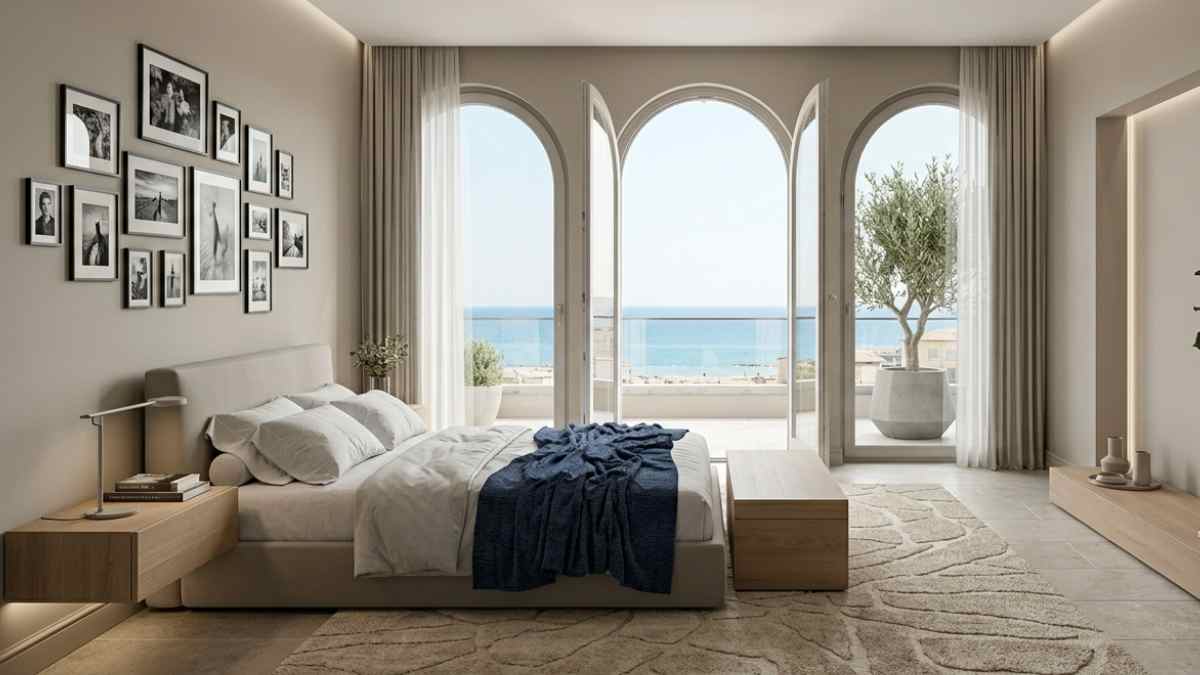
Why do they order? Because neither their light nor their dark tonal value creates an intermediate zone that absorbs both shadows and reflections. In practice, a white piece of furniture on a deep gray background loses some of its strong outline. A dark object does the same. Everything converges towards a common visual register and the eye reads the whole as a unity rather than a sum of parts.
A specific example: in his works Milanese studio Vudafieri-Saverino Partners, who works in private homes and boutique hotels, the use of natural pigment or clay bases is almost systematic. Not for a minimalist aesthetic, but precisely to contain the complexity of living spaces.
How it works on surfaces other than walls
The same principle is carried over to furniture, fabrics and flooring. A sofa in oat-colored bouclé fabric in a living room with dove gray walls is almost invisible as a shape in the sense that it does not attack, it does not mark the space, it does not introduce an inhibiting element. Conversely, a burgundy sofa against the same background creates a strong focal point that requires everything else to align with that choice. The stronger elements coexist, the more chaos the eye perceives.
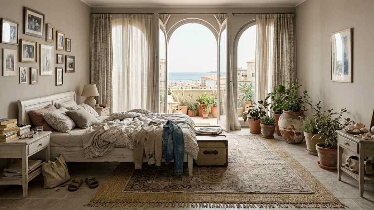
Ikea has understood this very well and it is no coincidence that the latest Söderhamn and Kivik collections almost all focus on variations sand, rope, moles as primary colors. It’s not minimalism, it’s contrast management on an industrial scale.
On the floors the situation is similar. A natural bleached oak parquet, between 120 and 160 euros per square meter installed, reduces the contrast with almost everything you put on it. A dark parquet frames every object, makes fluff visible and turns any room into a stage.
Where it doesn’t work (and why it’s worth knowing)
There are contexts in which the tone-of-order strategy produces the opposite effect. Kitchens with a lot of wall units, for example: if the walls, wall units and worktop converge on the same warm-neutral color register, the space can look compressed, without hierarchy. In this case a intentional element of contrast an island in a different color, a wall equipped with a deeper tone restores readability to the whole without creating chaos.
The same applies to small bathrooms. Deep gray on all surfaces of a bathroom under 4 square meters can restore the sense of closure that no succulent can fix. In these cases, it is better to work on a light background with a single element in a dark tone, a lacquered washbasin unit, a covered niche that creates hierarchy without fragmentation.
The ground rule, if there is one, is this the order color works on the dominant surfaces those that occupy most of the visual field. When the dominant surfaces are many and different from each other, a clearer principle of hierarchy is required.
An apartment with Purbeck Stone walls by Farrow & Ball, natural oak flooring and oak or linen furniture is not necessarily a tidy apartment. But it almost always feels like an apartment where clutter matters less.