

Four colors in a room is not a gamble. It’s a strategy. Interior designers have known this for decades, but it took time for the concept to filter out of showrooms and luxury contract villas and into regular homes. The reason is simple: four colors are scary. It seems like too much, it looks like a mess. However, the principle on which they are based is anything but anarchic: it is about creating a coherent color sequence that starts from the walls, descends to the fabrics and finishes in the accessories, with each tone enhancing the previous one rather than fighting it.
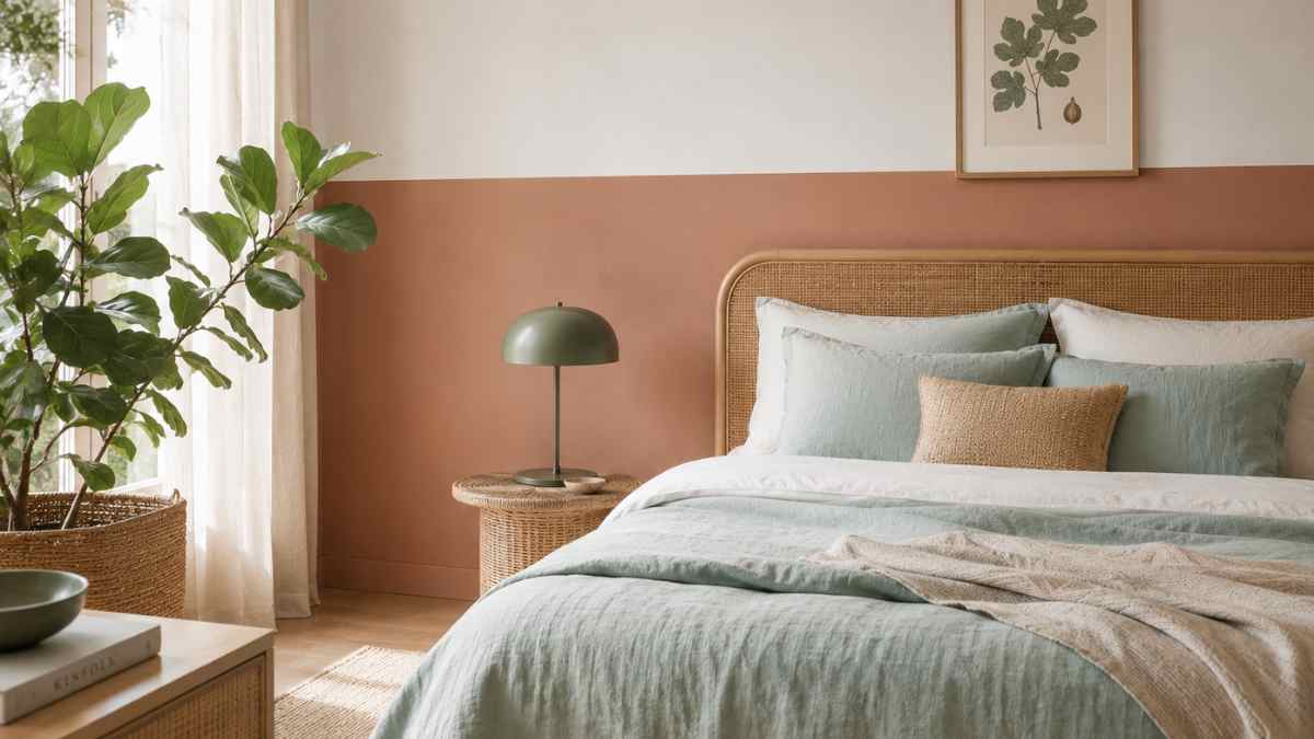
The starting point is the choice of use two colors on the wallsnot just one. It may seem complicated, but it is precisely this doubling that gives depth to the room and creates a sufficiently articulated base to support the subsequent addition of two more tones of textiles. The two most effective techniques are horizontal two-tonewith a colored board on the bottom half of the wall and a lighter or neutral tone on the top and single accent wall, where three walls remain one color and only one takes on a stronger or completely different tone. From there, the four suit game builds logically.
Walls that already communicate with each other
The horizontal two-color has made a dynamic comeback in the propositions of brands such as e.g Farrow & Ballwhich in its catalog often combines shades from the same color family with a difference in light value of about two steps. A specific example: Mole’s breath (a medium warm gray) on the top half and Down Pipe (charcoal gray almost black) in the low range. The outline is drawn at the height of the surface of the mattress or sills, about 90-110 cm from the ground, and is often marked with a white chalk edge or a thin high-relief frame. The result is architectural without requiring investment or structural work.
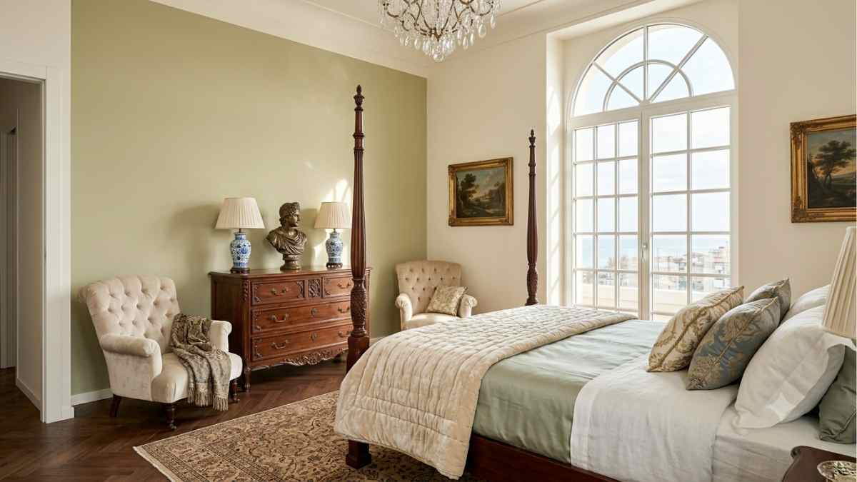
The accent wall variation works with less tonal and bolder combinations. The bold color always goes on the wall at the head of the bed, not the one facing the entrance. In the Italian market, Take off m Zofani they offer clean, strongly pigmented colors that hold together well on a single wall without overpowering. A petrol green like Eden by Zoffany on one wall, with the other three in slightly warm white like the classic NCS S 1002-Y, creates a clean but not aggressive contrast. Already with this option the two basic colors of the room are defined and the rest can be built on top.
The third color: where the fabric goes
Once the walls are established, the third color comes with the bedding or curtains. Here the possibilities are divided into at least four very distinct color directions, each with a precise character.
For effect elegant and formalthe third tone should be a warm neutral or antique bisque, such as Linen of the Percale line from Limonta Societywhich in satin cotton gives an almost sartorial effect. On oil green walls and white, a warm beige creates the heat point that keeps the room from getting cold. The elegance here is in not trying too hard: the tone fits as if it had always been there.
For something more pop or contemporarythe third color can be a strong complement. On a gray base at the bottom and light gray at the top, a mustard or terracotta duvet cover creates a sharp color contrast. HAYthe Danish brand, offers fabrics in the Soft series in shades like Mustard and Rust that work in exactly this sense: colors that take a stand without asking permission.
In the key Scandinavianthe third tone prefers to remain in a desaturated palette. Optical white, pearl gray, powder dust: the raw linen curtain Heavenly or a stone percale quilt from Tekla they build an almost monochromatic but never flat layering, where differences in texture matter as much as differences in tone.
For room with summer or light atmospherethe third color can be a powder blue, a sage green, or a sandy yellow. Against a base of off-white and pale terracotta walls, a fabric in blue creates that freshness that works well in rooms with southern exposure.
The fourth color: supplements that close the circle
The fourth color is that of accessories: decorative pillows, throws, bedside tables, small items on the shelf. It’s the freest tone, the one that can make the most mistakes without compromising everything, but also the one that, when it’s right, gives the room that final resolution that’s immediately noticeable.
In the elegant palette with petrol green walls and beige fabrics, the fourth color can be a dull brass or bronze. A bronze metal bedside lamp, a satin brass tray, a ceramic air freshener with smoke-colored glass: these are the objects that are easily found Firm Living the Hay with prices from 40 to 180 euros. The result is a room that has a project-like coherence without ever having been designed by an interior designer.
In the pop palette, the fourth tone is often black or pure white, used as a graphic element: a canvas pillow with a black and white geometric print on a mustard-charcoal bed brings visual order without reducing energy.
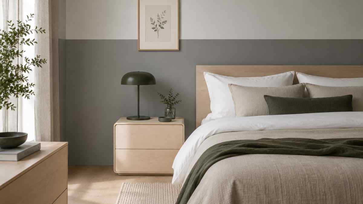
In the Scandinavian version, the fourth color often takes the form a natural light woodsuch as birch or ash. It’s not strictly a color, but it works as such in the palette: it warms without lighting, it brings organicity without decoration. A headboard in light wood, a bedside table in bleached oak, an ash tray: elements that In the army m String furniture have made them accessible to a wide audience.
For the summer palette, the fourth color can be a more saturated green, close to lime, or a muted coral. Small amounts are enough: two pillows, a colored candle holder. Even a bouquet of fresh flowers in the right tone does the trick.
Four combinations that work
For those who want a specific starting point, these four color sets have been tested in real projects and work in medium-sized rooms, between 12 and 18 m2.
Modern Palace: Walls inside Bone (antique white) e Gray French by Farrow & Ball (pronunciation wall). Antique fabric dust. Brass and black matte ceramic accessories.
Nordic study: Horizontal two-tone in light gray NCS S 1500-N and medium gray S 4000-N. Optical white and raw linen fabrics. Complements in birch wood and dark green moss.
Cam Pop: Accent wall in cobalt blue, the rest of the walls in pure white. Mustard and white fabrics. Complements in black and polished copper.
Mediterranean summer: Two-tone with light terracotta on the bottom and white lime on the top. Celadon blue fabrics. Accessories in natural and fig wicker.
Four colors do not multiply the disorder. They discipline him. The room ends up having an internal logic that can be felt even without knowing how to read a color palette, even without knowing what any of those tones are called.


