


Architects have a term for those spaces that no one knows how to manage: remaining space. It’s not a crisis, it’s a design category. The bottom staircase, the alcove between two walls that do not fit, the corner between the sofa and the window where the magazines you no longer read end up: these are spaces that were not foreseen in the plan and that are not covered by standard furniture. The problem is not that they are difficult. It’s just that almost everyone approaches it the same way they fill a suitcase: you take whatever’s left over and stick it where there’s room.
The result is predictable. A corner haphazardly filled with recycled objects does not become invisible: it becomes the point where the eye stops for the wrong reasons. A corner left empty doesn’t communicate minimalism, it communicates indecision. The difference between a well-resolved residual space and a poorly managed space is not budget, nor square footage. It is whether this solution seems like an option or an alternative.
Give a geometric identity before selecting any object
Before buying anything, it is worth stopping at one question: what angle should it be functional, decorative or both? It is not an academic distinction. A corner assigned a precise function, even a minimal one, ceases to be residual space and becomes an area of meaning. A floor lamp in a dark corner is not a decorative object: it is a lighting option that redefines the perceived geometry of the room.
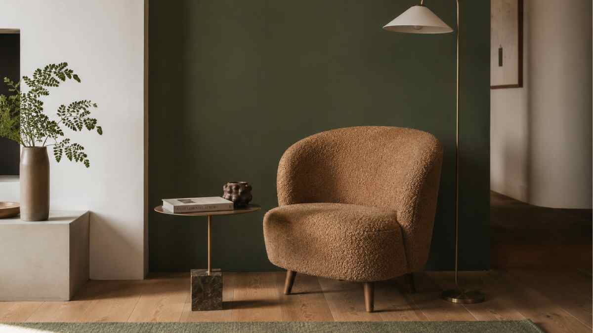
The principle that guides the best contemporary interior design projects for demanding spaces is what some designers call micro architecture: Treat each corner as a project in itself, with the same intention as you would an entire room. You don’t need much: an armchair, a lamp and a minimal support surface are enough to build a space with its own identity. The important thing is that the three elements are selected together and are not leftovers from other contexts.
The micro-relaxation area: when a corner becomes the best part of the room
A single armchair in a well-chosen corner works better than an ill-placed three-seater sofa. Not because it takes up less space, but because it creates a destination: a place where you go to stay, not just to sit transiently. Armchair size matters more than style. Armchairs with a solid structure and a deep seat, such as Matrix chair di Eero Saarinen by Knollor the most affordable Lounge Chair by Muuto in the small version they work in corners because they do not require lateral space to be used comfortably.
Next to the armchair, a floor lamp with a sculptural base completes the composition without adding horizontal bulk. Floss with it Arco It’s the classic reference, but for tighter angles the curved arm is too invasive. There Coordinates Floor lamp di &Traditionwith its adjustable arm and slim base, it takes up less than 30 cm in diameter on the ground and brings the light exactly where it is needed. A small coffee table, even a low stool or a table with one leg like this one Snaregade di Audo Copenhagencloses the composition without crowding.
The result is an area that is almost always taken first in interior photos because it has a visual density that the rest of the room struggles to replicate.
Verticality as a tool: shelves, plants and the movement of lines
Low corners, those that end below a window or close to less than two meters high, are best treated with vertical elements that lead the eye upwards. A broad-leaved plant in a tall pot, such as a Lyrata fig or one Monstera Delicious in a glazed ceramic vessel that exceeds 40 cm tall, adds presence without impeding traffic. The vase is not an accessory detail: it is the visual basis of the entire composition. Hay has a range of matte finish ceramic vases in neutral colours, the Botanical Familywith proportions designed for large plants that hold up well in corners without looking bulky.
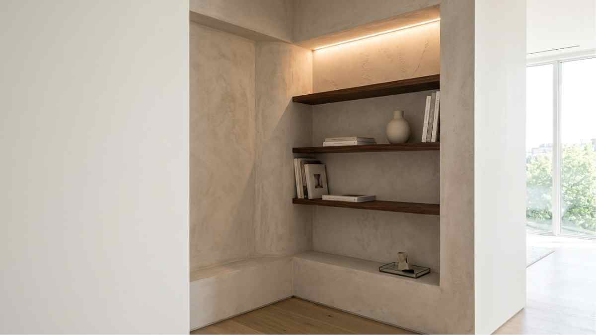
Custom-made hanging shelves that follow the shape of a niche are the most elegant solution for irregular spaces. It doesn’t have to be many: two or three shelves at different depths, placed at irregular heights, create a vertical rhythm that moves the wall without weighing it down. The system Series by the Swedish designer Nils Strinning, with its ultra-thin wall supports and modular shelves, is still the most versatile reference for this type of solution: it adapts to any position width and can be dismantled without leaving structural damage.
Color, wallpaper and the corner that becomes the focal point of the room
Painting just one wall in a difficult corner a different color than the rest of the space is one of the most effective and least expensive interior decorating moves. It’s not about creating an accent wall in the general sense of the word: it’s about using color to give this space a distinct visual identity that stops it feeling like a leftover and turns it into a purposeful point of interest.
The colors that work best in the corners are those with moderate saturation and a warm tone: moss greens, muted terra cottas, midnight blues. Farrow & Ball with it Mole’s Breath No.276 or the Inchyra Blue No.289 are two of the most used tones in interior design projects photographed for magazines such as Dezeen the Architectural Digest exactly in difficult corners, because they have a depth that creates a visual recess without darkening the space too much.
Textured wallpaper is an alternative that adds a tactile dimension in addition to color. Applied only to the back wall of a position or to a single short wall, it creates a backdrop that turns any object placed in front of it into a compositional element. Elitist with the collection Spirit of Nature m Dedar with wallpapers from the series Samurai they offer textured textures with heavy weights that hold well even on uneven or slightly wet surfaces.
The basement: the space that is always underestimated
The space under the stairs is the most complex space left to manage because it has a geometry that changes with height. The highest part, the one near the first step, can contain vertical furniture. The lowest part, where the roof falls below the 120-130 cmonly accepts horizontal solutions or low seats.
The solution most used by designers for low basements is the custom bench with built-in storage: a wooden or lacquered structure that follows the flow of the ramp and incorporates drawers or flap compartments. It is not a cheap solution if done well, but at the same time it solves the problem of difficult space and the lack of restriction in the entrance or hallway.
For those who prefer not to custom build, the most flexible solution is a composition of low modular components such as bookcases Eket at IKEA in different shapes, stacked following the descending profile of the roof. It is not the most visually sophisticated solution, but it has the advantage that it adapts to any geometry and can be disassembled and reassembled without losing its value. With a coat of black or dark green paint on the doors, the end result has none of the financial compromise it comes from.
Difficult space is not a defect that needs to be fixed. It is the point where furniture ceases to be automatic and becomes a place. The corners you remember in a room are almost always the ones someone looked at long enough to decide what to do with them.