


There is one kind of white that works and one that doesn’t, and the difference is not in the shade but in the finish. A room painted entirely with the same matte white on every surface, walls, ceiling, doors and skirting, produces a completely flattening effect: everything is canceled, the architectural contours disappear, the space loses depth. It’s not the white man’s fault. Uniformity is to blame. Interior designers who work with monochromatic environments know that color variation is only one way to give a three-dimensional feel to a room. The other, often more sophisticated, is the variation of finish: same color, different surfaces, completely different visual behaviors.
Light hitting a matte wall, a satin door, and a glossy lacquered piece of furniture produces three distinct visual effects, even if the underlying white is identical. Matte absorbs and diffuses, satin reflects gently and directionally, gloss clearly reflects the environment. Used together in the same room, these three behaviors create a system of contrasts that move surfaces without adding color.
Matte as a base: because it absorbs light instead of reflecting it
Extremely opaque colors, those with a specular reflectance index lower than 5%they absorb light instead of bouncing it. The visual result is a surface that appears deeper than it actually is, with an almost velvety quality that hides imperfections in the underlying substrate better than any other finish. On a wall with imperfect plaster or visible stucco, the matte finish is the most technically intelligent choice even before it becomes aesthetic.
The limit of opaqueness is mechanical resistance. Professional quality matte finish paints, such as Estate Emulsion by Farrow & Ball o yes Flat Emulsion di Little Greenethey do not withstand repeated friction. A wall painted with these products cannot be washed with a damp cloth without losing the color at the point of contact. This is why matte works best high surfacesaway from the daily contact height and above ceilingswhere there is no mechanical stress.
In the system of white finishes, matte is the scenographic base on which everything else stands out. A wall with a matte finish Pointing No. 2003 by Farrow & Ball Used as a primer, it highlights any architectural element treated with a different finish, even if the white is identical. It’s a contrast that doesn’t go unnoticed by its name but is immediately apparent upon entering the room.
Satin in architectural elements: where light becomes outline
The satin finish has a reflective index of between 20 and 40%sufficient to return a soft and directional reflection without reflecting the surroundings. Applied to the vertical elements of the room, doors, frames, moldings, boisettes and window profiles, it creates an effect of defining architectural contours that matte cannot create.
The logic is simple: when natural light passes through the room grazing, it hits the vertical surfaces at a different angle than the horizontal ones. A satin door captures this light and returns it as a linear reflection that pulls at its edges, visually separating it from the surrounding opaque wall, even if the two whites are identical. It is the same principle by which the moldings in eighteenth- and nineteenth-century houses were painted with glossier lacquers than the walls: not for decoration, but to bring out the architecture.
For interior doors and frames, the most suitable finish is that specified by the paint manufacturers satin or semi-glossywith a high cleaning capacity that the mat does not offer. Dulux with the line Easycare Satinwood m Zofani with it Satin wood color offer specific compositions for wood and vertical surfaces with certified abrasion resistance for 10,000 friction cyclesa price that in everyday doors makes a real difference in the durability of the finish.
The satin white on the low boisettes, this paneling band that reaches many renovated apartments 90-100 cm tall, it creates a horizontal dividing wall effect that adds vertical layering without extra color. The wall above in matte, the boiserie below in satin: same white, two levels of visual depth.
Transparency as a multiplier: where and how much to use it
The glossy finish, with a specular reflectance index higher than 60%it reflects your surroundings clearly enough to create additional depth perception. It does not reflect colors because there are none: it reflects light and shapes, visually multiplying the space in front of it. A glossy white lacquered piece of furniture placed against a matte white wall is invisible in color and very visible in shape because its surface reflects the room and creates a virtual window into nothingness.
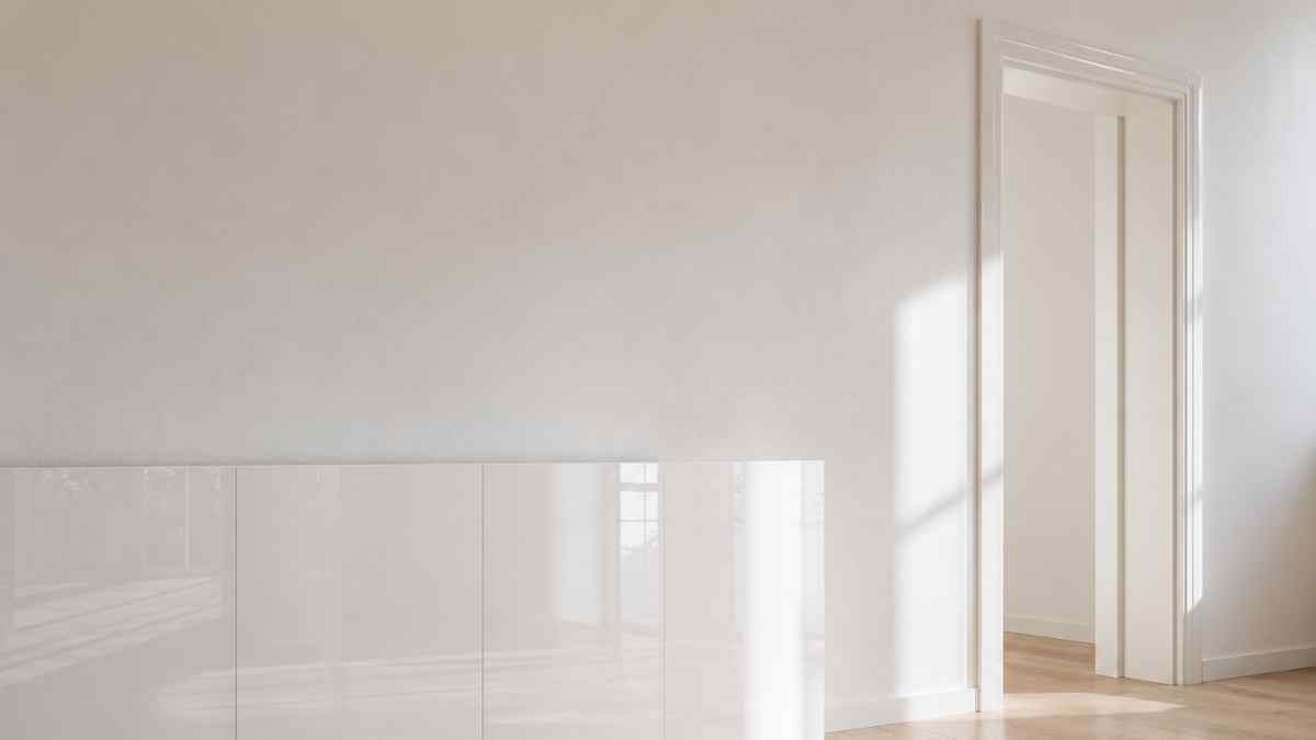
Polish should be used sparingly and in specific areas. On large surfaces, such as entire walls, it creates a visual tension effect that is difficult to manage because every imperfection of the support is amplified by reflection. His ideal size is his detail or single piece of furniture: a glossy lacquered door in a white kitchen, a set of diamond tiles in a monochrome bathroom, a glazed ceramic vase on a matte shelf.
In total white bathrooms, the combination of tiles with a glossy finish on the walls and Matte porcelain floor of the same hue is the solution most often used by designers to create depth without straying from monochrome. Rebellion with the collection Phenomenon m Marazzi in order Grande White Look they offer large formats in both glossy and matte versions of the same white, specially designed for this type of combination. The difference in visual behavior between the two finishes on the same ceramic mount is more pronounced than the photos in the catalogs can communicate: it must be seen in direct light to understand the true effect.
In living rooms and kitchens, high-gloss lacquered furniture has an expensive manufacturing tradition. Boffi with his line Code m Valcucine in order The genius of the place produce glossy polyester lacquered doors with 60 layers of paint and a surface reflection unmatched by that of budget glossy laminate doors. The difference is not only aesthetic: polyester paint does not yellow over time, while glossy laminate loses its color and uniformity 5-8 years old with exposure to direct light.
How to create the series of finishes in a real room
Effective application of the matte-satin-gloss system requires a precise hierarchy. The largest surface, the wall, always has the most opaque finish because it sets the basic tone of the environment. The vertical architectural elements, doors and frames, get the satin finish because they are transitional elements that should emerge from the wall without being imposed. The details and the selected furniture get the shine because they are the elements on which the attention is focused.
The indicative ratio between the three finishes in a well-balanced room is approx 70% matte, 20% satin and 10% gloss. Increasing the gloss level above this limit creates an environment that appears smaller because multiple reflections create visual clutter instead of depth. Reducing the satin finish below 15% results in loss of definition of the architectural elements and results in flattening of the all-matte finish.
White point selection is the last variable to consider, not the first. First the hierarchy of finishes is decided and then the color is chosen. A white with warm tones, like Strong White No. 2001 by Farrow & Ballit behaves differently in the three finishes because the yellow tone is enhanced by the gloss and softened by the matte. A cool white with a blue-grey undertone, like the Fabric No. 273 of the same brand, produces the opposite effect. Seeing swatches of the three finishes in natural light in the actual room, not on the card in the store, is the only way to understand how they will perform together.
A total white room with three different finishes is not a white room: it is a room where the light works by itself, changes with the time of day and does not require another color to be interesting.