


Gray has a problem that white doesn’t: it reacts to light unpredictably. A warm white stays warm in almost all lighting conditions. A medium gray, the one that looks perfectly neutral and sophisticated on the sample card, can turn purple in a room with natural Nordic light, green in one with fluorescent lighting, and blue half an hour before sunset. It’s not a color flaw: it’s his most difficult feature to manage, but also his most interesting. Gray is the color that most of all reveals the quality of light in a room rather than hiding it.
The second difficulty of gray is geometric. In medium and dark shades, fromanthracite al smoky grayapplied to all vertical walls creates what designers call a color box: an envelope of color that envelops the space and redefines its perceived limits. This is not necessarily a problem. In some contexts this is exactly the intended effect. In others, it turns an already not-so-large room into something akin to a submarine. The variable that decides which of the two results is achieved is almost always the cap.
The color box and the white ceiling: why detachment lowers the ceiling
When the walls are painted dark gray and the ceiling remains white, a clear color contrast is created on the cornice that the eye reads as a closing horizontal line. This line, the more visible the more saturated and darker the gray of the walls, acts like a visual cap: it draws attention down instead of up and makes the ceiling appear lower than it naturally is.
The result is measurable. Environmental psychology studies conducted in Technical University of Denmark on the effect of wall-ceiling color contrast on height perception show that a high-contrast gap between dark walls and a white ceiling can make the ceiling be perceived as high as 15-20% lower compared to its actual height. In a room with a ceiling 270 cmthis corresponds to a perception of height around 225-230 cmwhich is already at the threshold where many people begin to feel a mild sensation of vertical compression.
It’s the same mechanism that makes rooms with exposed dark wood beams appear lower than rooms with a smooth white ceiling, even when the height is the same. Contrast creates a visual boundary that the brain interprets as the physical boundary of space. The stronger the contrast, the closer this boundary appears.
The obvious solution is to eliminate the gap: paint the ceiling as well. But this option opens up a second scenario with its own rules.
Total color saturation: when the gray rises to the ceiling
Il color wettingthe technique of painting walls, ceilings, cornices and boards in exactly the same color has become one of the most mentioned trend directions by interior designers in the last five years. Farrow & Ball He actively promotes it as the most popular approach to deep color, and the results photographed in project homes are almost always convincing. What the photos don’t easily convey is that the dark gray color works in some spaces and produces the opposite effect in others.
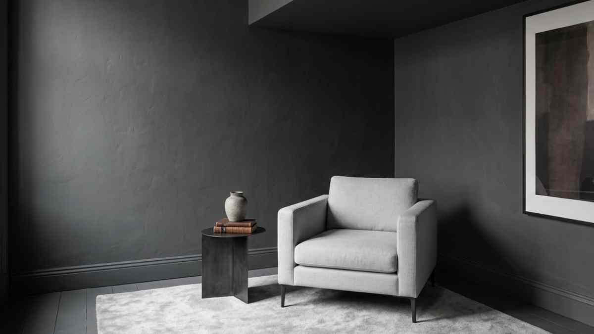
When it works, the chromatically intense gray creates what is usually described as an effect shell: the boundaries of the room blur because there is no contrast that defines them, the space seems wrapped rather than bounded and the feeling is one of controlled intimacy. In bedrooms, studies, libraries and any environment where concentration or relaxation is the goal, this effect works well regardless of square footage. Some of the most photographed rooms in recent years in major international interior design accounts are less than bedrooms 12 square meters dyed in total dip with Mole’s Breath No. 276 the Down Pipe No. 26 from Farrow & Ball: Small square footage isn’t a problem because the space isn’t trying to look big, it’s trying to feel purposeful.
When it doesn’t work, the color drenched in dark gray in a small, dimly lit room causes a perceived compression on all three axes: the walls seem close, the ceiling seems low, the floor seems to absorb light rather than reflect it. The difference between the two results mainly depends on three factors: the amount of natural light available, the LRV value of the selected gray and the presence or absence of contrasting elements within the room.
The price of LRV and why it is the most important fact to read before buying paint
LARGE’LRV (light reflectance value) is the value that measures how much light a color reflects on a scale from 0 (absolute black) to 100 (pure white). It is the most important fact to consider when choosing a gray for a room, more important than the brand and more important than how the color appears on the swatch card.
The grays that work in hydrating the colors without compressing the space are the ones with LRV between them 20 and 35: dark enough to create the shell effect, reflective enough not to absorb all available light. Below LRV 20, the paint absorbs more light than it returns, and the room begins to appear dark regardless of artificial lighting. Above LRV 40, the gray is light enough to not create the wrapped effect you’re looking for, and is visually closer to an off-white than a true gray.
Il Purbeck Stone No. 275 of Farrow & Ball has an LRV of approx 34 and is one of the most used grays in coloring in medium-sized rooms with good natural light. THE Mole’s Breath No. 276with LRVs around 24works best in rooms with plenty of light or in bedrooms where dimming is desirable. THE Down Pipe No. 26with LRV approx 12it is the darkest gray in the range and requires rooms with generous exposure or artificial lighting designed to compensate for absorption.
Little Green with it Lead color 60 and the Plummett offers alternatives with similar LRVs at slightly lower prices. Mylands in order Gray It has densely pigmented formulations that keep the color more stable in different lighting conditions compared to some budget paints.
Border management: where the gray ends and the rest begins
In the most successful color drenching projects, the gray does not stop at the walls and ceiling: it also invades window frames, skirting boards, interior doors and windowsills. This eliminates any break lines that could recreate the space between different color layers. A white door in a room dipped in dark gray is an open window on the visual level: it immediately brings the eye in and breaks the surrounding effect.
The skirting board is the most often overlooked detail. A white board in a room with dark gray walls creates a bright horizontal line at floor level that visually isolates the wall from the floor, fragmenting the space into horizontal zones instead of letting it flow. Painting the same gray as the walls or a slightly darker tone solves the problem and makes the floor look like an integral part of the composition rather than a separate element.
The only exception to the logic of total precipitation is windows and doors made of natural wood or bare metal: a window with a frame of natural aluminum or polished steel in a dark gray wet room creates a contrast that works just like a piece of art on the wall: defined, intentional, not random. It is different from the space between the gray wall and the white ceiling because it is localized and geometrically precise rather than circumferential and continuous.
Artificial light and gray: the marriage that requires planning
Dark gray in intense color is the color that most reveals the quality of artificial lighting. A wet room with a single central ceiling light creates harsh shadows on the side walls that accentuate any imperfections in the plaster and create a feeling of sadness that has nothing to do with the color chosen. The same room with multi-point lighting, combining grazing light on the walls, diffused light towards the ceiling and warm light spots at a low level, becomes something completely different.
The color temperature of artificial lighting changes dramatically as a gray appears. A color temperature lamp 2700 Kelvin (warm light) adds a yellow-orange tone that can make a neutral gray color turn brown. A lamp 4000 Kelvin (neutral light) keeps the gray more true to the sample. A a 5000 Kelvin (cold light) shifts it toward blue-blue. Before deciding on the final grey, it is worth seeing the painted sample on the actual wall in artificial evening lighting conditions, not just natural daylight.
Designers who regularly work with deep gray almost always use adjustable lighting or track lighting grazing wall light on the walls to take advantage of the texture of the matte paint, which with grazing light produces an effect of soft depth that no photograph can fully communicate. Floss with it Cape Wall m Vibia in order Hot produce wall lights designed specifically for this type of use, with narrow strips of light that enhance the surface of the wall rather than simply illuminating the room.
A charcoal gray on the ceiling of a bedroom with plenty of natural light and well-designed artificial lighting is probably the closest to authentic elegance you can get with a bucket of color. The same choice in a small room in the north with a ceiling lamp in the center is just an expensive mistake to correct.