

Designer: Constantin Bolimond
Have you ever looked at a product box and thought, “Wow, I really want to frame this?” That’s exactly the vibe I’m getting from this incredible new seafood design. At the edge of the Arctic world, where pristine frozen waters meet these endlessly beautiful horizons, nature hides some of its best treasures. And honestly, this luxury king crab packaging perfectly captures that raw, untamed northern magic.
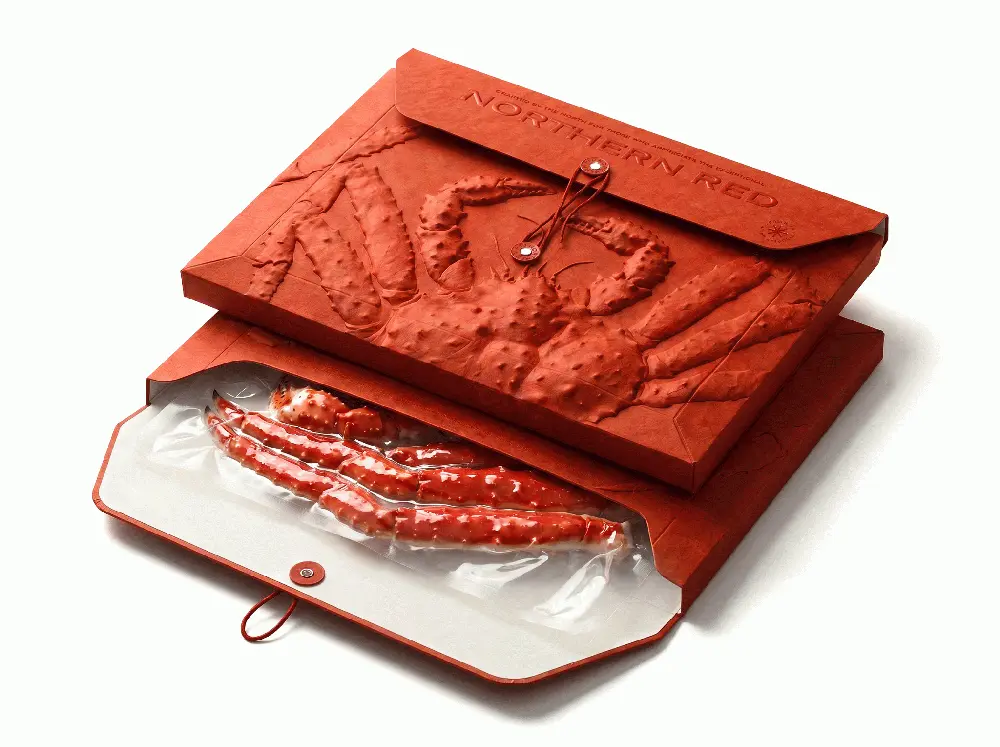
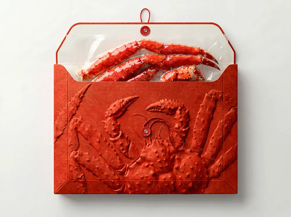
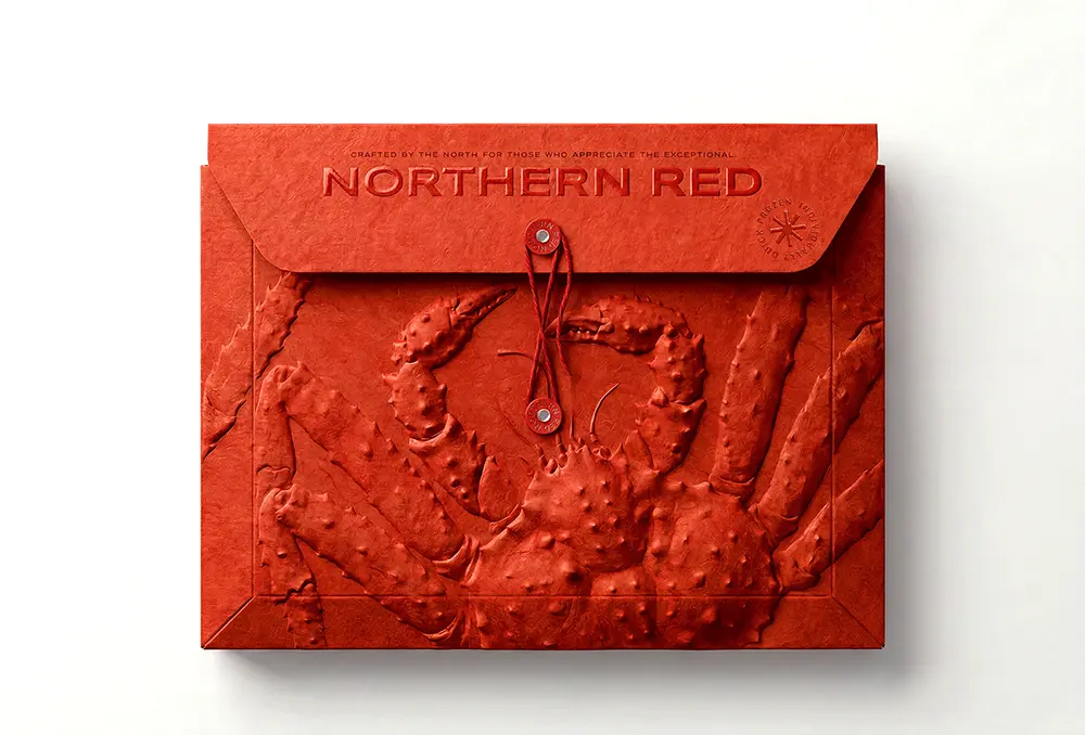
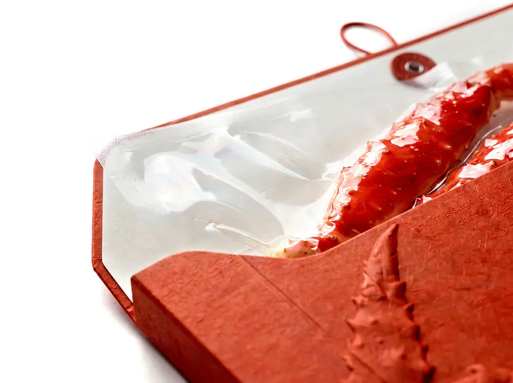
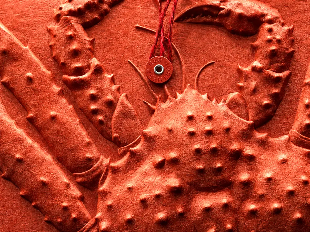
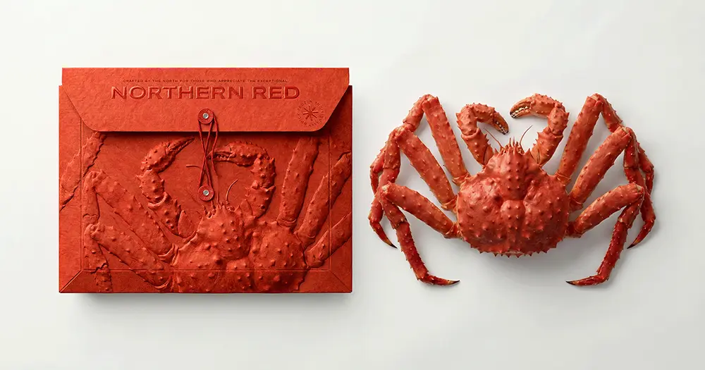
Instead of settling for a boring standard box, this design matches a gorgeous envelope-style structure. It feels less like a basic container and more like you’ve been given an exclusive, top-secret invitation! The absolute star of the show here is the bas-relief of a king crab right in front. It literally pops off the premium texture paper, giving you that super cool sculptural effect that you just have to run your hands through to believe.
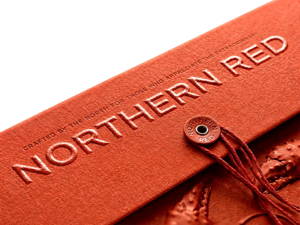
What’s more, those rich, bold tones of red aren’t just for show — they match the natural color of the premium crab inside beautifully, while making the brand identity look downright fierce. They even added that neat little drawstring and button closure that makes the whole unboxing process feel incredibly personal and special.
It is honestly so rare to see luxurious king crab packing that pays such meticulous attention to small details, from the carefully designed folds to the clean, embossed typography. It completely transforms premium seafood from a simple dinner option to a wonderful, collectible piece of brand art. I am totally obsessed!