
There are colors that seem immediately manageable and others that, just by naming them, raise some doubts. Lavender belongs to the second category. It’s subtle, but not neutral. It’s bright, but it doesn’t fit easily. It is precisely for this reason that it is often avoided, especially when there is a fear of creating an unbalanced environment.
However, in the latest interior design projects, it is one of the colors that comes back the strongest. Not because it’s easy, but because, if used in the right way, it manages to completely change the perception of a space, making it more interesting and less obvious.
Because lavender works more than you think
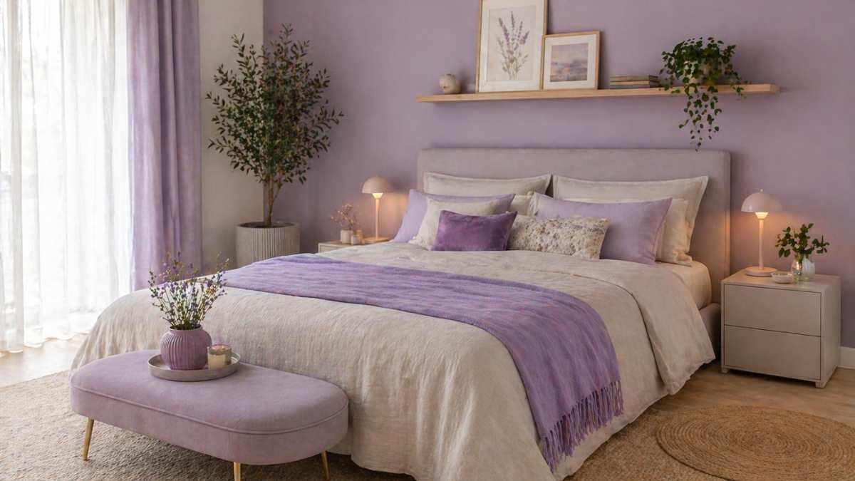
Unlike other more saturated colors, lavender has a special feature: it manages to bring personality without being obnoxious. It is not a solid purple, nor is it a simple pastel. It is in an intermediate range that allows it to adapt to different environments.
In well-lit environments, it gently reflects light, creating a relaxing but not flat effect. In more neutrals, it introduces a breakable element that avoids the “catalog home” effect. It is precisely this ambiguity that makes it interesting: it does not dominate the space, but modifies it.
Where to place it without making mistakes
The most effective way to use lavender is to avoid treating it as a main color. It works much better when it enters the space gradually, through targeted details or surfaces.
One wall, for example, can be enough to change the tone of a room, especially if the rest remains neutral. Even fabrics such as curtains, cushions or rugs allow you to introduce it without characterizing the environment too much. The most common mistake is to use it everywhere, while the best result comes with its dosage.
The combinations that really enhance it
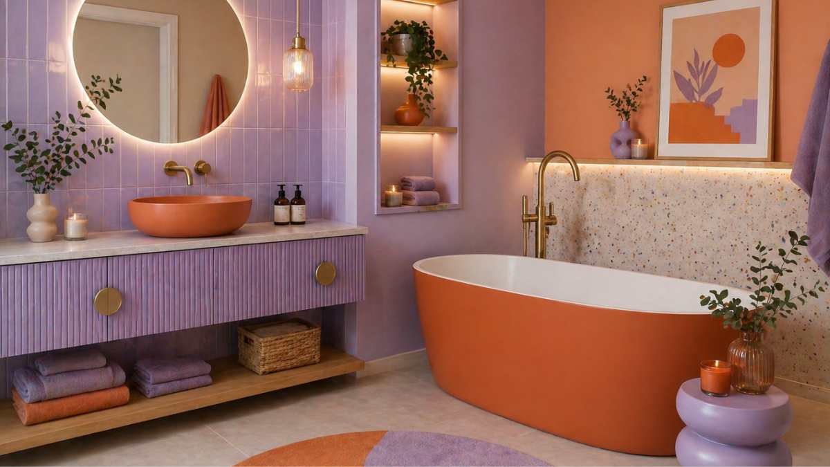
Lavender changes a lot depending on the materials it is combined with. With light wood, it creates a soft and natural environment, ideal for relaxing spaces. With darker surfaces, however, it gains depth and becomes more sophisticated.
Metals also play an important role. Bronze or gold finishes enhance its warmer side, while steel or matte black make it more contemporary. It is not so much the color itself that makes the difference, but the context in which it is introduced.
When it might not work
Despite its versatility, lavender is not always the right choice. In low-light environments, for example, it can lose some of its lightness and appear duller. Likewise, in spaces already rich in color or materials, it risks creating confusion rather than balance.
Tonality is also key. Very cold lavender it may not be welcoming, while a warmer one tends to integrate better into domestic environments. The difference is subtle, but it completely changes the end result.
A color that breaks the monotony without being overwhelming
In recent years many homes have followed a very similar palette of neutrals, beiges and greys. Introducing lavender is a way to break out of this monotony without messing it all up.
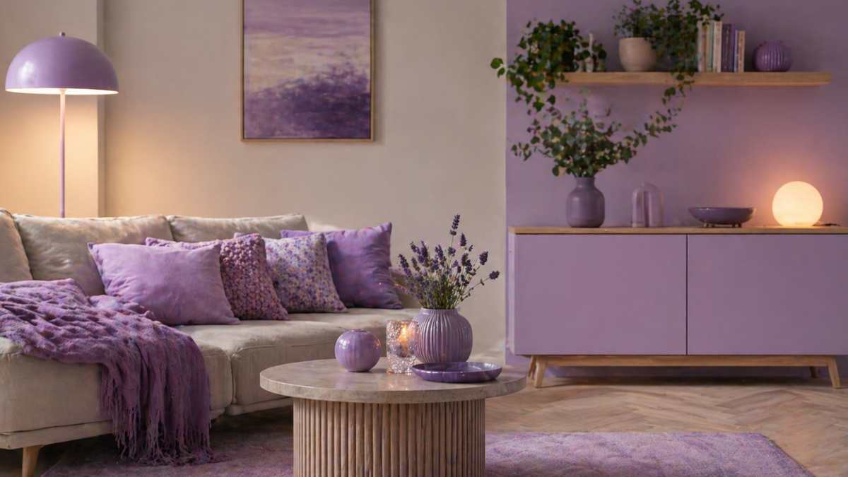
It is not a color that is imposed, but that introduces a variation. And this is precisely its strong point: it allows you to renovate a space without making life difficult.
Ultimately, lavender is not a danger, but a possibility. It requires a little more attention than other colors, but in return it offers a less obvious, more personal and above all more interesting effect over time.


