
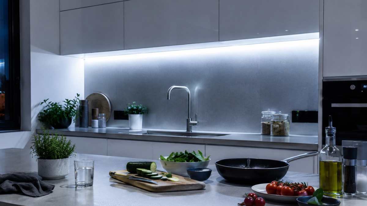
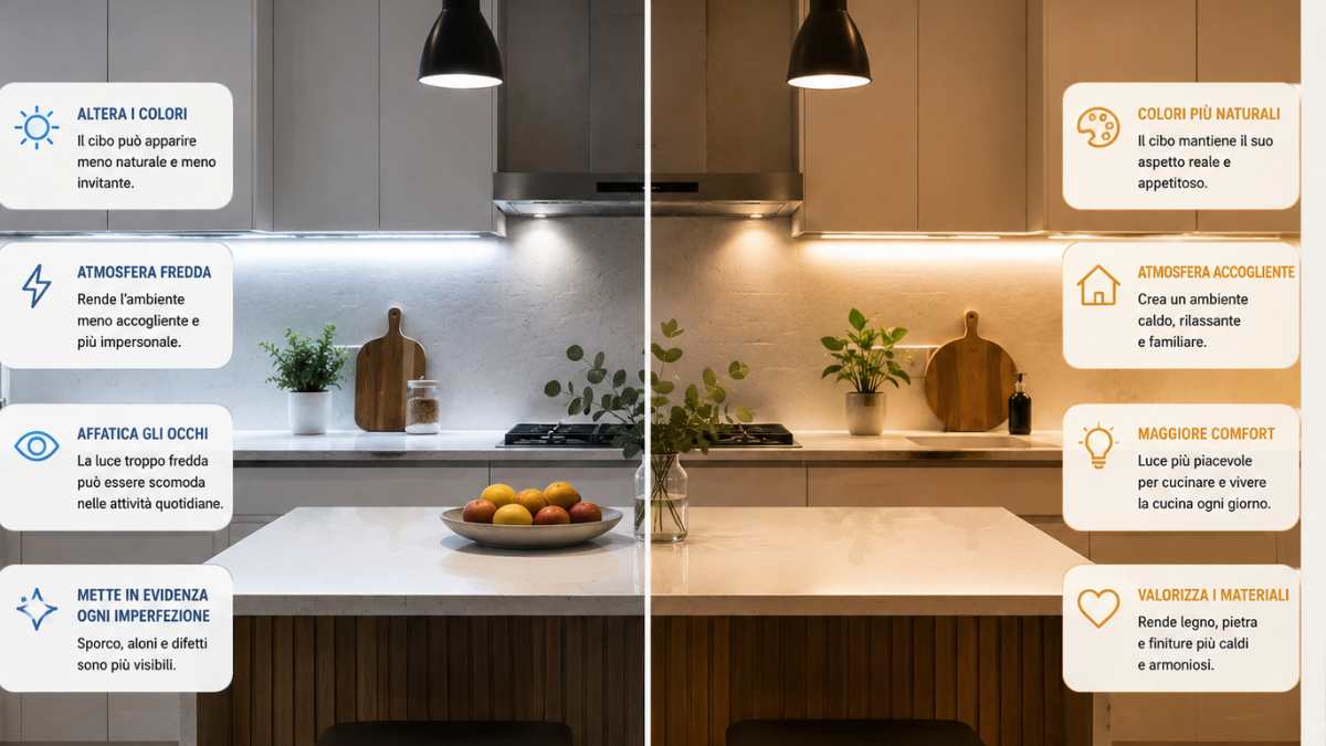
The kitchen is the only room in the house where a wrong choice of lighting can make you question what you’re eating. It’s not a matter of aesthetics: it’s physiology. The human retina interprets colors based on the temperature of the light illuminating them, and some cool LEDs, those with a color temperature above 5000 Kelvin, change the color rendering of food in a fairly accurate and documented way. A steak that appears deep red under a hot light becomes almost grayish under a 6500K lamp. Vegetables lose their satiety. Dairy products take on a slightly blue-green hue. The brain, accustomed to receiving visual signals even before olfactory ones, registers something strange and emits a subtle but real warning signal. The food looks less appetizing and in some cases is perceived as less fresh.
It is not a placebo effect. Research in this area, also developed in food marketing and retail design environments, has shown that color temperature affects sensory expectations. Supermarkets have known this for decades: butchers use warm-toned lights with a high color rendering index (CRI) to bring out the red of meat.o. The same logic applies to cooking at home, although one rarely applies it consciously.
Cold doesn’t mean wrong, it just depends on where you are
To lump everyone together and condemn the cold light would be simple but inaccurate. Cool light makes sense in certain home environments, and in specific ones. In one studio o in the UN officea color temperature around 4000-5000K promotes concentration, reduces the tendency to sleepiness in the afternoon, simulates daylight quite well in the central hours. Ikea also realized this in its office lamps like the Forså series, it has long since introduced the ability to adjust the color temperature for this very reason. In a bathroom that is mainly used early in the morning, a neutral or slightly cold light helps to wake up and better evaluate make-up or shaving under a color rendering close to the outside. Even in some commercial environments inside the house, laundry, closet and cellar, the cold light is functional and does not create perception problems.
The problem arises when this logic is transferred to environments in which visual well-being, relation to food, and rest are weighted differently. Cooking is one of them. The bedroom is the other end: a light above 3500K in the room inhibits melatonin production in a documented manner, even with short evening exposures. It’s not a rumor: studies published in chronobiology journals bear this out, including those from Samer Hattar’s lab at the NIH in Bethesda.
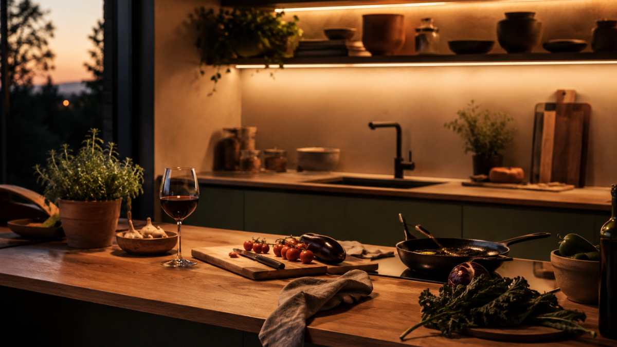
Warm light is not a romantic choice, it is a technical choice
When we talk about warm light in the kitchen, we tend to think of an inn or a country house. Actually, choosing to stay between 2700K and 3000K is a technical decision, not a stylistic one. At this color temperature, the CRI (Color Rendering Index) of the quality LEDs remains high ideally above 90 and the food is returned to its true color performance. Shades of red, yellow and green remain accurately perceived. Those who cook professionally know that the visual aspect of food is part of the assessment: the pinkness of a roast, the color of a saute, the consistency of a cream must be assessed by eye, and that the eye needs undistorted light.
Brands such as Artemide or Flos specify this in the technical data sheets of their kitchen appliances: Bjarke Ingels’ Gople series for Artemide, for example, is available in different color temperature variations precisely because the designer knows that the environment changes the function. For cooking, the recommendation is always towards the lower end of the Kelvin scale. Even in the cheapest recessed LEDs such as those of the Ledvance Smart series+ oi Philips Hue White Ambiance, the ability to adjust the color temperature from the application has become one of the main selling points, not out of fashion, but because the consumer market has begun to understand that constant light is a real limit.
Natural light, which no one achieves but everyone uses
Then there’s the variable that no designer can fully control: natural light. In the kitchen, a north-facing window brings in diffused and cold light for much of the day, which is great for color rendering because it doesn’t have warm dominants, but in the evening hours it leaves a void that artificial light must fill well. A west facing kitchen, with the late afternoon light coming in slanted and orange, creates a completely different perceptual condition. Natural morning light has a color temperature of around 5000-6000K, while sunset light drops to 2000-2500K. The retina is constantly adapting, but when we suddenly switch from natural light to poorly calibrated artificial light, the contrast becomes alienating.
In the living room, where natural light plays a scenographic role, the integration between natural and artificial light it is one of the aspects that interior designers work on the most. Rodolfo Dordoni, in several private residences he has designed, has used built-in adjustable regulation systems that automatically adapt to the level of natural light present in the room, maintaining a constant color temperature perceived by the occupant. It’s not science fiction: there are twilight sensors that can be paired with any smart home system that does just that, even at low cost.
Kelvin per room: a practical but not rigid map
Summarizing in numbers helps, even if there is no absolute rigidity. In the bedroom, the 2700K is the ideal arrival point for the evening, with a dimming system that allows you to raise the temperature slightly in the morning hours if the room is dark. In the bathroom, 3000-4000K works for most needs, with a preference for 4000K for those who use the bathroom as an area to get ready in the morning. in the kitchen, 2700-3000K with CRI above 90 It is the combination that best maintains feed performance and does not tire the eye during prolonged activities. In the studio or home office, 4000-5000K during the day, with the possibility of a decrease towards evening. In hallways, warehouses or laundry rooms, any temperature between 3500K and 5000K is fine because the use is short and organic.
The parameter that almost no one looks at when buying an LED is the CRI, which instead counts as well as the color temperature. A 2700K LED with a CRI of 80 renders colors much less accurately than a 3000K LED with a CRI of 95. Mid-range products such as those from Osram or Ledvance rThey bring this data to the label. Cheap ones often don’t, and that’s already a sign.
The next time your dinner seems less appetizing than usual, it’s worth looking up at the ceiling before revisiting the recipe.


