
For years the beige, gray or white sofa was the safe choice. Neutral, flexible, hard to make mistakes. He went with everything, it wasn’t tiring, he didn’t risk anything. The problem is that it didn’t add anything either. In many modern living rooms, where everything is already neutral, the neutral sofa is the last element needed.
A colored sofa does the exact opposite: it takes a position, defines the character of the room and when the color is right it makes the living room look brighter, not heavier. It is something that surprises those who have never tried it, because instinct says otherwise.
Because a color can add light instead of taking it away
The mechanism is less intuitive than it seems. A sofa in sage green, light terracotta or light blue in a living room with light colored walls it does not absorb light as a dark sofa would: o it reflects color, adding warmth and visual depth which a neutral surface is unable to provide.
Saturated but not dark tones, what colorists call mid-tones, work best in this regard. They do not compete with natural light, they multiply it. It is the same principle that makes Mediterranean living rooms with white walls and colorful fabrics always look brighter than Scandinavian ones with everything in the same cold shades.
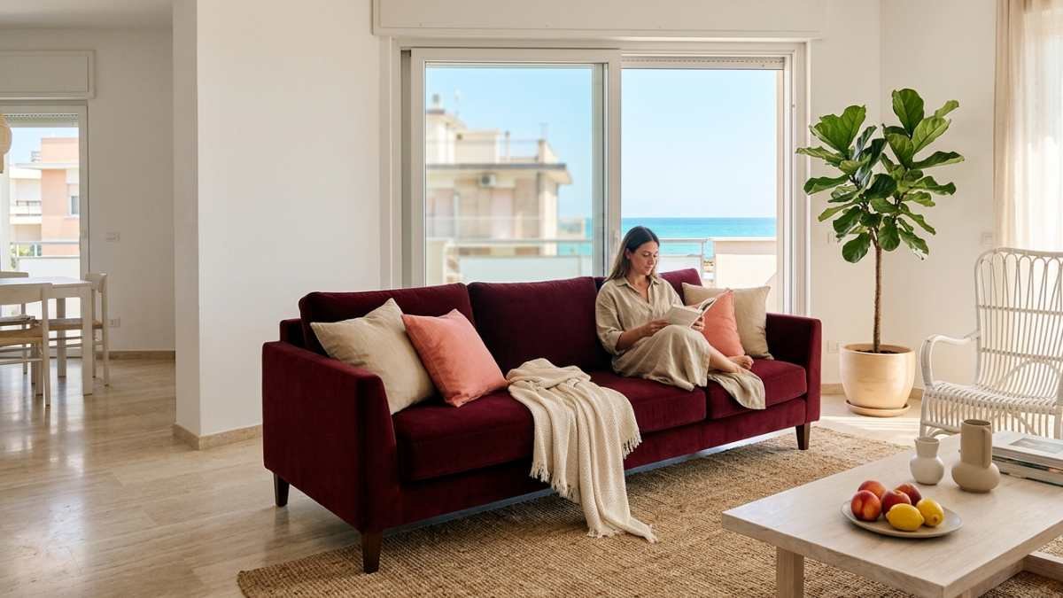
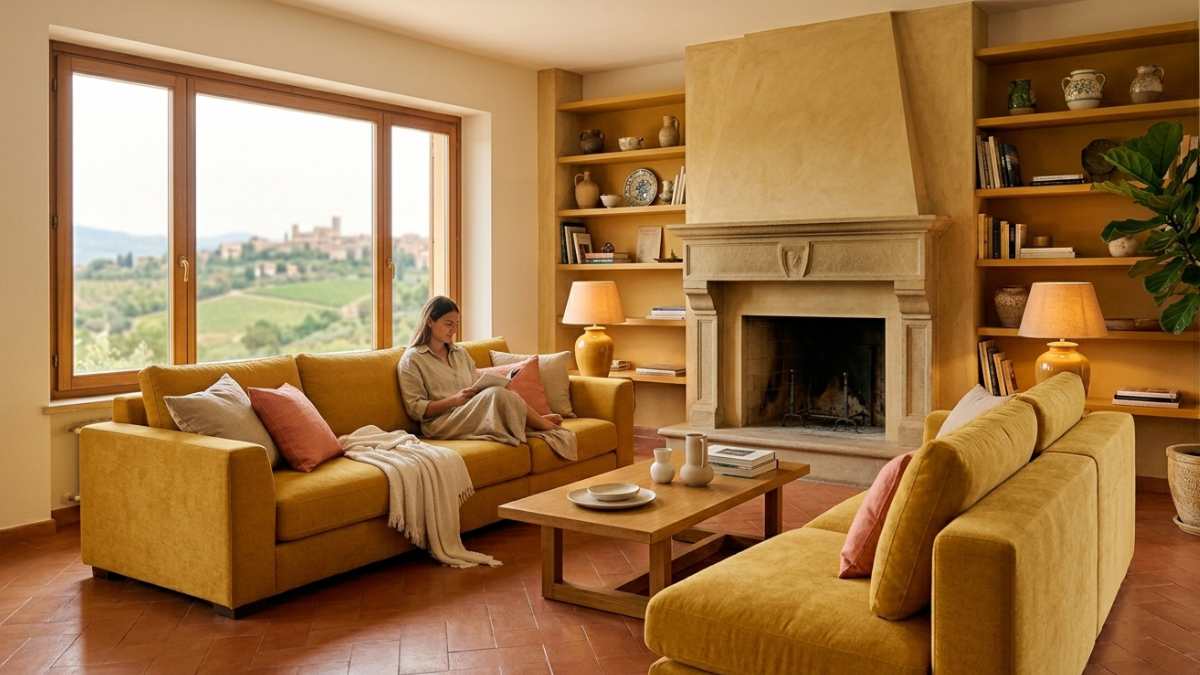
The colors that work best
Il desaturated plumin the versions that lean towards antique purple, it is one of the most underrated colors for the sofa. It has neither the vibrancy of burgundy nor the heaviness of deep purple: it is one soft shade, almost neutral in its complexitywhich brings an unexpected depth of color to a living room with light colored walls. It goes well with light woods and fabrics in sand or ivory tones.
Il yellow ocher in the coldest and most desaturated versionsthose close to aged mustard work better than you might imagine in living rooms with plenty of natural light. It’s not a lively, tedious mystery: is one color reminiscent of stone, grain, natural materials. Tekla and some Scandinavian manufacturers use it a lot in fabrics for this very reason.
Il moss greendarker and more earthy than sage but less saturated than bottle green, it’s one of the most long-lasting colors. He has one warm temperature that matches easily with medium parquet floorsto warm gray or naturally white walls and in any material that has an organic component, wool, raw cotton, linen. In an already neutral living room it adds character without taking over.
What to avoid
I very saturated and dark colorsdeep navy, bottle green, deep burgundy, work in large spaces with lots of natural light. In small or poorly lit living rooms they tend to do exactly what you fear: weigh.
The same goes for colors that are very intense, intense mustard, intense orange, pure red. They are choices that look bold and interesting in photos, but in everyday life they quickly tire because the eye never finds a resting point.
How to try before you buy
Many brands offer fabric samples for free or at minimal cost. Hay, Made.com, and several custom sofa manufacturers ship them to your home within days. It’s always worth it see them in the real light of your living roommorning and night, before committing to an important purchase. A color that looks perfect on the screen may behave completely differently in the natural light coming through the window of your home.
The colored sofa is not a bold choice. It is an expensive choice. The difference is all in the color.


