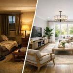


In furnishing, white has dominated kitchens for almost twenty years with impeccable logic: it enhances space, reflects light, never fails. It’s an honest choice. But honesty, in the long run, can backfire. There is a point at which the kitchen stops being merely functional and begins to say something more precise about those who live in it, and that point, for many designers, goes through the dark color.
Not as a challenge, not as a trend to be quickly curbed, but as a color decision that has its own deep coherence. Opaque, saturated pigments absorb light rather than reflect it back, and this makes them capable of something that light colors cannot: create a sense of weight and presence in the space. A dark olive kitchen is not imposed, it is arranged. One in blue petrol doesn’t scream, it holds back. It’s a completely different quality than classic visual impact, and it’s worth understanding how it works before choosing it.
The logic of absorption: why the dark color transforms the space
When an opaque and dark surface encounters natural light, it does not reject it towards the eye but diffuses it towards the interior of the material, restoring the perception of depth that glossy and light colored surfaces cannot reproduce. This physical phenomenon has a direct psychological impact: space ceases to look like an empty container that needs to be filled and acquires its own density. The effect is enhanced when you choose matte or satin finishes, which eliminate reflections and bring the pigment to the fore without mediation.
Come brand Valcucine have built entire systems based on this principle, offering matt lacquered doors in shades such as graphite or moss green precisely because the absence of gloss shifts all attention to the depth of the colour. The perception is that of an environment that contracts pleasantly not because it is small, but because it has its own intimate identity. A five square meter kitchen in matte dark green often works better than an identical cut in glossy white, simply because the former decided to be what it is.
Four combinations that work now
Controlled contrast is key. It is not to combine the dark color with something light to balance it, that reasoning almost always leads to uncertain results. It’s about building a dialogue between tones, finishes and materials where no element works alone.
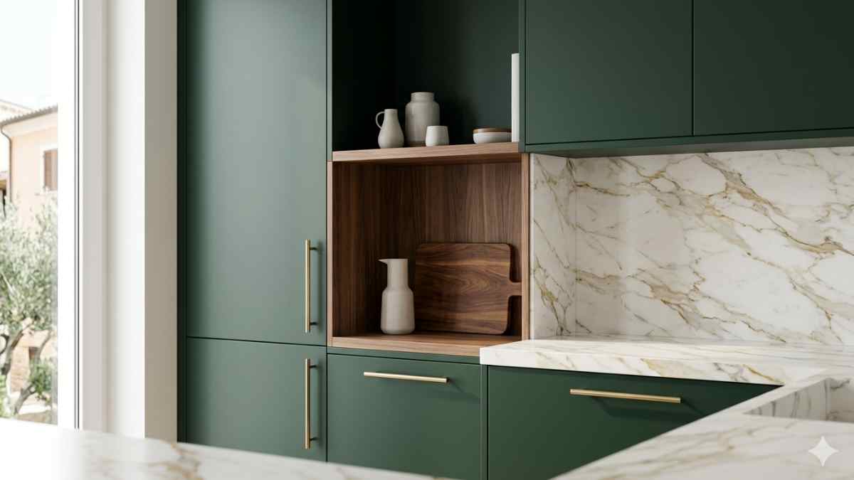
Forest green and brushed brass It is the combination that marked the last years of exhibitions like Eurocucina, and not by chance: the saturated green of the doors absorbs the light while the warm metal returns it in a controlled manner, creating a precise visual rhythm. A specific example is the Artex collection from Cesar Cucinewhere the matt green laminate doors are combined with brass handles with an aged effect. The effect is not decorative, it is structural.
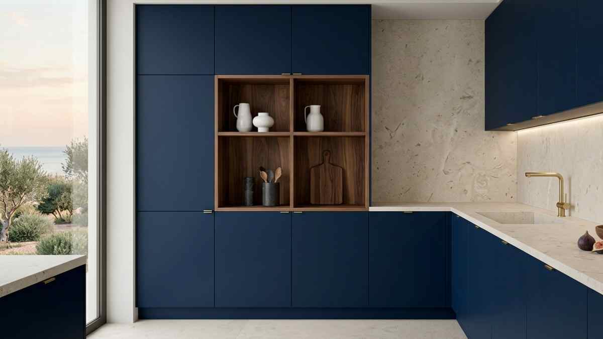
The second comparison is midnight blue and light limestone. A limestone or porcelain countertop with stone, like the large Florim shapes in the Stone Talk series, brings a neutrality of material that balances the dark pigment of the doors without artificially brightening the environment. The kitchen maintains its color intention, the design roots it.
Less frequent but with an excellent character is the confrontation charcoal and light natural wood, ash or bleached oak. Raw or lightly brushed wood introduces a texture that breaks the continuity of the dark color without contrasting it. Bulthaup uses this logic in b3, where open-pore wooden drawers coexist with the charcoal gray structural frame with a balance that is almost architectural.
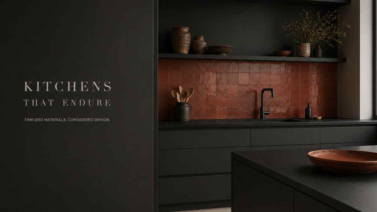
The fourth comparison is the most unexpected: all matte black with terracotta inserts. It’s not a textbook combination, but some kitchens photographed in recent years by publications such as Apartamento or The World of Interiors prove that the matte pearl black of the doors, when combined with handmade ceramics with irregular glazes in terracotta or rust shades, creates a visual tension that works precisely because it’s imperfect. The heat of the terracotta doesn’t soften the black, it makes it more precise.
The role of warm details in the overall outfit
A dark color used throughout the kitchen facades needs material anchor points that avoid the overall monochromatic effect that can become oppressive if not managed with care. The most effective category is that of details in warm natural material: handles in patinated brass or bronze, open shelves in solid wood, warm-grained marble top such as black Saint Laurent or Purple Calacatta.
Metallic details, in particular, have a specific function in this context: they do not decorate, but mark the visual space with small moments of light reflection that make the depth of the main color noticeable. 12cm polished brass handle on gray slate door Scavolini something comparable to the Foodshelf range doesn’t draw attention, but makes the door look sharper.
The same principle applies to the selection of hobs and taps. Kitchens that use deep colors hold up better rubinetteria dal black matt or gunmetal finish rather than the classic shiny chrome, which in this context is incongruous. Brands such as Fantini or Dornbracht offer matte finishes in professional lines with prices starting at 300-400 euros per mixer, which remain justified if the general level of the doors is consistent.
When dark isn’t forever: reversible finishes and modular options
One of the recurring objections to dark kitchens is about durability of intent: what if in five years I don’t like it anymore? It’s a legitimate question, especially when you consider that the kitchen is the furniture item with the longest life cycle in the home. The answer is not to give up color, but to choose carefully what to color.
Doors are the most immediate point of intervention, including some companies IKEA with the Method systemwhich have been updated in recent years with third-party fronts, such as those from Reform or Superfront, allow you to change only the fronts while maintaining the structure. In particular, Reform offers HPL laminate doors with matt finishes in cypress green or basalt gray at prices from 150 to 400 euros per door, compatible with the Metod structure. It’s not the same quality as a custom product, but it allows you to test the color intent without a definitive investment.
An alternative approach is that of island kitchens with varied colors: the walls remain in a neutral tone, the island or central bench takes on the deep color. This creates an autonomous object in the center of the room, with all the visual density of the dark color and without the irreversible total interference.
There is a kitchen photographed by Elisa Ossino for a Milanese project also undertaken by Domus a few years ago, where a freestanding matte black cooking block sits at the center of an all-white environment. The contrast is not brutal: it is precise. Black absorbs all the space around it and becomes the only thing the eye rests on. It is perhaps the most radical form of this principle, and also the most difficult to forget once seen.