


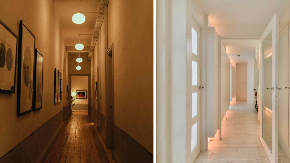
Narrow corridors have a particular visual problem: the two large parallel walls converge towards the back, creating a tunnel effect that compresses the perception of space. The eye follows the vertical lines of the doors, boards and beams down and in, emphasizing the length and completely ignoring the width. It is a phenomenon that does not depend on the actual square meters: a ninety-centimeter-wide corridor with three-meter-high walls appears narrower than an identical one with horizontal treatment on the walls, even if the centimeters are the same.
The horizontal lines on the walls work on exactly this mechanism. They lead the eye from left to right instead of top to bottom, changing the direction of visual movement and changing the perceived proportion of space. It is not a decorative trick based on taste: It’s the same logic that designers use in high-speed train cabins, ship interiors and any tubular space where the perception of spaciousness is a functional priority.
The problem is that horizontal lines on walls almost always turn out badly. Too thick, too opposite, too close to the ceiling or floor. The result is not a corridor that appears wider: it is a striped cage that narrows rather than opens.
The rule of thumb that changes everything
The thickness of the lines is not a free aesthetic choice: it has direct and measurable visual consequences. The fine lines, between 3 and 6 cmmultiply on the wall creating a dense pattern that the eye reads as texture rather than horizontal movement. The lines are very thick, beyond 20-25 cmthey become alternating blocks of color that visually weigh down the wall without creating the desired zooming effect.
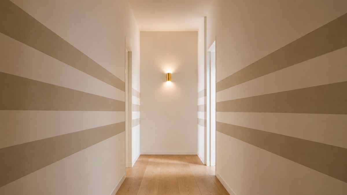
The ratio that works best for narrow aisles is the one with colored line between 8 and 15 cm m white or neutral range between 10 and 18 cmwith the gap slightly larger than the line itself. This relationship between full and void creates a visual rhythm that the eye follows horizontally without tiring and leaves enough neutral space between one line and the other to not saturate the wall with color.
Varying thickness between lines, a technique some designers use to create dynamism, works in large spaces but in a narrow hallway causes visual confusion. Lines of uniform thickness, repeated at a steady pace, are always more effective than varied compositions, when the aim is realized by magnification rather than decoration as an end in itself.
The height at which you place the lines on the wall is just as important as the thickness. Lines that start from the floor and reach the ceiling create a cage effect that emphasizes height rather than width. The most effective solution is to limit the lines to a central zone of the wall, between them 60 cm from the ground Hi 180-200 cmleaving the bottom and top a solid neutral color. This creates a horizontal band effect that visually expands the perceived width without touching the areas where the vertical lines of the doors and shutters already create enough movement.
Color contrast: why black and white is the wrong choice
Contrast between lines is the most often underestimated variable. A high contrast, such as black lines on a white background, creates a pattern that the eye perceives as an independent graphic element rather than an architectural treatment of the wall. The line becomes the protagonist, the corridor becomes the background, and the end result is a space that looks smaller and more agitated than before.
To visually widen a corridor, the color contrast between the rows should be low. Not invisible, because a slight difference makes the pattern illegible, but restrained. The rule of thumb is to choose two tones of it same color family with a brightness difference between 15 and 25 points on the LRV (Light Reflectance Value) scale, the value that measures how much light a color reflects.
In specific terms: a warm white like the Pointing No. 2003 by Farrow & Ball combined with a greige like Elephant’s Breath No. 229 of the same brand creates enough contrast to make the lines visible without causing visual tension. Little Green with the adjacent tone system, built specifically for low-contrast pairs, offers combinations that have already been tested as French Gray Light hectare French Gray Medium which work particularly well in corridors with limited natural light.
Saturated and dark colors such as navy blue, forest green or burgundy only work if used as a line on a very light white background with thin lines, under 10 cm. In this case the contrast is high but the line is so narrow that it does not dominate the wall. It is a variant that requires precise execution: a millimeter of smudge in a thin dark line is immediately visible.
How to perform series without technical errors
The practical execution of wall lines is where most designs fail, regardless of the quality of the color scheme. Hand painting is excluded for any line thickness less than 20 cm: the irregularities show in the light and destroy the effect of the geometrical order which the lines must communicate.
The most reliable system for sharp lines is Japanese paper masking tape, the one with less grip than standard blue tape. The Japanese cassette, such as the 3M Washi Tape in the painter’s version, it peels off without removing the underlying color even afterwards 24-48 ore of drying. The correct order is: apply the first color to the entire wall, let it dry completely at least 48 oreapply the tape to define the edges of the lines, apply the second color, remove the tape while the color is still slightly wet but not wet.
The laser level is necessary to keep the lines perfectly horizontal along the length of the runway. Also a bypass of it 2-3 millimeters over three meters in length is visible to the naked eye and compromises the final result. Entry level lasers cost between 25 and 40 euros and are easily found in hardware stores.
For those who prefer to avoid painting, striped wallpaper is an alternative with less margin for error in execution but more complexity in combining sheets. Sandberg wallpaper with the collection Extreme offers stripes in different proportions with pre-coordinated low-contrast colors, designed specifically for tight spaces. Cole & Son in order Marquee Stripes has options with lines between them 10 and 18 cm in neutral color combinations that work well in corridors with dominant artificial light.
The walls should be treated and they should remain free
In a narrow hallway, not all walls need the same treatment. Horizontal stripes work best long sidewallsthose parallel to the direction of travel. Applying them to the back wall, the one you see when entering the hallway, has the opposite effect: it brings the eye to the side right where the space ends, emphasizing the perception of closure rather than opening it up.
The back wall is best handled with a single color that is slightly darker than the side walls, which creates a visual recess and gives depth to the hallway. Or with a single vertical element, such as a mirror, a photo portrait print, or a wall lamp with an adjustable arm that draws attention up instead of down.
If the corridor has doors along the side walls, the lines stop at the shutters and continue on the other side. It is not necessary for the drawing to be continuous: the eye reconstructs the continuity even with regular interruptions, provided that the height of the lines remains constant throughout. Use a fixed reference as a guide, such as the third line from the bottom always a 90 cm from the ground in all sections of the wall, it maintains visual coherence even with many doors in between.
An eighty-five centimeter corridor treated with horizontal lines in the right proportion and contrast does not magically become spacious. It becomes a hallway where you don’t feel the need to exit quickly.