
White is not neutral. This is the first thing to understand when working with a room that doesn’t get much natural light. Pure white, in a low-light environment, turns into a cold gray, loses its luster and gives an almost clinical effect. It is not a problem of the amount of light, but of how that little light interacts with the painted surface. And the choice of color, in these contexts, becomes a decision with specific consequences for how the space is perceived every day.
Many people, faced with a dark room, believe that they must light it at all costs. Adjusted reflex leads to white, beige, light gray. But these tones, without warmth, risk flattening the environment further. The logic of painting in dimly lit rooms works counterintuitively: sometimes it’s better to accept the darkness and work in it, than to fight it with colors that promise brightness and don’t deliver.
White gray and the “safe” trap
Get a white one like it Pure White di Sherwin-Williams o one classic off-white from the hardware store. In a room with a single north window, these tones acquire a grayish dominant position that can already be noticed in the middle of the morning. The problem is physical: without direct light to activate them, the cool white pigments remain dormant. The end result is an environment that always looks slightly dirty or sad, even when freshly painted.
So are the light grays that have dominated renovations in recent years. A gray like Elephant’s Breath di Farrow & Ball It works beautifully in a loft with high ceilings and floor-to-ceiling windows. In a corridor with only one small window, the same color becomes leaden. The lesson is this: cool colors need light to be expressed. Without light, they close in on themselves.
Warm tones and reflective pastels: how they really work
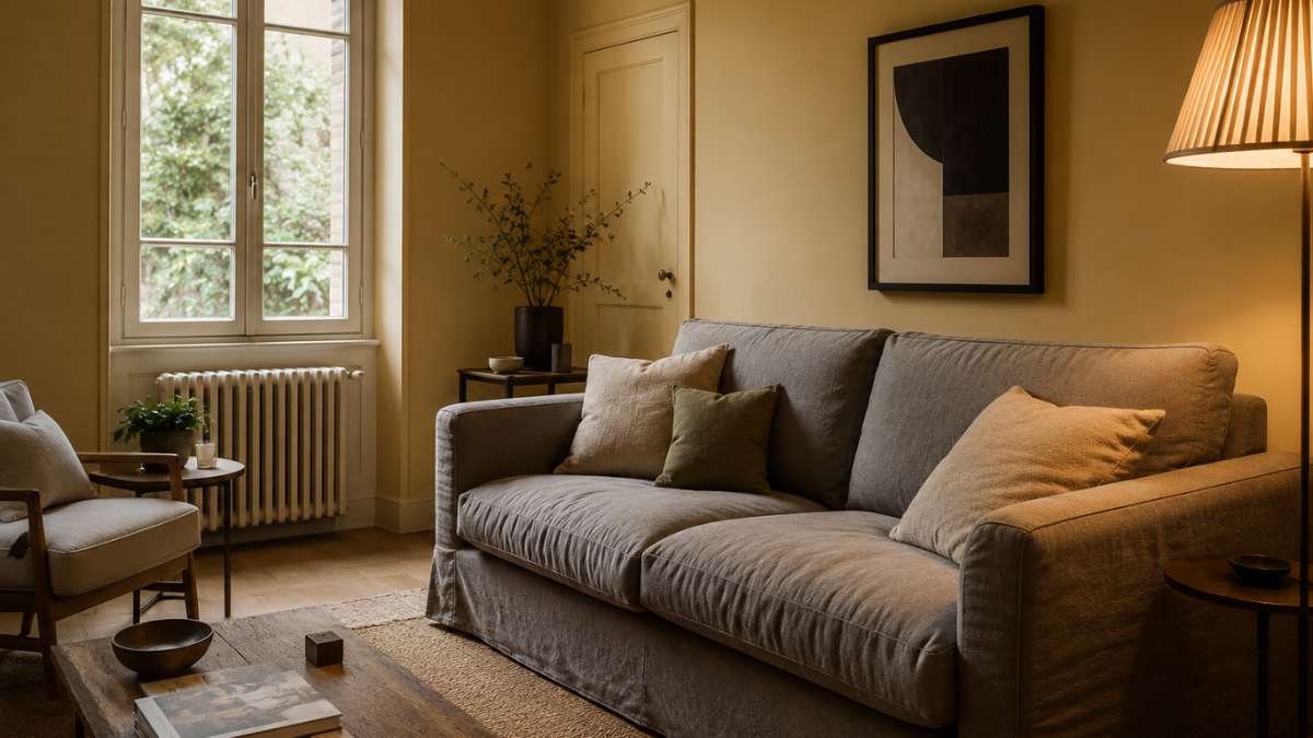
Warm tones have a certain quality: they manage to create a perception of brightness even without direct light, because the brain associates them with the heat of the sun. A pale yellow buttersuch as Farrow & Ball’s Hound Lemon (number 2), applied to the walls of a dimly lit studio, creates a diffused light effect that whites cannot reproduce. It is not a proposition: it is the response of visual perception to certain color spectra.
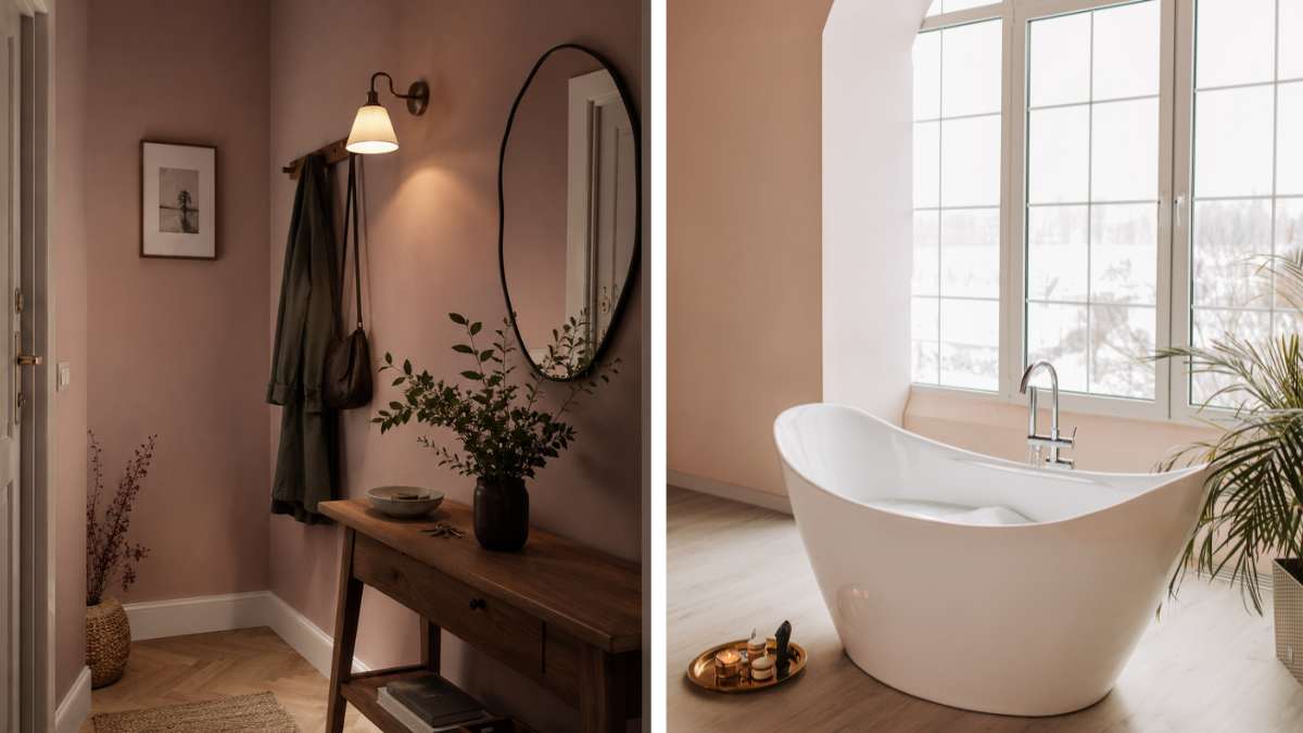
Warm pastels work similarly. A desaturated antique pink, like the Setting Plaster di Farrow & Ball or the equivalent in the Little Greene range, adds depth without weight. In a small entryway with a single wall light, this type of tone creates an ambient effect that turns a structural flaw into an accurate aesthetic choice. So are pale peaches, muted salmons, diluted caramels: tones that don’t scream, but work steadily.
I soft yellows and pale sage greens; deserve special mention. Sage green, in particular, has a dual nature: it brings a bit of gray into the mix, but with a warm base, it manages to look good in both bright and shadowy environments. Colors such as Farrow & Ball’s Mizzle or Mole’s Breath, or their counterparts in the Mylands range, are formulated with a tonal complexity that makes them customizable.
When darkness becomes a choice: deep colors in dark rooms
There is an opposite strategy, less intuitive but just as effective: embrace the darkness and use deep colors that transform the room into something purposeful. A bottle green such as Farrow & Ball’s Studio Green, or a midnight blue such as Hague Blue, applied in a dimly lit room produce a concentrated, almost muffled effect, which in some contexts is exactly what is sought.
A bedroom with walls inside midnight blue and a bedside table with warm 2700K light becomes a boutique hotel environment. A small study with dark green walls and natural wood bookcases from the floor to the ceiling ceases to be a dark room and becomes a deliberately intimate room. The difference between a gloomy environment and an atmospheric one almost always lies in the accessories, the artificial lighting and the consistency of the chosen palette.
Farrow & Ball has built part of its brand identity on these deep colours, with prices around €60-70 for 2.5 litres. Brand like Mylands the Painting source offer alternatives of comparable quality to water-based formulations and high color performance, at slightly lower prices.
Finishes and undertones: the details that change everything
Color alone is not enough. There paint finish has a direct impact on the perception of light in a room. Matte finishes absorb light, satin or semi-glossy ones reflect it. In a room with little natural light, a light satin effect finish in warm tones can measurably increase the perception of brightness, without changing color.
The undertone of the chosen color is the other element that is often underestimated. Each color has a dominant color base: a white can have a yellow, pink, green or blue tone. Before buying, it is worth applying a sample of at least 30×30 cm to the wall and observing it at different times of the day. Paper samples in the shop, under standard fluorescent light, are almost always found.
I’m coming brand Some lady or Benjamin Moore offer digital tools for simulating color in environments with different lighting. They are not one hundred percent accurate, but they allow you to avoid the biggest mistakes before investing in a full board. However, testing in natural samples remains necessary.
The palette that works: three specific scenarios
A living room with a north window and a low ceiling: walls in pale yellow butter (Hound Lemon or similar), light wood flooring, raw natural linen fabrics. The room will not look as bright as a loft, but it will have a warm consistency that makes it livable and pleasant at all times.
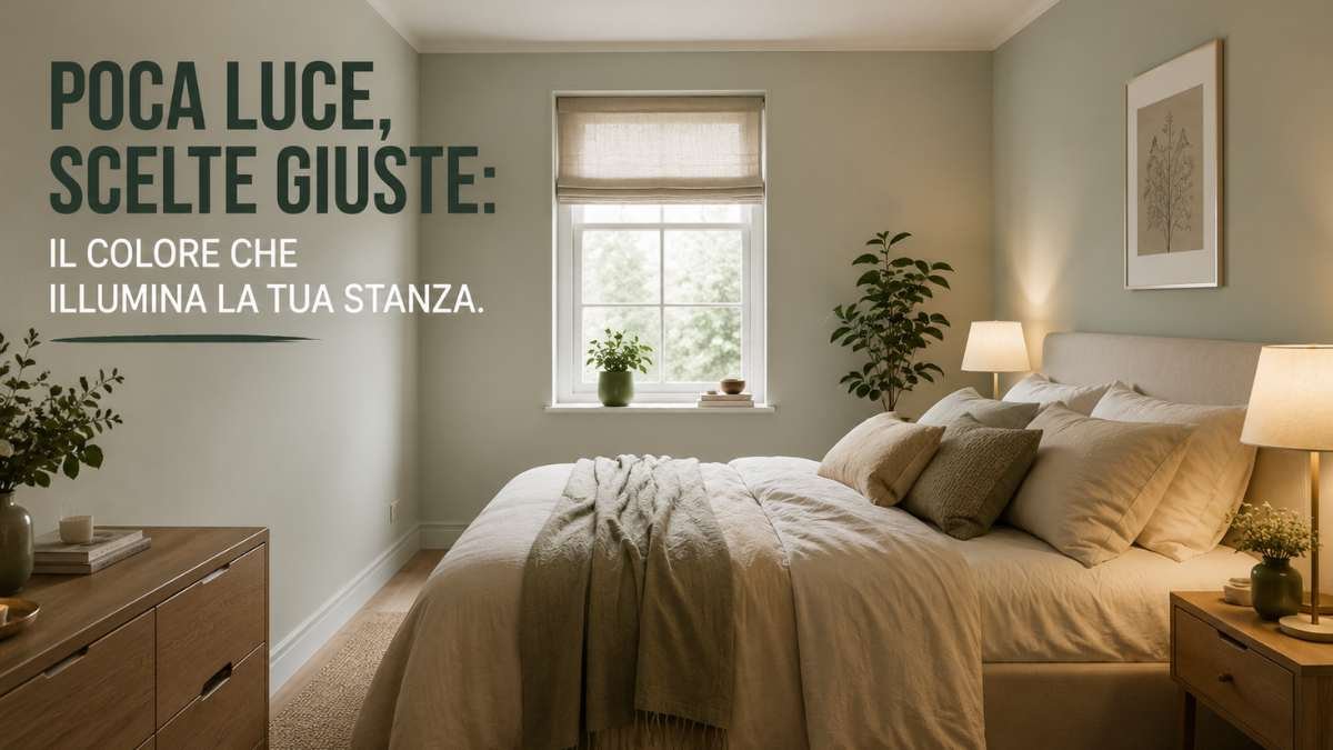
A bedroom with only one small window: walls inside desaturated antique pink (Setting Plaster or equivalent), powder velvet headboard, warm light lamps oriented towards the ceiling. The environment gains depth without losing intimacy.
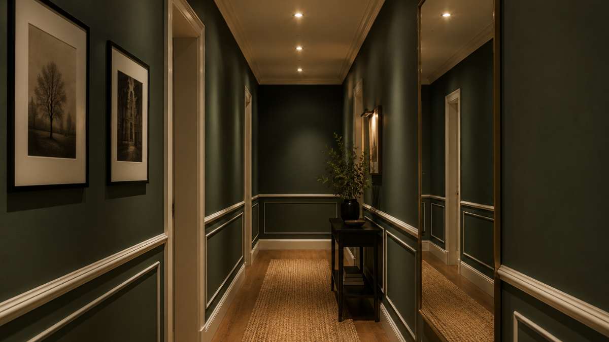
A blind corridor, without direct windows: instead of fighting it with useless whites, enter walls dark green bottle with cream white frames, long wall mirror and 3000K recessed spotlights. The corridor ceases to be a residual space and becomes a passage with its own identity.
In each of these cases, painting is part of the work. The rest comes from understanding how artificial light behaves on different surfaces and a willingness to let go of the idea that a dimly lit room must necessarily appear to be something it’s not.


