

The Mediterranean has a reputation problem. Decades of handmade lemon tiles, terracotta pots on the balcony and flowing white curtains have created a recognizable, comforting, holiday aesthetic. An aesthetic that works very well in an Apulian farmhouse or an apartment in Sète, but which in a Milanese attic or a two-room Roman apartment risks looking like a set for a summer shoot. The point is not the style itself.
It is that the Mediterranean, in its most widespread version, brings with it a sensation rural irregularity which is difficult to reconcile with real urban life: one consisting of hard surfaces, fast pace, small environments and a certain need for visual control. And yet something is changing. Designers and mid-high range brands are working on a version of the same color and material vocabulary that retains the warmth of southern Europe, but brings it to a stricter grammar.
This is not a distortion of anything. It’s about understanding the elements that make the difference between an apartment that looks like an inn and one that looks like the home of someone with a certain taste.
The color that does not disturb
The traditional Mediterranean works with strongly saturated colors: the cobalt blue of the Greek doors, the lemon yellow of the Sicilian balconies, the red of the geraniums. Transferred into an unmediated urban interior, these colors do exactly what they originally did: evoke warmth, summer, celebration. They work outdoors, under a certain light, in specific architectural contexts. In an apartment with north windows or low walls, they are done noisy in the worst sense of the term.
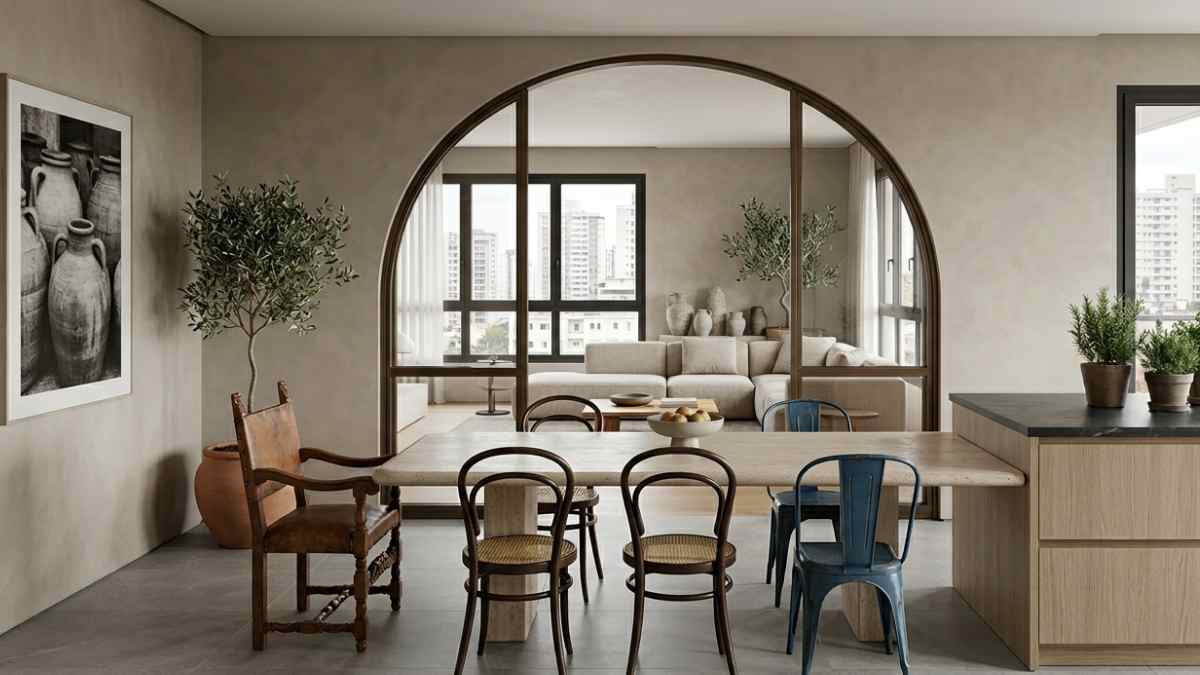
The transition to the urban Mediterranean goes through selective desaturation. Not from shedding the color, but from maturing it. Electric blue becomes slate blue. The canary yellow gives way to a burnt ocher that almost leans towards smoke. The dazzling white turns into a slightly harsh lime white, what Farrow & Ball calls it Old White the Satin slipperswith warm tones that do not aggressively reflect light. Mutina, the Emilian ceramist who in recent years has redefined what a porcelain cover can do, works on similar palettes in his collection Phenomenon: earthy backgrounds with minimal color variations reminiscent of Salento limestone without ever becoming decorative. The result is an environment that retains the perceived warmth that characterizes the Mediterranean, but acquires a muted quality, able to withstand even a metropolitan environment without decorations.
The thing that doesn’t pretend
The second element is not a color. It’s a superficial choice. The popular Mediterranean brings with it a fairly specific repertoire of materials: bleached pine, pressed rattan, polished rhinestones with handmade patterns, raw fringed linen. Each of these materials has its own logic. Pressed rattan, however, is not rattan: it is an industrial product that imitates a material with its own history. Fringe on linen mimics a textile tradition that belongs to no one in particular. The problem is not the imitation itself, but the general nature derived from it.
Sophisticated Mediterranean works with materials that have an exact physical presence. The Venetian terraceor, for example, which disappeared from the radar until ten years ago, has returned as a high-quality floor in European urban apartments. Not as a nostalgic reminder, but as a technical choice: it is durable, polished, unique in its composition. Companies like Marmoreal, founded by British designer Max Lamb, produce contemporary terrazzo with thoughtful grain sizes that look more like geological finds than floors. Price: from 180 euros per square meter for the basic versions. Less obvious than parquet, less cold than concrete. Next to the terrace, the Etna lava stone finds space as a kitchen top and as a cover for shelves. THE’Sandstone of Syracusea local limestone with an almost sandy grain, today it is cut into thin slabs and used as wall panels in Milanese interiors that want visual mass without weight.
When furniture ceases to be handmade
The third floor, which cannot be separated from the previous ones, concerns the choice of furniture. The traditional Mediterranean loves the handmade piece with some visible imperfection, the solid wood table with lathe marks, the market-bought wicker chair. These pieces have real quality, but the accumulation of them creates environments that hardly breathe. No visual hierarchy, no fixed points.
The urban version of the same style introduces at least one item with an accurate and industrial design. Not necessarily expensive. Hay, the Danish brand, has the chair in its catalog About a chair by Hee Welling: clean shape, available in a color palette including sage green and terracotta that blend perfectly with a Mediterranean aesthetic without completely owning it. The contrast between the designed chair and the handmade ceramic lamp creates a tension that keeps the room awake. The same principle applies to a sofa with an exposed painted metal structure, such as those from Petite Friture, combined with cushions in traditional ikat fabric. This is not a random mixing of styles. It’s about understanding that complexity almost always results from a calculated friction between different languages.
Density vs. stacking
There is one distinction worth mentioning, even if it risks seeming subtle: the difference between density and accumulation. The most successful Mediterranean interiors in an urban key are not minimalist. They have ceramics, textiles, plants, objects with history. But every element has a physical space around it. Nothing overlaps to fill a gap. Emptiness, in these environments, is designed as much as fullness.
Patricia Urquiola has been working on this balance for years. In his work on Hotel San Francisco of Palma de Mallorca, 2015, used the visual vocabulary of the Iberian Mediterranean with synthetic discipline by a Northern European architectural office: every iteration is checked, every exception is justified. The result does not look like a themed hotel lobby. It looks like a private home of someone with accumulated experience. That quality, the sense that everything is where it is for a reason, carries over to any scale. Even a fifty square two-room apartment with an open kitchen and a balcony facing east.
A lava stone shelf with two selected items. A chair with a recognizable design. A color that doesn’t scream. It’s not a formula. It’s a direction.


