

The Provence style has its own almost impenetrable internal consistency. Weathered whites, light woods, printed roses, natural linens: a system that has worked for decades and resists any trend. Precisely for this reason, when you want to update it without betraying it, you need to choose the entry point carefully. Not a restructuring, not a change of direction: a nuance. And sugar paper, with its dusty and slightly melancholy character, is perhaps the most appropriate color note to carry out this operation without leaving obvious traces of intervention.
Compared to navy blue or sage, buff brings with it something indeterminate, halfway between cloudy February skies and gray that hasn’t yet decided to be gray. In Provençal contexts, where everything tends towards the warm and worn, this tone introduces a controlled coolness, almost a pause in the visual breathing of the environment. It doesn’t break, but it cools down enough that the style stops looking like a movie set in Provence and returns to a modern home with a precise aesthetic identity.
Why shabby chic stopped and how to start again
Classic shabby chic, what Rachael Ashwell codified in the 90s with her line Shabby Chic Couturebuilt on a deliberate paradox: worn objects are treated with the same care as fine pieces. The problem is that over time this grammar has become formulaic. The artificially aged white lacquered furniturethe flower-shaped handles, the pink fabric on an off-white background: elements that have lost their ability to surprise because they are repeated too regularly.
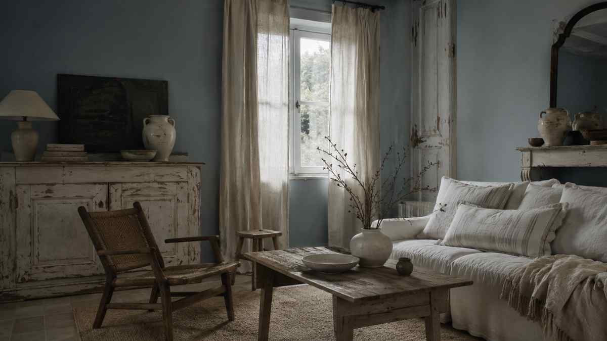
Inserting sugar paper in this box does not mean negation of these codes. It means a slight shift of the color focal point. A wall in this tone, even just the one behind the sofa or headboard, changes the perceived temperature of the entire room. The dirty white of the furniture, instead of referring to tired vintage, acquires a contrast and becomes readable as a conscious choice. It’s the difference between an ensemble that looks put together out of habit and one that shows intent.
The correct tone does not exist: the calibrated one does
Sugar paper is not a unique color. The palette ranges from almost blue versions, very cold and almost faded blues, to interpretations with a green or gray component that brings them closer to Farrow & Ball’s dusty blue or powder blue. In a Provençal-fragile frame, the versions to avoid are those that are too saturated or too bright, because they break the tonal consistency without adding anything useful.
Farrow & Ball Borrowed Light No. 235 It’s an accurate reference: a very light blue with a subtle gray element that makes it suitable for both walls and furniture. Alternatively, Annie Sloan offers Louis Blue in the Chalk Paint range, slightly more intense but equally compatible with weathered surfaces. If you are working on wooden furniture that needs to be reinterpreted, Chalk Paint has the advantage that it adheres without preparation to almost all surfaces and the end result retains that opaque and almost dusty texture that integrates with the shabby logic without appearing to be applied.
Where to put the paint and where to keep it
The temptation to spread sugar paper on too many elements is the main danger. A sofa covered in this tone, combined with cushions from the same color family and a coordinated wall, produces a monochromatic effect that neutralizes the visual complexity that makes shabby chic interesting. The contrast between the surfaces is an integral part of the style: its removal means impoverishment.
The most effective applications are timely. A repainted light wood bookcase on sugar paper, leaving the grain visible in the places of natural wear, it brings the color without invading it. A fabric panel behind the headboard, in raw linen dyed in this tone, introduces the color note with a materiality that marries the natural logic of the style. Or, in the most subtle version, the details are enough: the ceramic of a pedestal sink in an already white bathroom, the top of a painted wooden bedside table, the doors of a wardrobe unit in the kitchen.
The principle is that color should never have the same weight everywhere. It should have a point of maximum intensity and then fade to more neutral or lighter elements. In a Provençal living room, this might mean a tissue paper wall facing three white walls, with an off-white natural wool rug and mixed white and light gray fabrics.
The ingredients hold their own with this tone
Not all materials behave the same next to the sugar paper. White lacquered wood, characteristic of shabby chic, works well, but risks flattening if present in large quantities. More interesting is raw or waxed wood in warm tones, hazel or light honey: the thermal contrast between the coldness of the dusty blue and the warmth of the untreated wood produces a visual tension that keeps the whole alive.
Ceramics are an underrated ally. Brands like Pesaro Laboratory or the Faenza ceramic repertoire produce pieces glazed in an uneven white, with firing imperfections that create iridescent surfaces. Compared to the sugar paper, these objects do not seem decorative but elements that have their own story. Textile-wise, raw linen, loosely woven cotton and muslin are the fibers that absorb this type of combination best: they don’t reflect light like satin or velvet and retain that soft, not-too-defining quality that characterizes the style.
Wrought iron painted in white or ivory, a classic element of Provence, acquires a different readability next to the tissue paper: it ceases to be merely decorative and begins to look structural, almost architectural. An iron headboard, a lamp with arms, a handmade candlestick: in a more defined color framework, these pieces find a new role.
Modernity is not addition: it is subtraction
Bringing shabby chic into a modern version does not mean introducing elements foreign to the style. It means to remove something. The reduction of accessories, the stricter selection of decorative objects, the rejection of the most persistent floral motifs: these are the gestures that lead the result to a more current interpretation. Sugar paper doesn’t do this by itself, but it creates the conditions for it to happen.
A table with a weathered wooden top and turned legs, in natural aged white, above a tissue paper wall and with a single composition of white ceramics: this is a space that works without explanation. It doesn’t tell a story of the French countryside, it doesn’t refer to any photo set seen on Pinterest. It has only its internal coherence, silent and a little difficult, like all spaces that do not ask for approval.