
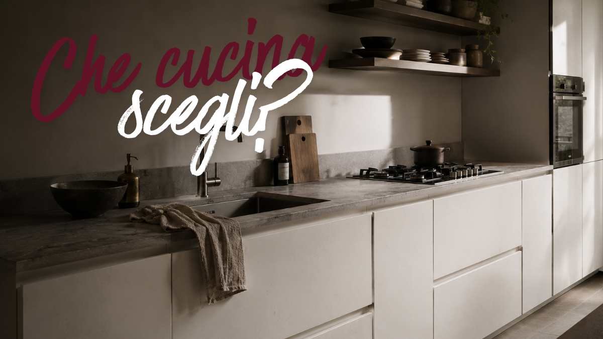
A color that has made a career in magazines and Pinterest mood boards. Gray has been the color of decorative intelligence for years. In kitchens it appeared everywhere: doors, worktops, appliances with anthracite finish. A color that said modernity without riskssophistication within IKEA’s reach. Then something snapped, but not in the way you think.
It didn’t get bad. He got tired. And in kitchens, an environment that accumulates artificial light, steam, grease and years of daily use, a tired color looks more than anywhere else. Interior designers working on residential projects continue to have clients come in with images of pearl gray, muted gray, warm gray kitchens. And almost always, at the end of the process, these kitchens end up with a different color. Not on a whim, but because the gray in the kitchen has a structural problem that manifests itself slowly and then all at once.
It’s a color that absorbs light instead of returning it, which interacts badly with food and which in north-facing rooms becomes something difficult to correct without radical intervention. All this does not make it absolutely wrong, but it does explain why those who know it well tend to put it elsewhere.
What happens when gray meets the real kitchen
The kitchen is not a living room. You live there in a natural, sensory way. Colors that work in 3D renderings in perfect light behave completely differently at noon with the sun slanting or at night with warm lights under the cabinets.
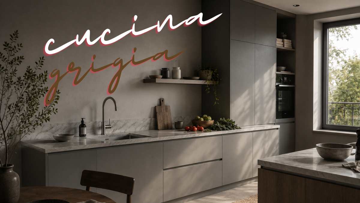
Gray has a light reflectance index (LRV) that varies considerably depending on the shade, but the most popular versions are the medium-dark ones found in the catalogs of brands such as Veneta Cucine or Snaidero they range around 20-35%. It means that they give back little of what they receive. In environments with small windows or with an unfavorable orientation, the result is a kitchen that looks permanently in the shadows, not put together.
But there’s a second problem, less technical and more visual: gray clashes with almost all food colors. The red of the tomato, the yellow of the eggs, the green of the aromatic herbs. On a gray background, these colors lose their saturation, they look less vivid. It is not an impression: it is a real perceptual effect associated with the simultaneous contrast of colors, studied by Josef Albers in Color interaction already in the sixties. The kitchen is an environment where the colors of the food and not the furniture take center stage.
Because it keeps appearing in directories
If the problem is so obvious, why doesn’t gray disappear from the kitchens sold? The answer is industrial rather than aesthetic. Kitchen manufacturers work with samples designed to be neutral on a large scale. A medium gray works in renderingsadapts to multiple theoretical environments, does not scare anyone at the time of purchase.
Cesar Cucinea high-end Venetian manufacturer has built entire color schemes around the gray variants. They work very well in their showrooms, with thoughtful lights and controlled combinations. The same applies to his matte gray collections Bulthaupwhere control of the environment is absolute. The point is not that gray is always wrong, it’s that it requires very precise conditions to express what it promises.
In normal houses, those with 10-14 square meter kitchens, single windows and connected dining rooms, these conditions almost never exist. And the gray kitchen that looked elegant on the day of installation begins to weigh down after the first winter.
What designers choose
Not white, necessarily. Indeed, pure white in the kitchen has its problems, it shows every mark, it requires constant cleaning which is unrealistic. The colors that return to the projects of interior designers with residential experience are different.
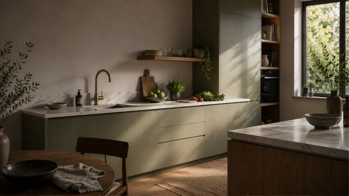
Why it keeps appearing in catalogues- designmag.itSage green is the most mentioned candidate right now. Not for circular fashion, but because it has interesting functional characteristics: an LRV high enough not to weigh it down, a neutral perceptual temperature that interacts with natural materials like oak or Guatemalan green marble. Farrow & Ball has a historic sage green, Mizzle No.266, which works almost flawlessly in the kitchen with matt lacquered doors.
Then there are the earth tones, beige with a red or yellow tone: a warm white like Pointing by Farrow & Ball, or All White by Little Greene combined with stone tops Burgundycreates a kitchen that never gets old or tired. Bulthaup B3 cream doors, available in several warm variations, have been used in Milanese or Roman apartment renovation projects since the 1990s and remain relevant.
It’s not about chasing trends. It’s all about choosing colors that work with natural light instead of absorbing it, that enhance food colors instead of dulling them, and that don’t show the signs of age in the relentless way that gray does when it starts to look dusty.
The moment the choice becomes irreversible
The cuisines rarely change. A kitchen installed today will probably still be there in fifteen years. This practical irreversibility is one of the reasons why the choice of color deserves careful discussion before relying on showroom samples.
A useful detail: Always ask the manufacturer for the color data sheet marked LRV. Any price below 40% in a small or poorly exposed kitchen is a sign to be aware of. Bring a sample size of at least 30×30 cm to the real environment, hanging it for a few days in different light conditions. No digital simulation can replace it.
What if the gray is already there, if the kitchen is already installed and the result is not convincing? Sometimes it is enough to replace the wall units with versions in a lighter tone or intervene on the counter with a warm-toned material. One floor inside Silestone quartz of the Ethereal series with white veins on a slightly ivory background on medium gray doors can completely change the perception of the environment. It doesn’t solve everything, but it does show how some colors need the right company to really work.


