

Interior designers have known this for decades, but they still don’t say it clearly enough: the bathroom is not small for structural reasons. It is small for how it is dressed. Get two identical bathrooms, same layout, same ceiling height, same window. Paint one with white walls and a checkered black floor, the other with a floor-to-ceiling pearl gray palette. You will enter the first one and call it “the small bathroom”. You will enter the second and unconsciously look for the point where it ends. This phenomenon is not a matter of taste: it is purely visual and has practical consequences in any bathroom under ten square meters.
The mechanism is simple to explain and difficult to accept for those who love strong combinations. The human eye measures spaces by looking for edges: where one surface ends, where another begins. Every sharp contrast, every line, every sharp color change is a signal that says “here is a discontinuity.” The more discontinuities there are in a small space, the smaller it appears. Eliminating or softening these contrasts is not an aesthetic sacrifice: it is removing road signs from a street to make it look like a highway.
The floor that cannot be seen, the ceiling that does not crack
The most underrated contrast in small bathrooms is not between walls and furniture, but between floor and walls. A dark ceramic on a floor with light-colored walls draws a very strong horizontal line that visually lowers the entire room. The result is a cramped box, not a packed space.
The solution that works best in these cases is to bring the same material or at least the same shade from the floor to the wall, at least up to a meter high. Porcelanosa has developed entire collections designed for this type of visual continuity: the line Urbatek XLight offers ultra-thin porcelain plates in the shape of 120×260 cm that can be used on both surfaces with the same texture, eliminating the perception gap between horizontal and vertical planes. The price is around 90-130 euros per square meter, which is not cheap, but it is a choice that transforms the perception of the space in a measurable way.
The same principle applies to the roof. A white ceiling on colored walls clearly defines the upper limit of the room. Also bringing the shadow of the walls to the ceiling, perhaps slightly open, erases this line and the perceived volume increases. Not because the room gets taller, but because it stops feeling low.
Where pottery becomes a continuous narrative
Wall covering is the main cause of unwanted contrasts in Italian bathrooms. The classic installation with a decorative tape halfway up the wall, the change of form between the floor and the shower, the resin border around the bathtub: each element adds a line, each line adds a border, each border becomes smaller.
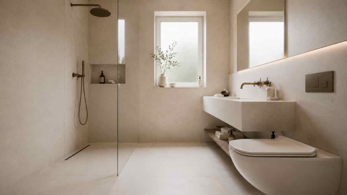
Designers working in small spaces have been using the technique for years full height continuous liningpreferably in large format. The reason is technical as well as aesthetic: the joints are an indicator of scale for the human eye. Few joints, big slabs, few breaks. Marazzi with the collection Grande brought this principle to the mid-range residential segment, with dimensions up to 160×320 cm also available for floor installation. In a space of four square meters, two or three full sheets cover the entire shower wall without a single visible vertical joint: the result is that of a surface that has no beginning or end.
The choice of shade is as important as the form. The warm beiges, the foggy grays, the dirty whites with the barely noticeable veins they are more effective than pure white precisely because the grain creates movement on the surface without creating contrast with the surroundings. It’s the difference between a wall you look at and a wall that disappears.
Sanitary ware and faucets: the visual weight that no one counts
A white sink on a beige wall is invisible. The same sink on a charcoal wall immediately becomes an object, an element that occupies visual space. In a small bathroom, every object that is “visible” weighs down the perception of size.
For this reason, colored bathroom lighting or sinks in opaque materials that contrast with the wall are an option that should be carefully evaluated in spaces under six square meters. It’s not a matter of trend: it’s that a matt white sink on an ivory-white wall it almost disappears, while the same sage-green sink on a white wall exists as a standalone sculpture, mentally occupying twice the physical space it actually occupies.
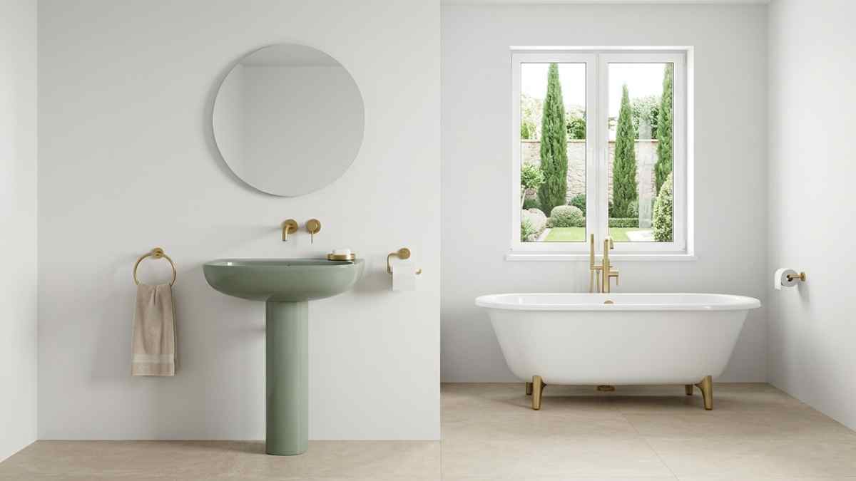
Agape, the Mantuan brand that has built its reputation on minimal aesthetics, has worked for years on the idea of sanitary ware that integrates into surfaces rather than emerging from them. The sink Dotdesigned by Benedini Associati, it has such a basic shape that it almost disappears completely when combined with a wall of the same shade. It costs around 600-800 euros, which does not make it accessible to everyone, but the principle it incorporates, that is reduce the visual weight of each elementit also applies to lower quality products, looking for simple shapes and colors aligned with the environment.
Pushes follow the same logic. A chrome faucet on a dark wall creates a bright spot that draws the eye and defines a space. The same mixer in a satin finish combined with the tone of the coating becomes almost invisible. Fantini offers greige and light bronze finishes that naturally match the earthy palettes increasingly used in modern bathrooms.
The shower without borders as a laboratory of the invisible
If there is a single intervention that changes the perception of a small bathroom more than any other, it is the elimination of the shower cabin as an element visually separated from the space. An aluminum and glass box, although transparent, introduces a vertical structure that divides the room into two distinct areas. The mind reads two small spaces instead of one single space.
The floor-level shower cubicle with a fixed or unglazed window solves this problem at its root. The floor continues, the walls continue, steam is the only boundary between the wet and dry areas. Technically it requires a sufficient slope and a well-designed linear drainage system: products such as drains Tributary by Geberit, which can be placed at the same level as the cladding, make this type of solution possible even in standard renovations without extraordinary work.
The end result, with continuous floor-to-wall coverage, sanitary ware integrated into the color palette and a borderless shower, is not a bathroom that looks large. It’s a bathroom that you stop wondering how big it is, because the eye can’t find where to measure it. And that’s exactly where you wanted to go.


