

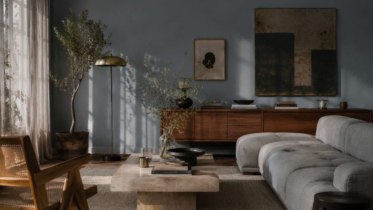
There is a color that works in silence. It doesn’t impose like black, it doesn’t reassure like white, it doesn’t warm like terracotta. Sugar paper makes something thinner: It changes appearance depending on what you put next to itthe time of day, the type of lamp lighting the room. In a bedroom with raw linen fabrics it almost looks like Scandinavian grey. In a living room with brass elements and burgundy velvet, it turns to gasoline, becomes darker and more deliberate. This chameleon-like behavior isn’t a flaw of perception: it’s why interior designers and architects continue to choose it even as the color market pushes toward more reassuring palettes. Not a color for those who want a room finished quickly. It requires attention, some mistakes along the way, a willingness to observe how it transforms over time. Those who choose it without this availability risk finding themselves with a room that just looks sad. Those who choose it consciously, however, get something that is difficult to get with a gray or an off-white: a room that has its own character.
It’s not blue, it’s not gray: the question of perception
Defining sugar paper is already a complicated exercise. Major manufacturers’ color charts put it in its own territory desaturated bluebut just compare two samples of different brands to understand how stretchy the name is. Farrow & Ball offers theirs Spatter and the Dix Bluewhich many associate with this color family: the former leans towards sage, the latter has an almost lavender component in the evening hours. Benjamin Moore has the famous Newburyport Blue HC-155, which in some settings comes across almost like a 70s powder blue. Zoffany, a British brand with a solid history in the high-end segment, offering Fog in the Rhapsody collection: a light blue that almost disappears under warm artificial light, becoming neutral with a barely perceptible personality.
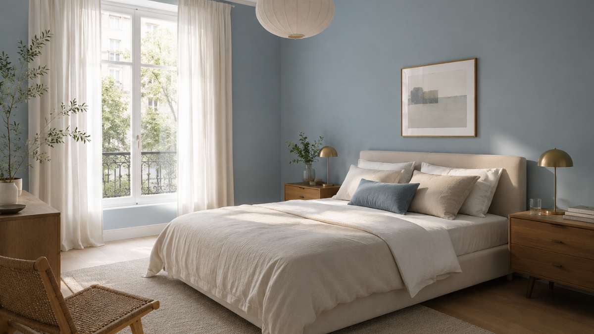
This variability is not a technical problem. It depends on the percentage of gray and green pigments that each manufacturer adds to the blue base to dilute it. A baby blue with more gray tends to read as industrial, almost military. One with a hidden green ingredient, even a minimal one, becomes more natural, botanical. Knowing this difference before you buy changes everything: a sample of at least A5 applied directly to the wall, observed at three different times of the day, any description is valid.
What it really works with (and why some combos are overrated)
The most mentioned combination is the one with white. It works, but it’s also the least interesting. Baby blue next to a cool white works well in Scandinavian style kitchens, but tends to become predictable. Much more effective is the combination with materials that have their own imperfections: Arabic marble with gray veins, raw walnut wood, unpainted natural rattan. These materials absorb tone without fighting it, and the result is a consistency that doesn’t seem planned.
The combination with terracotta, which has invaded interior design foods in recent years, only works if the tissue paper has a strong gray component. Otherwise the two colors compete for attention with no one winning. A specific example: a light blue wall in a living room with a 1950s terrazzo brick floor, a dove gray boucle sofa and a travertine coffee table. Here the shade acts as a neutral but not anonymous background and the travertine brings the necessary variation without adding new colors. The situation is different with pink powder, A combination that seems appropriate in the magazines but in reality often produces a pastry that becomes hard to bear after six months.
Brass and bronze are the metals that enhance this shade the most. Copper is more dangerous: It can work in small doses, like in a wall sconce, but on large surfaces it competes rather than complements.
Walls or details: where color gives its best
The bravest choice, but also the most successful, is to paint all four walls. Not just one colored wall, not two: all of them. The resulting wrapping effect is different from any other solution and the sugar paper has the characteristic that it does not become oppressive even in large quantities, as long as the room has a ceiling of at least 2.70 meters. Below this size, it is better to limit yourself to three-quarters of the wall with the upper part in white, or use it on furniture and furnishings instead of the walls.
On the furniture front, history is rich. Ikea has offered several versions of its system over the years Kallax in sandpaper-like shades, with mixed results. His case is much more interesting Licka British brand of eco-friendly paints, which he developed Blue 04 specially designed for use on wooden surfaces and lacquered furniture: the result is homogeneous and does not require a primer in many cases. For those who want an alternative to the brush, some lines of Harlequin wallpaper offer geometric patterns in this shade on a linen background, with an effect that maintains the depth of color without the stiffness of the paint.
Paper kitchens had a moment of great visibility around 2019-2020. The ones that have stood up well over time are the versions with matt lacquered doorsnot shiny, combined with gray stones or quartz. Satin versions have shown over time a tendency to absorb fingerprints and lose uniformity in the most touched areas.
Sugar paper in small spaces: against all logic, it works
The rule that dark colors are reserved for large spaces is a simplification that does not take into account how the perception of environments works. A three square meter bathroom painted in sugar paper on all surfaces, including the ceiling, produces an effect of continuity that paradoxically eliminates the boundaries of the room. It does not expand them: it dissolves them. The result is a space that stops feeling small because it stops showing its boundaries so clearly.
The most documented case in this sense comes from some English boutique hotel projects, notably from the chain Firmdale Hotels by Kit Kemp, who uses tissue paper in utility rooms and bathrooms as part of a deliberately unsettling palette. The stated goal is to make each environment memorable rather than comforting. A distinction worth remembering.
A twenty square entryway with sugar paper on the walls, a black and white concrete floor and a black matte metal hanger: no other details are needed. The room is already finished. This is perhaps the least discussed benefit of color: visually saturate the space with less furniturewhich also means less expense and less mess.


