

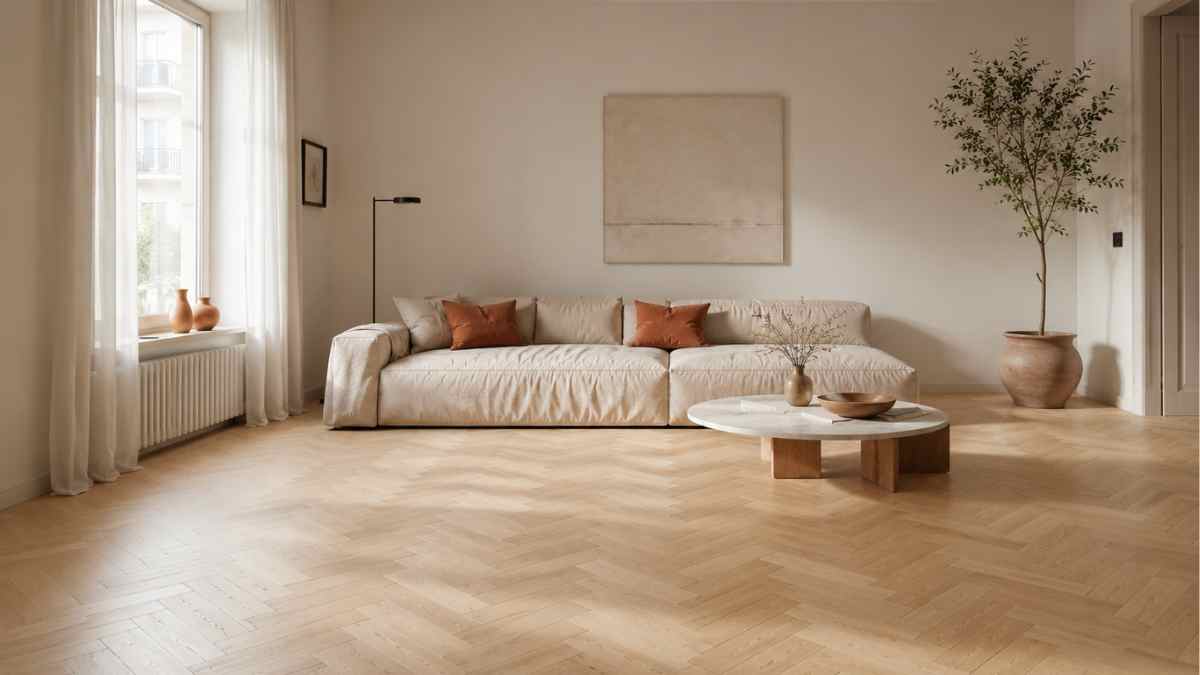
Japanese interior designers have a term, mamawhich describes empty space not as absence but as active presence. It is not an abstract concept: anyone who has lived in a forty square meter apartment knows exactly what it is, even without knowing what to call it. Free space has weight. It occupies the room as much as the objects that fill it, maybe more. However, the first thing you buy for a living room is almost always a coffee table, and the first thing you do is place it right in the center of the rug, symmetrical to the sofa, equidistant from everything. A choice that seems logical but instead works against the perception of space in at least three different ways.
Moving that coffee table, or removing it entirely for a few weeks, is one of the most revealing experiments you can do in your home. This is not about minimalism, nor about following a trend. It is a question of how the eye reads a room and what happens when it stops stumbling upon an object that is at the most predictable geometric point of the design.
The center is a visual trap
When a heavy element occupies the center of a room, the eye registers it as a point of arrival. It stops there. He doesn’t walk around the perimeter, he doesn’t explore the corners, he doesn’t mentally measure the depth. The coffee table, especially if it is low and wideit acts as a horizontal visual barrier that literally cuts the field of vision in half, right in the area where our attention is focused when we sit.
The problem is not the board itself. It’s his position. An object centered in a small space makes it smallerbecause it prevents the eye from making the natural movement to the back of the room. Spatial perception studies conducted by the Polytechnic University of Milan in the framework of the European project COST Action TU1306 confirmed that people overestimate the surface area of a room when the central visual field is free of horizontal obstacles. Not a little: the Width perception can be increased up to 20% simply freeing the central area from elements below sixty centimeters high.
Vertical objects, surprisingly, take up less space. A floor lamp, a bookcase, a tall plant: anything over a meter in height doesn’t interrupt the visual path in the same way. The coffee table is the most damaging element in proportion to the volume it occupies.
So where does he go?
The answer is not universal, and those selling off-the-shelf solutions probably won’t give you an honest solution. It depends on the floor plan, the orientation of the sofa, the presence or absence of an adjacent dining area. That said, certain locations almost always work better than the center.
Lateral to the sofa, placed side by side at one end, becomes the coffee table punctuation element rather than a fulcrum. It maintains its practical function, remains accessible, but frees up the area in front of the sofa. IKEA has built an entire line around this principle with the range of coffee tables Holy crapdesigned to be used in pairs and easily moved thanks to the thin metal construction that does not weigh down visually. They cost eighty-five euros each, are stackable, and their lightness is not an aesthetic limitation but a deliberate functional choice.
Another option is the corner opposite the sofa, near a single armchair or a reading lamp. In this case, the coffee table ceases to be the center of the living room and becomes part of a more intimate complex, a separate corner that enriches the room without dominating it. The living room gains depth because the eye has two separate points of interest instead of one.
Third possibility: remove it completely. Or at least try. The free floor, especially if it is made of wood or resin, acts as a horizontal mirror and multiplies the perception of the surface. This is not a challenge: is the logic with which Patricia Urquiola has worked for years, one of the most important designers of the last twenty years, who in her residential projects prefers small or absent low tables, which are replaced by support surfaces integrated into the arms of the sofas or the perimeter elements.
Dimensions, materials, transparencies
If the coffee table stays, its physical features matter as much as its location. The most useful rule of thumb is that of the sofa analogy: the length of the table should not exceed two thirds of the length of the sofa and its height should be aligned or slightly lower than the height of the seat cushions. A coffee table that is too large in relation to the sofa creates this feeling of crushing that is mistaken for a lack of space when in fact it is a lack of salts.
Transparent materials deserve a separate mention. Glass and acrylic do not visually eliminate the coffee tablecontrary to what we read, but they lessen its impact by letting you see inside, restoring continuity to the floor. The coffee table Saarinen by Knoll, with its white marble top on a white base, works on a similar principle: color continuity with the walls makes it less perceived as an interruption. It costs about two thousand euros in the original version, but the principle is repeated with any light base on a light floor, without necessarily reaching this figure.
Dark wood tables on light floors are the most damaging combination: maximum visibility, maximum visual weight. If you have a dark wooden table, it is best to place it on a carpet of the same tone to reduce the contrast with the floor and soften the reading of the obstacle.
The carpet as an accomplice
Moving the coffee table without rethinking the rug is a job half done. The rug defines the living area and, if it is large enough, the coffee table can move freely within it without losing the coherence of the composition. The minimum dimension for this to work is that all sofa legs touch the carpet. A rug that is too small, placed just under the table, accentuates the island effect and anchors the table in the center even when you physically move it.
A carpet of at least 200×300 cm in a typical living room It completely transforms composition possibilities. The table can be moved to one side, remain partially outside the carpet and be replaced by two smaller poufs arranged asymmetrically. Hay, the Danish brand known for its quality-price ratio in the medium-high range, offers woolen carpets 200×300 for around three hundred euros, dimensions that in many Italian homes seem excessive but in fact is the limit below which the carpet starts to create more problems than it solves.
What remains, once the table is removed from the center or simply moved, is a room that breathes differently. Not bigger in an absolute sense, but readable in a more extensive way. The eye follows a path, rests on different points, discovers the corners. It’s the difference between a space that you read immediately, all at once, and a space that continues to reveal something as you sit.


