

The moment you photograph a dining room to sell, rent, or just show off to friends, something interesting emerges: environments that actually seem to work very well appear disorganized, crowded, almost incoherent in the images. It’s not the lens’s fault. It is the fault of a detail that no one notices in person but the eye registers anyway, even without knowing what to call it. This detail has an exact name: la transition area between the table and the wall. This strip of space that includes the backs of the chairs, the edge of the furniture behind them, a possible frame, a makeshift hanger. That’s where most of the visual noise in a dining room is concentrated. Not on the table, not on the chairs, not on the chandelier.
The transition zone is that vertical zone that the eye automatically travels while sitting at the table. It goes from the floor to about halfway up the wall and is right in the eater’s line of sight. Everything in this range competes with the dining experience, the conversation, the atmosphere you want to create. And the problem is not the quantity of objects: it is their relation to each other.
When chairs get annoying
Chairs are the first item to look at. Not the design, not the color: the way they relate to the background. A high-backed wicker woven chair in front of a wallpaper-patterned wall creates an overlay of texture that the eye can’t quickly decipher. The result is a perception of chaos, even if every element has been carefully selected.
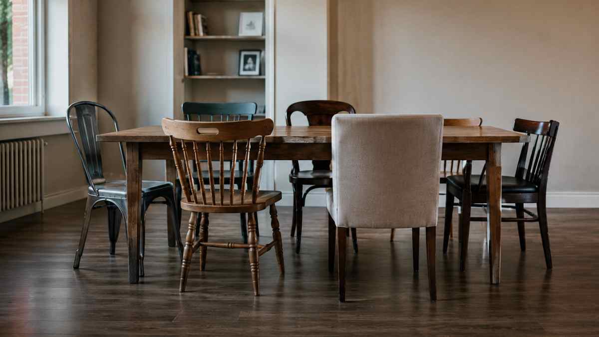
Mid-range and high-end chair manufacturers are well aware of this. HAYthe Danish brand known for its ability to fit into domestic environments without overwhelming it, designs many of its chairs with solid surface backs for this very reason: fewer visual filters between the environment and the wall. About A Chair, for example, has a back that doesn’t catch the light in a discontinuous way. When you place it in front of a plain wall, it almost disappears. And disappearing, in this case, is exactly what you want.
In contrast, chairs with a beam structure or with an open back in turned wood create a series of visual fragments that multiply the perception of elements in the environment. It is not an aesthetic flaw in itself: it is a fact that must be managed. If the frame is a clean white wall, that’s fine. If the frame is already complex, these chairs increase the visual temperature of the environment.
The service furniture that no one disputes
Behind the table or along the main wall of the dining room, almost every house has a service piece of furniture: sideboard, sideboard, sideboard. Things end up there that have no place elsewhere. An open bottle of wine, the centrifuge that was used once, the folded shopping bags, the books that they never had time to put away.
The issue is not the presence of objects in the furniture, but theirs height and distribution. A service cabinet with objects at different heights, placed without a common axis, produces an irregular line of the sky that the eye reads as a disturbance. Not because things are bad: because they don’t talk to each other in any recognizable way.
Take the road as a reference Ikea presents its Hemnes systems on displays in the store: even when the furniture is loaded with objects, they follow a maximum height that creates a coherent horizontal line. Below that line, anything goes. Above, the void. It’s a trivial, almost obvious solution, but it’s rarely implemented in real homes. The reason is simple: objects accumulate over time, they are not all arranged at the same time, and therefore the synthetic logic is lost.
The back wall is not neutral
A white wall is not neutral. It is a mirror. It reflects everything in front of it with a clarity that dark walls don’t have. A dining table with a white wall and chairs made of different materials, a picture hung slightly crooked, a piece of furniture with handles of three different shapes: every imperfection becomes legible. The white wall enhances, not hides.
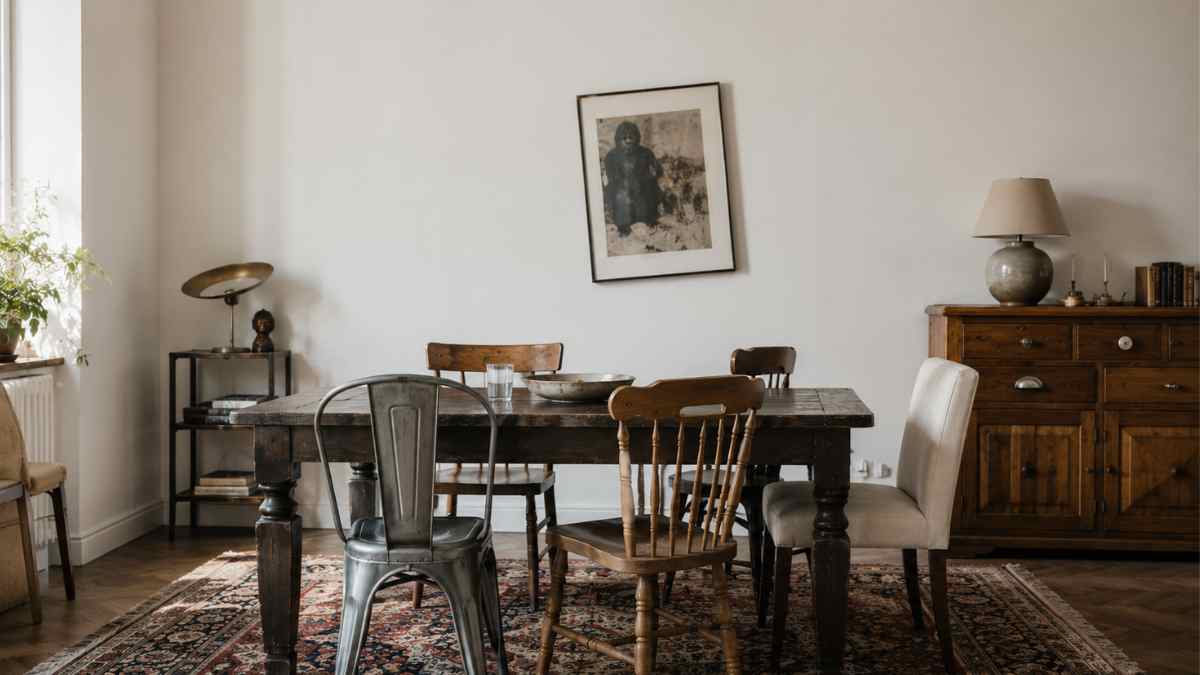
This does not mean that the wall should be dark. It means that the relationship between the wall and the elements in front of it must be considered as a system. A medium-saturated color, such as sage green or soft terracotta, absorbs imperfections because it creates a less reflective base. Farrow & Ball has built a large part of its catalog on colors that have this property: shades with a grayish or earthy element that reduce the visual resolution of the environment, making it more coherent. Their Mole’s Breath, for example, works particularly well in dining rooms because it unifies the background without dominating it.
That said, repainting isn’t always the first answer. Before thinking about the wall, it is worth looking at what is in front of it. An intricately patterned rug under a dark wooden table in front of a white wall produces three visual levels that compete with each other. Removing the carpet or replacing it with a solid color often solves more than half of the stains.
The detail that no one examines: the cable of the hanging lamp
There is one element that appears in almost all modern dining rooms and which is rarely evaluated in terms of its visual impact: the pendant lamp cable. When visible, and descending vertically from the center of the ceiling, it divides the room into two symmetrical halves. So far, no problems. Chaos is created when the cable is off-center with respect to the table, when it is twisted, when it is a different color than the body of the lamp, or when it is framed by other vertical elements that compete with it: a curtain, a window, an edge of furniture.
Cable has a visual weight that adds to everything else. Producers like it In the army the Lose they design their lamps also considering the aesthetics of the cable: often fabric, often monochromatic, with a reduced diameter that minimizes its presence in the visual field. A lamp like Set by Muuto, for example, has a cable that is integrated into the overall silhouette rather than creating a separate element to manage.
In homes where the lamp was chosen for its shape rather than its suspension system, the cord remains an orphan element. It may be enough to wrap it in a fabric sock that matches the roof to reduce the impact. It’s not a glamorous solution, but it works.
A tidy dining room is never the result of a single intervention. It is the result of a series of relationships that happen or don’t happen. When they are not held, something in the environment holds their gaze without releasing it. And this conservation, prolonged for the whole duration of a meal, is tiring.


