

A wall is never neutral. Even what you would like to be invisible, painted white, smoothed to the point of anonymity, says something: the intention to erase, to disappear, not to disturb. For years, this has been the unwritten rule of home interior design. Perfect surfaces, clean corners, plasterboards that erase every trace of what was underneath. The result? Houses that appear to be architectural renderings, aesthetically coherent and vaguely uninhabited.
Something is broken in this story. And the crack, we must say, has become the most interesting point to see. Modern designers are recapturing the Japanese idea of it wabi-sabithat philosophy which does not seek perfection but the beauty of what is transitory, incomplete, marked by time. Applied to domestic walls, it means embracing exposed concrete, rough plaster, ancient brick with its irregular patina. Not out of design laziness, but as a deliberate, technical choice, calibrated down to the smallest detail.
Wabi-sabi is not rustic: the difference is in the details
First of all a necessary distinction. A wabi-sabi wall is not a neglected wall. It’s not the plaster that’s peeling off because no one took the time to fix it, nor the exposed brick of a basement that hasn’t been renovated yet. The wabi-sabi philosophy applied to interior architecture provides precise control of imperfections: they are selected, highlighted, protected.
The technical process that distinguishes a carefully constructed wall from a half-abandoned construction site begins with controlled removal of old paint layers or by applying lime and clay based plasters that are left deliberately rough. Next is the application of opaque and breathable stabilization resins: an invisible protective film that prevents degradation, makes the surface washable and silky to the touch, but keeps the porosity intact in light. The concrete grains remain visible. The color nuances of the old bricks, with their ocher and smoky gray streaks, emerge instead of disappearing under a layer of paint.
The German brand Lime & chalk produces a series of natural plasters based on lime, the so-called Clay plasterwhich allow you to get surfaces with deliberately uneven color variations from dirty white to warm beige, passing through gray slate. Applied with a large spatula and allowed to dry without final smoothing, these products give exactly that layered texture that is the heart of the wabi-sabi language applied to domestic architecture.
Visual combinations: when the wall becomes a landscape
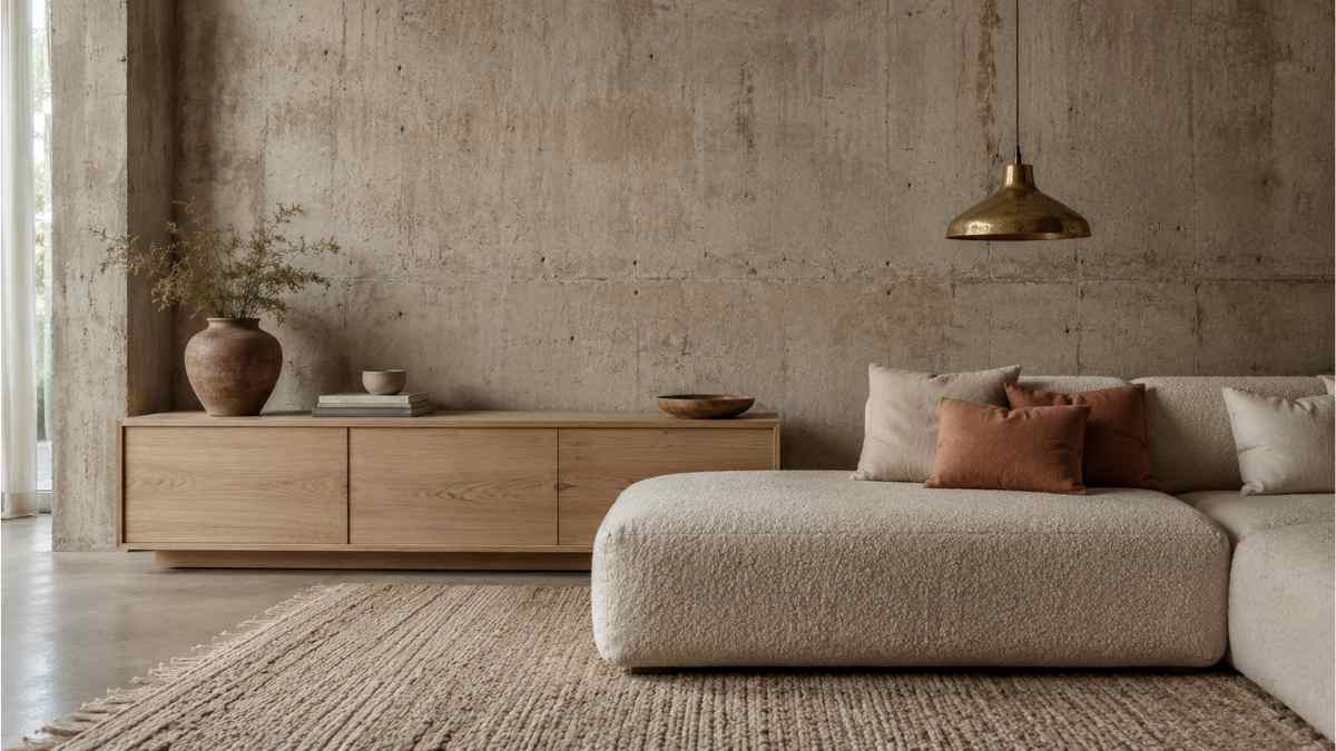
A wall of exposed concrete or rough plaster only works if the environment supports it. Left alone in a neutral and minimal environment, it becomes a decorative element in itself, like hanging an industrial print in a living room that otherwise lacks personality. Wabi-sabi requires coherence: the other materials in the room must bear traces of time or create a deliberate contrast.
A combination that works well: medium gray exposed concrete with furniture in solid raw ash wood, cushions in oat-colored raw linen and a sofa covered in bouclé clay. The palette remains cool but not distant. A wool rug with handmade knots like those in the Nudo by series Nanimarquinawith its desired irregularities in texture, it brings to the floor that texture that recalls the wall without reproducing it.
A second, more daring scenario: a wall in reclaimed ancient bricks, with their natural polychrome between ancient red and burnt brown, combined with oxidized brass elements, handles, hanging lamps, shelves with arms. The metallic warmth of raw brass dialogues with the warm tones of brick. In the middle dark fabrics: petrol velvet, charcoal cotton. The result is heavy in the best sense: an environment that has weight, that seems to have been inhabited for years.
A third, more contemporary approach plays up the sheer stratigraphic effect: the wall shows fragments of original plaster, pieces of exposed brick and areas of concrete applied above, like an architectural palimpsest. In this case, the rest of the room should be strictly furniture with clean geometry, such as the sofa Toot by Molteni&Cclean horizontal lines, some selected objects. The wall talks, everything else listens.
Domestic brutalism: not just aesthetics
Brutalism has had a difficult life as a residential language. Born into the public architecture of the 1950s and 1960s, Le Corbusier, His béton brut, unapologetic buildings for what they are have long been considered incompatible with the concept of a welcoming home. The idea that raw concrete could fit into a living room without turning it into a shelter seemed like an unresolved contradiction.
Modern designers have solved the problem by working on it scale and color temperature. A brutalist wall in an apartment is not the exterior of an English welfare building: it is a three-meter-wide surface, receiving natural light from a window, which is experienced up close. The texture of concrete with its bubbles, casting imperfections, shades of light gray to almost beige at this scale becomes something different. Almost familiar.
The Belgian designer Vincent Van Duysen he uses this logic consistently: in his interiors, exposed concrete walls are never the only protagonist, but part of a material layering that includes marble, linen, aged leather. The hardness of the concrete is balanced by the softness of the fabrics, neither softened nor hidden. It’s still hard, but it has a context that makes it readable as a choice rather than an absence of choice.
What happens when you make a mistake?
The main danger of this approach is not aesthetic: it is technical. An untreated exposed concrete wall in a residential environment releases fine dust, absorbs moisture and can develop limescale over time. Treatment with breathable stabilization resins is not optional, it is the minimum requirement to make this option sustainable in the long term. The products of the series Mapei Planitopused in a professional context or in the most accessible of Rust-Oil for domestic use, they offer water-based solutions that do not alter the appearance of the surface but make it stable, clean and dust-free.
Another common mistake: applying this logic to a single wall, as if it were an alternative wallpaper. Wabi-sabi is not a decorative accent, it is a system. If the wall is raw and everything else is white lacquered and smooth, the wall looks like a problem to be solved, not an option to be admired. Even the introduction of an unpainted wooden piece of furniture, a raw fabric, a handmade ceramic object creates the minimum material cohesion for the whole to make sense.
A wall showing the time promises nothing. It does not reassure, it does not beautify in the conventional sense of the term. It demands attention and in return offers something that smooth surfaces cannot: the feeling that this space has history, even if it was built yesterday with plaster and trowel.


